|
I have previously written about turnover adjustments to Expected Points Added (EPA) per play. This is because I generally use EPA to evaluate quarterbacks. As a result, I do not believe an ideal EPA statistic should penalize QBs for things out of their control. Today, we are going to expand on that philosophy. We are going to introduce my Isolated EPA Per play model fully. This ridge regression model aims to better evaluate QB's effect on EPA per play by accounting for various contextual factors they cannot control. Note that since this post is about evaluating NFL quarterbacks better, everything from here on in will be about plays labelled as QB dropbacks in the NFLfastR dataset. Theory This methodology comes from my first favorite sport, Hockey. When scrolling through NFL Twitter, I noticed a familiar theme. Football people sometimes filter out "garbage time". These charts only used stats while the game is at least somewhat close. The theory is that stats when up 37 points aren't super meaningful. Hockey analysts noticed a similar problem some time ago. These analysts coined the term "score effects". Winning teams get outplayed in hockey once winning. Originally, "Corsi close" was used to get around this. Corsi close only used player statistics when the score was within a few goals. But, what hockey analysts have done since is "score adjust". They have found that rather than filtering out good some of our precious data, it is better to adjust for these variables, generally using regression models. No amount of math can make up for the lack of data, so I believe this change is very important. Then hockey analysts started doing this for all sorts of variables. For example, RAPM, the ridge regression model that inspired this post, doesn't punish players for the quality of their competition/ teammates, zone starts, score effects, etc. So I figured something along the same lines could be done for Football. Instead of filtering out data, it is preferable properly adjust for the contextual variables that influence statistics like EPA. To make such an adjustment, I decided to make a ridge regression model. This would allow us to estimate all of the quarterback's and defense's effects on EPA that season, independent of each other and various contextual variables we know affect outcomes. For example, if one team doesn't throw enough on early downs (when it's relatively easy to throw), the QB's raw EPA numbers will be punished, but this model will account for this. Not punishing QBs for coaching decisions should QB evaluations with EPA. Now let's dive into the model. Public Code For Open Source Changes Now we know where I got the idea for this model. I want to note that I am not an NFL football expert. Somebody with far more domain knowledge than me may be better at picking control variables than me. This is why I have made the code for this public. Not only that, but I published the code to make this model public going back ten years (if you want, you could easily run it farther back) and attached code at the end to allow for year-over-year testing of the model in case anyone wants to try and evaluate their improvements. So don't think this model is something I think is final; you are welcome to take a crack at the code, too; if you think I'm missing something (I probably am) or overfitting somewhere, please improve what I have done. The code for this post can be found here. Control Variables So, let's start with how the model's control variables affect EPA per play. Let's begin with the easiest one, down. Down A major piece of the NFL analytics movement has suggested that NFL offences should pass more on early downs. Why? Well, passing is more efficient than running, on average, but there is more to the story. It has been easier to pass the earlier the down for as long as we have data. This gives an edge for smart teams to maximize passing efficiency by passing more early. This edge adds a layer to QB evaluation. If not every QB passes an equal amount on every down, and different downs have different difficulties, it is one-way teams can make passing easier/more difficult on their QB. There are massive differences across the league too. Since play calling is not in the QB's job description (I understand they can manipulate these things to some degree, but still), it does not make sense to penalize a QB whose team forces him to pass on later downs more often. To account for this in the model, 4 dummy variables have been created. One variable for each down. One of these variables will be equal to one at any given time, depending on the down. For example, if a QB passes on second down, the second down variable will be equal to one, while the 1st, 3rd and 4th down variables would all be equal to 0. Distance (Yards to Go). The following control variable is the distance to the sticks. In other words, how many yards the QB needs to gain to get a first down on that drop back. Thus resetting the number of plays, they have to gain another first down. Again, as distance increases, it becomes more and more difficult to generate positive plays. Again this creates a problem because QBs pass at different distances over the course of a season. For example, let's follow the rookie QBs as our case study. Trey Lance has had the longest average yards to go, while David Mills is on the opposite side of the spectrum. While these differences are not massive, Mills's average yards to go is over half a yard shorter than Lance's. Half a yard over hundreds of pass attempts adds up. QBs, of course, have some control over this. But again, play calling is not in the job description. So it doesn't make sense to penalize QBs who are asked to pass from longer distances. It's also worth noting that there is an evident nonlinearity. To account for this, the yards will go variable, and a logged transformation of the variable will go into the model. Shotgun Next up we have the shotgun variable. This is a dummy variable set equal to one if the QB lined up in the shotgun instead of under center. This probably matters because teams tend to pass more from the shotgun than under center. While they tend to run more from under center than the shotgun. NFL defenses know this and adjust accordingly. These adjustments are likely what makes passing out of the shotgun so tricky. Passing from under center has been about six times more efficient than passing from the shotgun. The difference above almost certainly has a lot to do with play action. Play action rates are also almost certainly much higher from under center than the shotgun because teams can more credibly threaten a run play. The run and play-action rate is likely much of the reason for this effect. Continuing our common theme here, QBs have limited to no control over where they line up since they don't call or create plays. So it would be unfair to penalize QBs whose offences ask them to pass out of the shotgun more often. No Huddle After shotgun, we have another dummy variable, no-huddle. This dummy variable equals one when the team hurries and does not huddle between plays. This makes it difficult for the defences to make adjustments and leads to more efficient passes. Goal to Go The final control variable in the model is also a dummy variable. This time it is set equal to one when the team is in goal to go. This means they cannot gain any more first downs because the drive started within 10 yards of the end zone. The only positive outcome here is scoring, you can't get a fresh set of downs and continue on. No matter what happens on these drives, the possession will change after a maximum of 4 downs. This probably matters in the model because of something that any experienced Madden player will know. As you approach the goal line, there is less and less space for the pass defense to cover. As a result, passing in goal-to-go is really, really difficult in goal-to-go situations. Goal to go will go in the model the same way as the two dummy variables above. Opponent Adjustment The final control variable to evaluate the QBs will be an opponent adjustment. Not all teams have equally good defences. Passing against the 2021 Bills or Patriots has been very difficult. Teams have averaged negative expected points against them this season. On the contrary, specific teams like the Jaguars and have bled points to their opponents. So there will finally be a control variable for the team the QB was passing against in the model. Again this will be done with dummy variables set equal to one corresponding to which defence the QB was passing against on that play. Another benefit of this is that we will obtain estimates of team pass defence along with QB estimates. Since the QBs also go into this model, the pass defence estimates will be isolated from the QB they are playing, along with all the control variables listed above. As I write this, I wonder if a model like this is more beneficial for defences than QBs because it is usually assumed that even a great defence is mainly at the mercy of the QB they are facing. Target Variable Now we can move to the model's target variable. I will be using a variation of QB EPA from NFLfastR. QB EPA is a modified version of EPA. QB EPA doesn't punish QBs for expected points lost on receiver fumbles. Similarly, my turnover-adjusted EPA discussed here (link here) will be the target variable. This treats all fumbles and interceptions as having their average EPA for that year rather than their actual impact. For example, the average fumble cost a team 2.5 expected points in 2021. But, a QB may get lucky and have their team recover said fumble and gain points on that fumble. Or another QB can lose 7+ expected points on the exact same play if the other team recovers for a touchdown. In the EPA used in this model, the QB will be punished 2.5 points no matter the outcome. I did this because the model aims to estimate how a QB has influenced EPA per play, and the article linked above shows evidence fumbling or throwing picks in high/low EPA situations is not a skill. The goal of this model is to evaluate Quarterbacks. So if the mitigating expected points lost on a per fumble or interception basis is not a skill, I do not believe there is any reason to include it in our analysis. There is no reason to add randomness to QB evaluations if we do not have to. So fumbles and interceptions will all have the same effect on EPA in this model, no matter the outcome. Again if you believe this was a mistake, the code is public! Take a shot at the estimation without this adjustment if you wish How QBs Enter the Model We can now add QBs to the model with all the control variables. The QBs go into the model as dummy variables. Each QB has their own variable set equal to one if they are the one dropping back to pass. The model then estimates how that variable (the QB) affects EPA per play independent of all the other variables in the model. This is how we use regression to isolate QBs from contextual variables. Why Ridge Regression? For this analysis, Ridge regression is used in hockey instead of Ordinary Least Squares (OLS) for two main reasons. I will be following the same idea here. The first Ridge regression is preferable to OLS is that Ridge regression (which penalizes the coefficients by some lambda) tends to deal better with collinearity. So if the model is being estimated early in the season and some QB estimates are pretty colinear with the defence, ridge regression should be preferable here. Additionally, ridge regression allows a coefficient to be estimated for each dummy variable-based coefficient. This way, we get an estimate for how much each quarterback, down and defence affected dropback EPA that season. If we used OLS, one quarterback, one defence, and one down would all be dropped from the model, and the interpretation would be increasingly difficult, especially year over year. QB ResultsNow for the fun and exciting part. Once we have a model to quantify QB performance independent of various contextual factors they do not control, we can better isolate QBs from their surroundings. So we can plot all NFL QBs isolated EPA Per dropback in 2021. We can see Patrick Mahomes and Aaron Rodgers leading the way atop the list. Right behind them is Joe Burrow. Burrow only ranked 7th in EPA per pass, but the adjustments shot him up the list. We can also view these results over a more extended time period. For example, we can estimate the most efficient QBs on a per-play basis since 2010. It's no surprise Patrick Mahomes sits far above everyone else. Those next closest behind him include a group of many of the best ever to play, Payton Manning, Aaron Rodgers, Tom Brady and Drew Brees. Additionally, we can even view these estimates over time. Here are some of the all-time greats isolated EPA per play estimates over the years. Remember all of this is in the code so you can play around with evaluating different quarterbacks over time if you wish! Go to line 4500 in the R code if you wish to make your own plots with different players selected Defensive Results As I mentioned earlier, we can also use this to evaluate defenses too. Here are the top defensive teams from the previous season! Effect of Control VariablesTo better understand the estimates above, we can re-visit the control variables. This time we can look at how the control variables affect EPA per play independent of the QBs and other control variables. This is something the graphs above did not do. Here are the distributions of each variable from the past 11 seasons in the model. All the variables mostly show the same sign as directed. For example, it's more challenging to pass the later down and is tough to pass into the end zone etc. These estimates help illustrate how much easier it is to pass in these specific situations. Again I am not an expert here, but it is encouraging the signs of the control variables do not flip very often. A control variable that did not influence EPA per play would theoretically be fluctuating around zero, which does not appear to be happening generally. If you think i missed something here, feel free to update the model! Year Over Year Testing The last order of business when introducing a new player evaluation model is to test it against other publicly available QB evaluation metrics. First up let's compare the year over year relationship between my new Isolated EPA and future EPA Per play. We will be using regular QB EPA per play as the benchmark here. Note the weighted by total passes will also only include QBs who had at least 50 drop backs to avoid super small samples. While nothing crazy has been done here and the differences are not worth bragging about, Isolated EPA is definitely not a worse predictor of future QB EPA per play than past QB EPA per play. This is encouraging, and the general trend holds when evaluating this metric against other metrics. Note the next metrics all came from PFF which I downloaded. This is the only part of this post that won't be publicly available because I can't post other peoples data. Note the PFF data I used was from 2014-2020 because I did this mid season. This time the difference is slightly large. Isolated EPA per play has been ever so slightly more predictive of future PFF passing grade than QB EPA per play. More encouraging results! The next three metrics will be presented together to show a similar trend. I know these make less sense to test against but I wanted to include them simply because they were in the PFF dataset downloaded anyways, and show the same general trend robust across more QB evaluation metrics. The general trend here is pretty similar. This new metric is somewhere between equally as and more predictive of public metrics used to evaluate QBs than previous QB EPA per play. While this may not be the best way to evaluate a new metric, it's a good sign. We can also compare the relationship on the defensive side of the football. It turns out the Isolated EPA numbers are more predictive of future QB EPA per play allowed by defences than past QB EPA per play allowed by defences. There is a similar trend on the defensive side of the football. While the differences are not huge, this new metric predicts future EPA per play allowed and success rate better than past EPA per play! I do not believe this metric is perfect, and people who know football better than me may easily be able to improve it. However I believe the general logic makes sense, and testing results are encouraging.
0 Comments
Evaluating NFL Quarterbacks is incredibly hard. There are a few ways this can be done, each with its own strengths and weaknesses. Right now, public analysts usually use Expected Points Added (EPA) per play for quarterbacks. This post will show I adjusted for fumbles in my adjusted EPA per play to better understand a quarterback's isolated impact on his EPA per play. Why Adjust EPA Per Play? While I cannot speak for everyone, QBs EPA metrics are usually used to compare Quarterbacks, not offences. So, if we want to use this statistic to evaluate QBs to the best of our abilities using public statistics, I do not believe we should punish QBs for things they cannot control. This brings me to the first turnover adjustment, fumbles. There is already a method to begin adjusting for fumbles. The NFLfastR dataset calls this QB EPA. This metric does not penalize passers if the receiver catches the ball and goes on to fumble at some point after the catch. Because such fumbles are not the QB's fault, we should not penalize them. Further Fumble Adjustment But what about QB fumbles? Once a QB has fumbled, the outcome is almost entirely out of their hands. Sure they can recover it themselves. This does happen a small percentage of the time, but that is really getting into the weeds. Compounding this problem, turnovers make a massive difference in EPA. Especially in small samples. Here are the distributions of QB EPA on fumbles over the past few seasons. We can see by the fumbles distribution that the range of outcomes is enormous. Say the quarterback fumbles. If his running back recovers, he can still gain expected points on that play. On the contrary, if someone on the other team is a step ahead, it can cost them 7+ expected points because of field position and the other team's potential to score. The difference between a -7 EPA or a breakeven 0 on a given play will take about 23 plays at Aaron Rodgers's average efficiency this year to make up for. Then for more average QBs, it can take games to make up for these losses. All because the other team's corner beat his team's running back to the loose ball and returned it for 6? That does not seem like something we should include in QB analysis. There is no reason to pin these massive swings on QBs unless we can confirm some QBs are better/worse at fumbling. Is Fumble Quality Skill? So is fumble quality a skill? We know from above that QBs rarely recover their own fumbles. This suggests outside of the act itself, QBs do not impact fumble EPA. But, QBs may be able to influence fumble EPA by mitigating fumbles in high leverage situations. If QBs are good or bad at this, we should see some repeatability in the EPA lost per fumble from year to year. This has not been the case. QBs who fumble in high expected points situations have been no more or less likely to do the same next year. It seems clear that fumble quality is not a skill among QBs. So, EPA analysis can probably be improved by treating all fumbles as equal, rather than swinging wildly based on an outcome that the QB has little to no control over. An Interception Adjustment? The other type of turnover worth looking into in this article is interceptions. Earlier this season some people were defending Jamies Winston on Twitter. Their reasoning? Sure, Jamies throws a tone of interceptions but using EPA they were able to show he tended to throw them in low leverage situations. As a result, the number of expected points he cost his team on a per interception basis was much lower than any starting QB. This lead me down a rabbit hole. It turns out the opposite was true in 2019. Such a wild swing made me question if there was any skill here. Outside of 1 case study, are some QBs better or worse at throwing interceptions in high/low leverage situations? If so, interception numbers won't tell the whole story. But, if not, is having EPA weigh certain interceptions wildly differently just adding noise to our QB evaluations for no real reason? So is it a skill? Well, again we generally expect skills to repeat themselves year over year. There is a small relationship here. The year over year R squared of EPA lost per pick relative to league average is 0.01. Meaning about 1% of the variance in EPA lost above average on interceptions carries from year to year. This is an incredibly small number, so we can be reasonably certain interception quality is not a skill because it is almost entirely random year over year, and skills will tend to repeat themselves over time. Turnover Adjusted EPA If the amount of EPA lost fumbling and throwing interceptions is not something any QB is good or bad at, it makes sense not to include it in our metric to evaluate players. After all, we have such a small amount of data to begin with, there is no need to inject massive swings into our QB analysis if we are not picking up any skill there. A straightforward solution to this problem? Treat all interceptions and QB fumbles the same. Each equal to their average value and compare QBs then. Here are the two variables plotted against each other. We can see here that while the values are similar, there are some meaningful differences for a small amount of work. Joe Burrow was hammered on turnovers this year. He lost about 14 expected points more than average on his turnovers. Once we have adjusted, his 2021 campaign looks even more impressive, vaulting Burrow into the top 3 in terms of EPA per play. A similar story happens with Justin Herbert. Turnover variance is the difference between him ranking 6th in EPA to inside the top 5 (4th). The flip side includes QBs like Zach Wilson. Wilson's horrible 2021 season looks worse if all his turnovers are treated as average. Here is a table showing the effects for the 25 QBs with the most drop backs in 2021. This gives us a better way to view players' performance with some of the noise stripped out.
Conclusion The analysis above shows it is highly unlikely that mitigating points lost on a per fumble and interception basis is skill. So, including different EPA values for their fumbles and interceptions is not adding any signal about QB skill to our analysis. So, QB analysis can be improved by treating all interceptions and QB fumbles with the same value. This is especially true in smaller samples. While the changes aren't huge, this simple trick can strip some noise out of public QB evaluations with a few lines of code. I have posted a tone of NHL draft research over the past few months. My focus has been on draft biases. I have found various metrics, which were available to teams at the time of past drafts, that are correlated with success independent of draft position. For example, high scoring players tend to outperform their draft position, while taller players tend to under perform their draft position (don't forget hyperlinks). The fact that these relationships persist show NHL teams have failed to properly account for this information. A good question after finding these various draft biases is, do they still exist today? While true guess must be they aren't sure. Nevertheless, I think I have a cool way to test this. I am going to be looking at my sample to see if teams got better at accounting for this information during the sample. If teams were rapidly improving during my sample, it would strongly suggest that the inefficiencies I found are likely gone by now. If teams didn't get noticeably better at accounting for this information during my sample, it will make me incredibly skeptical of anyone arguing these biases are gone today. At least with a high degree of certainty. My Prior I should be up front about this, I have a relatively strong prior here. I am reasonably certain these loopholes are not gone at the moment. At least not all of them. Additionally I am somewhat skeptical teams got significantly better over the sample. The biases I found will eventually be gone, but I think somebody would need good evidence to convince me otherwise. I think once these inefficiencies have been found, everyone should have the prior that they exist until it is proven otherwise. Additionally I am not neutral here. I doubt anyone in my shoes would be, to be honest. I found a bunch of biases and I think it would be a lot cooler if my findings still may exist in the modern NHL. It would be somewhat depressing if my findings here were just like yup its all gone. Either way though, we will let the data decide. NHL Draft Bias Index To keep this post from being too long, we are going to look at all the biases I have found at the same time rather than individually. To do this, I am going to use an algorithm called Principle Component Analysis (PCA). PCA is an algorithm used to make indices, which aim to show you how some numbers move together over time. It's usually used when some variables are highly related so you look at them all at once, because putting highly related variables in a model will mess with your model. I put the big draft blind spots I found in a PCA, and this was the results. (Ignore the word Stata before everything) For those who aren't sure what's going on don't worry, on their own PCA results literally don't mean anything. It just shows you how some variables tend to move together. As a result, I will need to convince you that what I am using actually represents what I want to measure. Focus on the first dimension (Dim 1) here. In Dim 1 increases when the prospect is 1) Taller 2) Takes more penalties 3) Is a defender drafted high while the same dimension is decreasing when the prospect 1) scores more 2) is an over-age prospect Now, note the direction of the variables I have found to be not properly valued. I found, high scoring players do relatively well, over age players do relatively well. On the flip side, tall players do relatively worse, players who take a lot of penalties do relatively poorly, and finally highly drafted defenders tend to underperform. Directionally, this Dimension one is decreasing when a player has characteristics that are associated with being undervalued, while the opposite is true for players shown to have been over valued. (technically are all flipped but the direction doesn't matter, it just means negative represents player's likely to be undervalued instead of positive). For an example, here is our first dimension for each first round prospect in the 2014 NHL draft. What this means is this number, Dimension 1 is doing a reasonably good job at approximating all of the variables being examined at the same time. So, rather than looking at each metric individually, we use this dimension 1 variable to account for all our under / overvalued characteristics at the same time. Since it represents all our metrics at once, I am going to call this out NHL draft bias index for the remained of the post. NHL Draft Biases Index Against Time Now that we have 1 metric to represent a bunch of NHL draft biases, we can test to see if the NHL draft has been improving over time by testing this metric in a model. If the relationship between our draft bias index and draft success is shown to have been declining over time, the biases I have found are likely gone today. To do this, I am going to be looking at success rates. Success rates start from my NHL draft pick value curve. This chart shows how many Goals Above Replacement (GAR) a player is expected to produce based on their draft position. From there each player is given a 1 (success) or a 0 (failure). They get that 1 if they produced more value than expected based on their draft position, and a 0 otherwise. Note highly drafted players are more likely to get a 1 due to the heteroskedastic nature of the draft, and that will be accounted for in all the analysis below. To do this, all the relationships below will include our draft bias index, draft position and draft position squared. If there is still any relationship between out draft bias index and pick success rates, it will show that the NHL draft market failed to properly account for the information in our index. The logistic regression model will look like this. Where we predict if each player in a given draft is a success based on our index, and their draft position. Of course we know they have failed to properly account for this information when looking at the sample as a whole, but the more interesting question is, if the relationship between our index and success rates have been changing over time. If the relationship our index and Success Rates is trending towards 0 in our sample, it will show that NHL teams began adjusting and better accounting for this information. If the relationship is just random over time, it will show NHL teams didn't actually make any progress in accounting for these biases over a nearly decades worth of drafts. What happens when examine the relationship over time? Well, there is a trend. Remember the undervalued players by our index are negative in this model, so numbers closer to -1 indicate the league was particularly poor at accounting for the biases in that year. On the flip side, if the coefficient sits within error bars of zero, it means the league properly accounting for the biases we found in that draft. Here are the results. A few things pop out. First, get used to the trend where our NHL draft bias index did not predict success independent of draft position in 2012. Although given 2012 is considered a historically bad draft for the league too, we can probably give the model a pass for that season. Weird stuff happens sometimes. Beyond 2012, there is a trend. Altogether, as expected, players who have really small numbers in our NHL draft bias index were far more likely to be successful draft picks. We expected to see this thought. What's more important is the small trend showing the index did worse towards the end of the sample. Although, the cumulative point estimate is well within range of each drafts error bars. So, maybe the falling predictive power of our index isn't as meaningful as it may look. I have another reason to be skeptical the decline your seeing above is as big as it looks, because there is more than one way to define pick success. Using other metrics, the trend looks more cyclical than anything. New Target Variables The next metric up to define pick success is NHL games played. I applied the same draft pick value model, except this time used games played to arrive at the following curve. Then repeated the same process to measure success rates. Did our bias index do noticeably worse at predicting success rates when using games played rather than GAR as our measure of prospect success? Not really With a new target variable, the same high level finding holds. As expected, players who, based on our index, we believe are likely to be undervalued have generally outperformed their draft position, suggesting they were undervalued. Although this time when we look at the predictive power of our index against time, it just seems to be fluctuating randomly. Like, did teams get worse at drafting, then better, then worse again? Probably not. The trend above is more likely to be random variation. Of course, we can do this with more than just games played. This time lets use points to measure player output, applying the same pick value and success rate methodology as before. Aside from 2012 which is again an outlier here, if anything, teams actually seem to have gotten worse at accounting for the biases we have looked at during the sample. Again, it is important to respect the large error bars which will be present whenever looking at individual drafts. We probably looking at 2012 as a weird year, then a bunch of random variation. Of course we can even get into more niche measures of success too. This time I will attempt to account for opportunity given to players. This is important because if you look above you will notice our index did the worst job at finding inefficiencies when targeting games played. In other words, when drafting, NHL teams are best at maximizing games played. Of the three variables above, games played is of course the one NHL teams have the most control over. They get to control who is or is not in the lineup each night. This is strong evidence of how much of a self fulfilling prophecy the draft can be. So, to better adjust for different levels of opportunity, lets look at GAR per games played to measure success. Note values have been regressed towards replacement level up until a player hit 82 games player. Again, I doubt teams got worse then better than worse. This is likely just more random variation, with 2012 as an outlier. Finally, let's do the same thing with GAR per minute played. This time, regressed towards replacement level up until 1500 minutes played. Again we are seeing a familiar cyclical looking pattern. Here is the coefficient on our index graphed against time for each different target metric. Remember, as these numbers trend towards 0 it means teams are getting better at drafting. Maybe there is a small trend of improvement. Although more than anything it just appears although 2012 is a draft our index would want back. This is of course true for much of the league too, so I am inclined to give it a pass there. So did teams actually get any better at correcting for league wide biases in my sample? It doesn't really look like it to me. I'm confident they didn't get worse, but an overarching idea of improvement is far from obvious in my opinion.
In a world where RAPM charts are easily accessible to everyone, points get dumped on a lot. There is some validity to this, points are probably over rated by everyone except hardcore member of the hockey analytics community. They are the general hockey fan's equivalent of a crutch perk. But I do think some people go too far the other way when talking about how useless points are in the modern NHL. Metrics like RAPM are better than points because they can account for various things like quality of teammate, competition, usage etc. (Note for this post I will be referring to RAPM goals for as the offensive target metric because scoring goals is the point of offence, but all of these things hold if you include RAPM xGF in the functions too. Also points is referring to primary points.) But, I still believe points have value in a world with better offensive evaluation metrics available, even independent of those metrics. Obviously points will always have value for their simplicity. They are highly correlated with better offensive metrics despite being much easier to digest. That fact alone will always make them valuable. But I think it goes beyond that, even if you know a players RAPM goals for impact, there is still signal of player talent in points, despite the metrics shortcomings, especially in the short run. Today I will use one of my favorite statistical tricks to show how, while introducing what I call "Unexpected Points". The first thing to understand with my logic is that all metrics that use statistical techniques have "error bars" even if you can't see them. A metric like RAPM cannot make them explicitly visible because of the penalization in ridge regression, but they are there. So when you see an RAPM chart, you should probably think of it like this. Marner technically had a higher RAPM Goals for impact than Thomas, but imagine a confidence interval around that value. Something like what I have beautifully painted in red. Within our imaginary intervals, we shouldn't be very confident that any player was significantly more valuable than anyone else. This is where points come in. An RAPM like metric is the best starting point, but when comparing players with similar impacts points helps show exactly where in that interval the player is more likely to fall. I believe this probably makes intuitive sense to hockey fans familiar with all the jargon I have just used, but let's see what I mean statistically. To do this, let's look at year over year correlations of the various metrics we are talking about. RAPM Goals for predicts itself well year over year. But, if you want to predict RAPM goals for year over year, including both the players previous RAPM Goals for and points per hour will probably improve the model. Note the target variable in these regressions are year x plus 1 RAPM GF at evens, with year x RAPM GF at evens and then primary points per hour as the predictors. Additionally, player's had to have at least 500 minutes in back to back seasons to be included in any of the analyses going forward The fact that points has predictive signal for the best publicly available offensive value proxy we have even when holding that metric's past value constant suggests to me there is still signal in points beyond RAPM. If you want to know who is going to be good? You are best off using RAPM and points. So there is clearly something about points that has value even in a world with better offensive metrics. So how exactly to find that signal? It's not as simple as just grabbing points data, because points and RAPM goals for are strongly related. So if you just take the two variables at face value you will do a lot of double counting. As a result, it's not quite as simple as saying look this guy has a good points per 60 and RAPM impacts. A regression will do the trick of weighing the two, but there are a couple problems here. 1) Most people aren't going to go run their own regressions 2) Even with a regression model's output, it won't be obvious which part of the value is from point production So, to find the signal in points, we are going to generate a variable I call unexpected points. This is the result of an equation where unexpected points is the U (residual / error term) in the following function. Points Per Hour = Some Constant + RAPM Goal For Per Hour + U Statistically, the U term here shows the part of a players point production that cannot be explained by RAPM. Technically, the independent variation in their points per hour, which is why I call it unexpected points. This way we can look at points without double counting already available information that is generally superior. Unexpected points helps predict future RAPM success. Showing us that even if you take out all the information also contained in RAPM Goals for numbers, points still have value. Another way, I grouped players unexpected points into 5 quantiles. The bottom 20% of players in terms of unexpected points were in the first group, then the players in the 2o-40th percentile were in the second etc. Here is how players RAPM goals for values changed year over year based on their quartile. Generally, players who had below average unexpected points totals saw their RAPM values decline, while above average unexpected point producers saw their RAPM goals for increase. The relationship is most extreme at the bottom where players with the lowest values of unexpected points per hour saw sharp declines in their RAPM Goals for estimates, on average. This is despite the fact by definition unexpected points is completely uncorrelated with RAPM goals for. To me, this shows that unexpected points probably helps show us where a player's RAPM goals for impact is within those error bars mentioned above. Let's take a great past example and illustrate it. One of the top seasons by unexpected points in my dataset was Auston Matthews rookie season in 2016-17. Here is what his RAPM chart looked like after that season. But using our knowledge of his incredibly high unexpected points value and that RAPM has error bars, we can guess Matthews true value was probably closer to the black dot on our imaginary confidence interval than his actual RAPM GF estimate. The next season, Matthews offensive value shot through the roof. This was of course partially due to age / natural progression, but part of this increase was because that using unexpected points, we would have been able to wager he was probably already a better offensive player than his RAPM value suggested. So generally, if two players have a similar RAPM GF impact, the one with more points is more likely to be better next year, which suggests he was probably better this season too. Especially because the target variable in hockey (goals) is so noisy, if two players were equally as good descriptively, the one whose predictive numbers (ignoring age) are better, was probably actually better that season too. This helps us sort through RAPM values and help show where in the imaginary confidence interval players are likely to sit. The metric also passes the smell test, for whatever that is worth. Here are the top 10 and bottom 10 seasons per my values. Note the season variable is a little wonky, it actually represents the season after. So if a value says 16-17, it's the players 15-16 season with the high unexpected points value. Here are the top seasons in unexpected points. Also ignore excel's stunning ability to misread numbers as date for some of the seasons. And then the bottom. I know which names I think are more likely to be towards the top of the imaginary error bars. The names seem to generally make sense. 2022 Offseason Finally, let's use unexpected points to find some players likely to be over valued by RAPM charts this offseason. Let's start with some of the most potential under rated forwards. A few interesting names here. People have used RAPM to dunk on those in awe of Panarin and Huberdeau's season so it's interesting they are in the top 10 here. Huberdeau still likely wouldn't deserve MVP love, but it adds some nuance to the conversation at least. And then for the over rated forwards. Hardcore nerds may know that Mikko Rantanen got a lot of "credit" this year while Mackinnon got less than expected, even though Mackinnon is generally considered better and this metric may help us explain why. Mackinnon's value was probably under rated and Rantanen was likely the primary beneficiary. Another notable name to me is Jesse Puljujarvi, who ranked 12th last. Public analysts, admittedly including myself, seem to be much higher on than the rest of the league. Maybe this might explain why the statistics we generally use to define success are so out of sync with his league wide trade value. For fun, here are the Toronto forwards ranked by this metric this past season. Bunting was great this year but him being atop Toronto's "most over rated by RAPM GF" list makes all the sense in the world to me. There is pretty much no way his true impact this season was anywhere near his 4+ standard deviation from the mean estimate. Especially given Marner's name on the probably under rated by RAPM list, now we can guess exactly who Bunting took the credit from in the model.
So that's unexpected points. How to make an obsolete statistic useful again in 2022. Many of these relationships like Marner likely having some of his value given to Bunting seemed intuitively true, so it's interesting it happens statistically too. I will be posting the data publicly at some point so check my Twitter for that! If you follow me on Twitter you have probably seen a few of my posts about prospect statistics which predict NHL success independent of draft position. For this post NHL success is defined as career Goals Above Replacement in the 7 years after the draft. Today, I am going to take these findings and apply them to the 2022 NHL draft and its prospects to find possibly under and over valued prospects. I have no idea what to expect, but I want to put something out publicly like this I can look back on in a few years. Who knows, maybe my model will nail a few of the players. Note. These are NOT draft rankings. If the output shows a player likely to be over valued and he goes say third overall, he is still likely to have a better NHL career than an undervalued player taken at 25. These are the players who are most likely to be under/ over valued relative to their draft position, not a substitution for the rankings themselves. Also, note I am only looking at the top 32 prospects in Elite Prospects May rankings today. Finally, note that I will publish the formula in full at some point this summer when I finish my paper, but NHLe is an input. The points data came from Elite Prospects, but Bacon's NHLe translations were used. Let's look at the prospects Under and Over Valued NHL Draft Prospects Let's take a look at which of these potential first round picks are likely to be over and under valued. First, let's look at the forwards. The values will be presented as Z scores to make them easier to interpret, the higher a prospect's Z score the more under valued they are likely to be relative to their draft position. So I have never really cared about prospects enough to have "a guy" before, but apparently, that player should be Joakim Kemell. Kemell is a 5-foot 9 winger scoring at over half a point per game in a professional league (Liiga), while on the younger half of the top 32 prospects. He completely jumps off the page as the prospect my model expects to be the best in the class relative to his draft position. All aboard the Joakim Kemell hype train, somebody who I have never actually watched before but am now invested in. Johnathan Lekkerimaki and Matthew Savoie are the next two, both are high-scoring shorter players. Savoie specifically I have heard a lot of prospect people rave about so I take that as a good sign. Also, note Shane Wright looks fine here despite how underwhelming everyone discusses him as. His expected output is going to be a lot higher than most of these guys because he will likely be the first overall pick, but his statistics aren't an incredibly big red flag IMO, even if they aren't other worldly. On the flip side is the prospects my model does not "like" and are more likely to underperform their draft position. Nathan Gaucher jumps out as the biggest red flag of all the 1st rounders by these rankings. Maybe he will have a great career but he certainly does not look like a first-round pick statistically. The other two more likely to be controversial are Juraj Slafkovský and Brad Lambert's positions as the next two most likely to underperform their draft position. The pushback is guaranteed to be that they play in a pro league suppressing their statistics and my or any other statistic model is "wrong" about them. I assume this is true but the simple fact of the matter is that prospects who have statistical profiles like these guys tend not to live up to their draft positions. Now it's time for the defensemen. The first thing you will notice is all the defenders have negative values. At least a couple of these guys will probably outperform their draft position but the simple fact is defenders taken in the first round have a relatively poor track record of living up to their draft status, even holding scoring constant which is crazy given defenders tend to score a lot fewer points. Perhaps this is the timeline I'm using to define success, but defenders generally produce far less GAR than forwards, so it probably doesn't matter as much as you might think.
But the name who my model picks as the most likely to outperform his draft status is Simon Nemec. Apparently, Nemec and Kemell are prospects I should cheer for from the 2022 class. I do believe the most valuable use of hockey analytics is to avoid very bad decisions above all else, and the model has a handful of defenders that may be that. I know this is crude but Owen Pickering is the largest red flag in the class. Elite Prospects has him 15th ranked, but statistically, his best feature is that he is tall. He's probably good defensively or something too but again, prospects who look like him tend to do worse than their draft position suggests they should. Maybe his height will allow him to do great things but he is the biggest red flag in the class using my model. This is my first attempt at using my model out of a sample. Maybe it will suck, or maybe we will look back in 5 years and say maybe I am on to something because Kemell should have gone higher, who knows. If you are a part of the scouting community I would love to hear from you on these outputs, you can dm me @CMHockey66. Now it's time for the defensemen. This post is going to reintroduce a model I created to evaluate NFL Quarterback and Defense's. For now I am calling the metric "Adjusted EPA Per Play". What this metric does is takes Quarterbacks Expected Points Added (EPA) numbers, and calculates them independent of the defenses they have played, plus the down, distance, field position and win probability at the time of their throws. The inverse of that is it also allows us to see defensive EPA per play estimates independent of quarterbacks, plus all those contextual factors. This is not a finished project. I first created this a few years ago for a school project, and have been testing it recently with all the signs being encouraging so far. It is still early in the testing phase, but I wanted to get something out there as a sort of proof of concept that would also allow me to get feedback from other people. This way I can make adjustments if need be before fully testing the model, and releasing it. So, lets dive in. I am going to start with a quick explainer of where this idea came from in case that interests you, if you just want to see the metrics writeup feel free to skip this first part. 1) Why Adjusted EPA? A Hockey History Lesson I am a hockey analytics nerd with a secondary interest in NFL football and its stats community. Note for my hockey nerds reading, you can think of EPA like Excepted Goals in hockey. But, when scrolling through football stats tweets, I noticed a familiar theme. The first was that football people sometimes filter out "garbage time". This is only using stats while the game is at least somewhat close because somebody putting up big numbers while up 37 points probably isn't that meaningful. Hockey nerds noticed a similar problem some time ago, calling it score effects (winning teams to get outplayed in hockey, once winning). What nerds who came before me first did was look at "Corsi close". This was the same thought process as football analysts filtering out garbage time, where Corsi close only included stats from when the game was within 3 goals. But, what hockey analysts have done since is "score adjust". They have found that rather than filtering out good some of our precious data, it is better off to adjust for the score of the game. When doing so, you have a larger dataset, and therefore your variables are more predictive. So I figured something along the same lines could be done for Football. I figured rather than filtering out garbage time or only looking at early downs or something like that, it might be a good idea to create an adjusted metric for football too. These metrics could make better predictions, along with being more descriptive (assuming you want to know a quarterback/defence's marginal effect on EPA per play, not just how efficient the offence is when they are throwing/being thrown against). To make such an adjustment I decided to make a ridge regression model. This would allow us to estimate all of the quarterbacks and defenses effects on EPA that season, independent of each other the various contextual variables we know affect outcomes. For example, if one team doesn't throw enough on early downs, the QB's raw EPA numbers will be punished, but an adjustment should help us better compare QBs across different contexts. Now let's dive into the model. 2) Why Ridge Regression The basic idea is to program a dummy variable for each team and defense. This variable will be equal to one in the NFLfastR dataset when that QB is throwing the football, and when that defense is on the field. So, when Tom Brady threw against the New England Patriots, I literally made my variables named "was_NE_D" and "was_T_Brady" for was New England's defense and was Tom Brady throwing the football, and these variables were each equal to one. Every other defense and QBs variable was set equal to 0 in this scenario. Then the next week when Brady is playing against a new defense, his variable and that new teams dummy variable will be set equal to one. It is tedious as hell, but a dummy variable must be created for each QB who throws a pass, even the Julian Edelman's of the world who pass like twice a year, plus each defense. Then, put all the QB and team dummy variables, along with a handful of other control variables into a ridge regression model together, we get opponent adjusted QB and defense EPA per play, that also accounts for all the other variables in the model. My idea to use Ridge Regression came from Evolving Hockey's RAPM model, which they based on an old research paper by Brian Macdonald, which he came up with based on a Basketball statistics. In other words, using ridge models to isolate performance from opponents and contextual factors is not new in sports. Ridge is works like OLS but the values are penalized towards zero by a factor called lambda. The benefit of using a ridge regression model for this analysis is it allows us to obtain estimates for every team and defense in the NFL. With OLS we would have to leave out one QB and one defense, so the coefficients would get really, really hard to interpret, especially year over year. Additionally ridge tends to preform better than OLS when there is a high degree of collinearity between variables, I don't believe this problem (given our current set of play by play data) is as much of an issue for football as hockey/basketball, but it definingly should improve the model when dealing with smaller samples than a full season. The downside of ridge is that there are no standard errors, since the coefficients are penalized towards 0. Note I have run this model with a lasso instead of a ridge model before, but a lot of QB and defense estimates are simply set equal to zero using lasso. I believe it is far, far more interesting to obtain estimates for each player. With the model set, and a dummy variable for each quarterback and team created, let's move on and look at the control variables selected for the model. 3) Control Variables Down - The first and most obvious control variable is the down. NFL nerds always talk about how throwing on early downs is more efficient than throwing on late downs. As a result, they praise teams who pass more on early downs. The one problem with the differences in down to down efficiency is when evaluating quarterbacks, a players efficiency statistics can be artificially inflated by his offensive coordinators run pass balance on early downs. So, by including a dummy variable for each down set equal to one when that down was thrown on, we allow a flexible estimate of down to down efficiency, and get the QBs EPA per play independent of how often he passes on each down. Yards to Go - The next variable is yards to go for a first down. Throwing with more yards to go has tended to be more difficult for quarterbacks. This makes an intuitive sense, it is more difficult to come up with a positive play when you need 10 yards than when you need 1. So I included a control variable for yards to go. I also noticed a non-linearity and added a log term along with yards to go. This was from when I originally created the model, I am not sure this is the optimal way to account for this, so if you have any better ideas please let me know. Shotgun - NFLscrapR and its younger brother both include a dummy variable set equal to 1 if teams are in the shotgun formation (For hockey nerds this is when the QB is standing far being his center and takes the snap through the air, teams usually do this when they are passing). Passing out of the shotgun has been less efficient in every iteration of this model that I have created, and it seems to be out of the QBs control. So, we will be adjusting for that as well. No Huddle - On the contrary, passing after running no huddle has been more efficient. This makes sense that it helps the offence more than the defense because the offence is the one who gets to chose when and when not to run no huddle. So, this variable will also go into the model. Win Probability - This one is inspired by score adjusted numbers in hockey, and Football people filtering out garbage time. Passing seems to be more and more efficient at really high win probabilities, and difficult with low win probabilities. As a result, a win probability term was included in the model. Note there also appeared to be a nonlinearity here, so a square term was added as well. Open to suggestions on if this is actually optimal or not. Field Position - The final variable included in the model is accounting for field position. It appeared although some areas of an NFL field are more difficult to throw from, so I included this variable originally. It appears although the significance of this variable in the model has declined in recent years, so I may stop accounting for field position in future iterations. Note that I used both a linear and squared term here too. So with all these variables selected, I will show you a quick regression when filtered to only look at passing plays since 2015. Here we can see that these control variables (other than that field position one) have statistically significant effects on EPA per play. Furthermore we know that different QBs face these variables at different rates. So this model should help us better judge QB and team (pass) defense efficiency by controlling for all these variables. Results There are a few ways to look at the results. The first is that we can look at estimates within the current season. These in season estimate charts should look familiar to football fans. At this point in the season the biggest benefit is probably accounting for opponents. This model allows us to do so, even in season. It can be interesting to note the biggest risers and fallers relative to unadjusted EPA per play. After accounting for context, the model really likes Dak Prescott, Kyler Murray, and Derick Carr. On the flip side, the adjusted numbers are less kind to Mac Jones, Jameis Winston and Josh Allen. As for defenses, the model really likes the Cardinals and Chargers, while being lower on the Chiefs and Raiders. The other way to look at the results is to watch them over time. Note I mentioned before this is only the beginning of this model, and its time consuming to get estimates for a season because each passer requires a variable in the model. As a result, the numbers only go back to 2017 right now, but we can still look at the 5 most efficient seasons by defenses and quarterbacks.
All the MVPs and historic defense's show up just like with EPA. Only thing to note is that for those used to working with EPA data, the adjusted EPA per play estimates are much smaller than the unadjusted EPA numbers. So What? Anytime a new metric is released, the first question anybody should ask is so what? And honestly, this can be a difficult question to answer. For a new metric to be useful, it should probably be either more descriptive, or more predictive than existing metrics (or some combination of the two). Since my metric is built off EPA, the obvious benchmark will be comparing it against EPA. If a metric is more descriptive or not seems somewhat nebulous, but I do believe this metric is a better description of a Quarterback / defenses impact on expected points added because it accounts for various contextual variables. This is especially true for defenses because of the opponent adjustment. If smart people like Eric Eager are right (and they probably are), then a defense is more heavily influenced by the QB they play than their own talent. As a result, EPA per play that accounts for the opposing QB should be incredibly helpful. Then there is the predictive value than previous metrics. Specifically for adjusted EPA per play, let's look at and see if it is more predictive of future EPA per play than unadjusted EPA per play. First we can look from the QB perspective. This will be done by looking at year over year correlations. Note that the "weighted r squared refers to running the year over year regression weighted by the total number of dropbacks the QB had over the two year period. While the difference is small, a QBs adjusted EPA per play is actually more predictive of future EPA than his past EPA per play. Next we will see the same is true for defences as well. So overall, its still early, but all the signs are positive. I believe the metric makes sense in theory, descriptively, plus it seems to be slightly more predictive than past EPA at the team and player level. Additionally, this metric is more repeatable than raw EPA per play (ie its more predictive of itself year over year than raw EPA is) , again using the weighted and unweighted regressions we get an R squared of 0.2679 and 0.2396. While this is not a massive difference nor a huge dataset, these are the most positive signs I could realistically hope for. Again, testing is not complete, I would like some feedback from people in the football stats community, but the signs are all positive thus far. If you have any questions, comments or concerns, feel free to reach out to me on Twitter, @CMhockey66!
A hot topic on Twitter recently has been the Toronto Maple Leafs and "getting goalie'd". The debate is something like this. First. Toronto outplays a team but loses. The shots are like 33-20, the xG is like 3-2, and the deserve to Win O'meter says Toronto would have won this game like 80% of them time. Then people begin claiming that yeah the Leafs got goalie'd tonight sure, but it happens to them more often than anyone else, so something might be wrong right? Is it Keefe, Marner, Matthews, the depth? Etc. The first measured response to this is to look at the difference between their goals for and expected goals for. This will tell you, almost no matter what model or the sample size (within reason), that the Leafs are not special. They kinda just finish slightly more than expected given their chances. (Basically I think the team itself is pretty average here and Matthews is a god, thankfully Matthews takes more of the shots than anyone). The problem is this Macro level analysis misses out on game level variance. There is a chance that while the Leafs have finished well on average, that finishing ability has been clustered in specific games. If this happened, there is a chance have had more games where they get goalied than average, despite strong macro level statistics. This would be similar to how they have a strong xG%, suggesting they generally play better than the other team, but they also have way more disasterous games than most teams of a simialr quality. So let's test this. Do the Maple Leafs get goalied more than the average team? To define "Goalied" we are going to look at each game teams have played since 2019-20. Then we are going to set a variable equal to one when a team wins the expected goal battle by at least one but still managed to lose the game in regulation. Let's look at the league-wide results. Note I think league-wide results are important because as a fan, it's hard to know league-wide base rates when you mostly just watch one team. How else are Leaf fans supposed to know how often the Vegas Golden Knights and Pittsburgh Penguins get goalied if they are only watching the team a few times a year? I don't think very many people watch enough of the league as a whole to estimate where a team lies on a league wide scale when talking about a variable like this. So let's look at the league. There are a few important takeaways here. The first is that the Toronto Maple Leafs have gotten 'goalied' 9 times since 2019-20. This is the second most time in the league since 2019-20. This may make it seem like might just be special. The problem with that is that Toronto is tied with the Penguins, Devil's and Sharks, and only ever so slightly ahead of the juggernauts in Vegas and Colorado. These teams are better than Toronto and have been "goalied" only 1 fewer time in 2+ seasons. The other important takeaway comes from the trendline. You will notice it is sloping down. Good teams get goalied more often than bad teams. This makes sense, the Red Wings are going to struggle to outplay the other team and lose because they rarely outplay the other team. Since how often a team gets goalied is inversely related to how good they are, we can look at times a team got goalied as a percentage of total losses to account for this. Now Toronto doesn't look special at all. They sit right in a tier of teams including the Penguins, Avalanche, Bruins and Golden Knights. No team in this tier is particularly special, they are all just good play driving teams who have gotten goalied on about 17 or 18% of their losses. Toronto is not special. They don't get goalied more often than other teams like them, they are just a good team.
As an aside Its almost too fitting given the Hurricanes reputation as perennially underperforming their xG that the one team in the league whose fans can rightly complain about getting goalied more often than the rest of the league is Carolina. Last time I thought Leafs twitter was over reacting, I was wrong. The data showed that the Leafs played more bad games than we should expect from a team of their quality, this time, it looks like I was right and the meltdown about Toronto getting goalied is in fact an over reaction when looking at the league as a whole. Here are the main takeaways. 1) The Leafs do get goalied a lot. 2) Basically every good team gets goalied alot. 3) If one fanbase really has it tough watching their team get goalied super often, it is the Carolina Hurricanes, they are the only real outlier here. Any hockey analytics nerd will tell you goalies are the worst. Nobody, numbers nerd or scout, can be nearly as confident with goaltender evaluations as with skaters because their numbers are almost completely random from game to game, month to month, and season to season. Guys will win the Vezina and suck literally one year later. It is generally believed that the reason why is the sample size. The only thing we can evaluate goalies on is how often the puck goes in the net. The problem is, the puck only goes in the net like 10% of the time. If only had goal differential to evaluate skaters, we would run into similar problems, especially defensively. This got me thinking if the sample size is the problem, why do we artificially restrict the sample size we use when evaluating goalies? People tend to only look at regular season results when analyzing goaltenders (or anyone in hockey for that matter). As a result, hundreds of games and thousands of data points are thrown out before we even begin to evaluate goaltenders. Then once we are done analyzing them, we turn around and complain about how we need a bigger sample size. I don't think the noise will ever be close to eliminated, even with tracking data from the next century, but I think a relatively simple trick can help us forecast goaltender performance. My idea is why don't we start including playoff results when evaluating goaltenders. More data should almost always be better, and it should be especially meaningful to help us with hockey's nosiest position, goalies. So, today let's see if including playoff statistics might help us forecast goalies. Adding Playoff Statistics for Goalies So, to test my theory the metric we are going to use is goals saved above expected per 100 Fenwicks (unblocked shot attempts) against. (Statistics from evolving hockey). We are going to compare the same set of goalies using this same statistic, just calculate 2 different ways. Once with only regular-season results, and once with regular-season and playoff results combined. Note that the set of goalies will be those who played in both the regular season and playoffs since 2007-08. Additionally, those goalies will need to have faced at least 750 Fenwicks against in both season X and X+1 (the season after whatever year is in question) to be included. With the sample of goalies defined we get 130 goalies. From there we will look at how well both numbers predict goals saved above expected per 100 shots in the next regular season. If including playoff statistics does help us predict goaltending performance, the correlation to future results should be higher when including the playoff numbers as well. Was that the case? Well, let's find out. Again it may not look crazy to the naked eye, we actually see a relatively large improvement in how predictable a goalie's regular season results are when using playoff statistics too. This will be more obvious when looking at the regression tables below. These tables simply show the results of the two regressions visualized above. Model one is when a goalie's statistics in a given year were purely a function of his statistics in the previous regular season "Reg_GSAx_Per_FA.Y". Then there was a second model where his statistics in a given year were a function of his aggregate results from the previous season including both playoffs and regular-season games "Total_GSAx_Per_FA.y". Since that looks annoying to read, I enlisted some help from MS paint to help people group the models. In red, the first model is how to get the first graph. We see using only regular-season numbers, a goalie's previous season had no statistically significant relationship with their next season's results. In blue this regression is the output of the second graph. We see that the R squared nearly doubles when including playoff results too. Additionally, in the second method, there actually is a statistically significant relationship between a goalie's previous season's numbers and his regular-season output that year.
The TakeawayWhat we can learn from this is pretty simple. Goalies are weird and that is not a novel idea. Even using adjusted numbers a season of data on a goalie will generally tell you very little about what he is going to do in the future. So, if you are going to evaluate them in a predictive sense, include his playoff results if he has any. It will give you a better idea of what he is likely to do in the future with playoff numbers included, and it is a very simple idea. Goalies will always be noisy, but by including their playoff results we can increase the sample size and make slightly better predictions about their future. Finally, I should note I only did this test for one metric, but I am willing to bet it will be the same for other goalie statistics too. If you do end up testing other metrics using playoff data as I did, dm me @CMhockey66 and I'd love to see if the same is true for other metrics or the same metric but from a different model. Thanks for reading! Mitch Marner is famously on an 18 game goalless streak during the NHL playoffs. Additionally, the Vegas Golden Knights' have chronically underperformed their expected goals for 3 postseasons in a row (34 games as I begin writing this). In both these cases, we have begun hitting that point where people are generally unwilling to accept this as simply luck. It has been 3 years in both cases, so this is not unreasonable. But, I am, apparently, far less certain than everyone else that 3 season-long playoff trends cannot be bad luck. I don't think either of these trends would be league-wide stories in the regular season. We would all look and say that is simply the wrong side of variance. After all, we all know nothing can make up for a lack of data. And it is worth stating these samples are extremely small for any real analysis. We are talking about less than half a season for Vegas and fewer than 75 shots for Marner! But, something changes in the playoffs, people are unwilling to accept these poor outcomes as a result of luck. The problem is, I think, if anything, we should be more willing to accept the luck/variance argument in the playoffs than the regular season. I believe the sustained periods of bad luck are more likely to persist for long periods of time in the playoffs, not less. The reason why comes from a concept familiar to any poker player that has ever moved up in stakes. How Poker May Help Us Understand Playoff Variance Poker is a way to gamble while playing cards. Who ends up winning can mostly be a function of luck in the short run, but will mostly be a function of skill in the long run. (The same is true for hockey.) In poker, there are various stakes (I.e. how much money you are playing for) that determine the quality of players you will be up against, on average. When you move up, beginning to play higher stakes with more money on the line, you will begin playing more difficult opponents. When doing this, any good player who has risen through the various stakes will tell you something very important you need to be ready for. When you start playing more difficult opponents, you need to be ready for your "downswings" to last longer. Downswings in poker represent a period of sustained bad luck where winning players lose because of bad luck in spite of a skill edge. You can think of this as being PDO'd by an inferior team in the NHL. What happens in poker, is that as a winning player moves up, they begin to play against opponents who are closer to their skill level than their previous opponents were. So based on sheer will and skill, the winning player cannot play their way out of bad variance as easily. Why? Because as their opponent's skill gets closer to their own, they need more things to go right to continue winning. As a result, a run of cards that might have led to a 2000 hand downswing at the lowest stakes may become a 3000 hand downswing at higher stakes. Basically, the downswings begin to last longer as the skill gap between you and your opponents gets smaller and smaller, and I suspect the same happens in hockey. But first, let's see what I mean from my poker database. I looked at my data from 3 different levels, we will call them low (the least money on the line), medium and high stakes. Here are my results in terms of how many hands my longest downswing lasted. As expected, the higher the limits, the better the competition, the longer the downswings tended to last for me. And as mentioned above, this is closer to the exception than the rule. It is something most good players tell you to prepare for when moving up in stakes. While no analogy is perfect, I suspect something similar probably happens in hockey. At least in theory, it should. Difference being moving up in stakes becomes playing in the playoffs. In the NHL playoffs, any good team's skill edge should decrease, on average. Especially when looking at the value of a teams shooters compared to the opposing goalie. Because not only are the opposing goalies going to have generally performed above average, but there will be no backups, barring injury. The resulting increase in competition should likely produce a similar effect right?
As a result, if I am right, we should expect the opposite of general wisdom among smart hockey fanalysts. Sustained runs of bad luck should be more likely to occur during the playoffs, not less because as skill edges shrink variance becomes even more important, and even more punishing to those who are on the wrong side of it. Meaning, if a trend would not worry you during the regular season, say an individual like Marner struggling over like 60 shots, or a team like Vegas struggling over 35 games, then you should be even more willing to excuse it as luck in the playoffs right? I know the emotional value we place on playoff results will make this almost impossible, but I believe it is the logical thing to do? All the question marks are there because I am not aware of a way to test this given the differences in sample sizes in the playoffs. So I am open for ways to test this theory, I would love to hear ideas, and theories counter to mine, testable or not. That being said I think the logic holds up. My prior is to trust the poker community's understanding of variance more than the hockey community, but I'm curious to hear people's thoughts about that too. And if I am right, that would make it a huge mistake to trade away great players (Marner), or make fundamental changes to a your elite team (Vegas) based on poor playoff luck (when defined as an uncharacteristically bad stretch of finishing or point production kind of thing). If I am right and people are finding false signals within even more noise than this very random sport usually produces, it may even mean that picking up players who are labelled as "playoff chokers" is a market inefficiency. Because these players are simply being punished by variance more harshly than we tend to give them credit for. Remember somebody actually is that unlucky, no matter how annoying it is to watch. Of course, some people probably do chronically underperform in the playoffs because of nerves or whatever rather than luck. Maybe one day we will find out certain players truly have the clutch gene. The problem is as purely an outside observer, I will probably never have enough data to be confident someone truly is incapable of playing playoff hockey. And hey let's be honest, without the benefit of hindsight, you don't either. My 4th year project for school was about the marginal effect of income taxes on NHL salaries (with bonus content on inertia and the hometown discount). So, I wrote this post for 2 reasons. 1) Explain the findings of my project for those who are interest how taxes and the hometown discount affect NHL salaries in free agency, 2) Show and test my model of NHL salaries which I plan to reference in future posts probably at last word. Previous Work Predicting NHL Salaries My first idea for this project was pretty simple. Matt Cane and the Evolving Hockey Twins have produced great contract projection models in the past, They have taken various player statistics like points and time on ice to produce estimates of what players are going to make in free agency. Since they use player statistics but not things like tax rates and the "hometown discount" as variables, my idea was to look at their model's residuals. If the tax rate really was as important as people think and players were taking less money to sign in say Tampa Bay than Montreal on average, then Cane and the Twins models' errors should be positively correlated with the tax rate. That is players would tend to sign for above expectations in high tax cities, and below expectation in low tax cities. That is based on the simple assumption that the player's preferences will be revealed through their salaries. If player's dislike something, (i.e. paying high-income tax rates) they will tend to command more money when signing in high-income tax cities, and less money when signing with low-income tax teams, all else being equal. I don't believe this assumption will be controversial among sports analytics nerds. A field where people often must sacrifice a large part of their potential salary in another field just to have their dream job in sports. I wrote some posts using the data referenced above, but my Prof said this idea was a little too black boxy. Admittedly, looking at the residuals of 2 separate models, one of which isn't even public anymore (Cane's) is a little weird. Plus there were only 2 seasons of data at the time. So to increase the sample size and make it easier to interpret, I began building my own model of NHL salaries. Except for this time I was going to build variables like the tax rate right into the model. If taxes do affect NHL salaries, they should be a significant variable in the model alongside all the other variables we know influence salaries like points. So, time to build the model, but first a few notes about the data being used in this article as well as future articles on similar topics. If you're interested in what data was used to build the model and reach the conclusion, read below. If you're simply curious how you can expect players AAV's to change with the tax rate, you may want to scroll down to the results. Data There were some things that needed to be done to the data before I began my analysis, here's a list of the data sources and what data was included in the analysis. 1) All Salary, signing, and tax data will be from Capfriendly. 2) All the player statistics and information will be from Evolving Hockey. 3) I only used offseason contracts that were not extensions. Salaries were modeled as a function of the previous 2 seasons statistics. So, mid season contracts would present a problem. Also extensions signed a year ahead of time would be problematic, so they were removed. 4) Contracts were only included from the 2013-2019 off-season's. The first offseason under the new CBA was 2013, so that was the logical place to start. Then, since we were only part of the way through a super wonky offseason in 2020 when I began my analysis, 2019 was the logical place to end. 5) Since we began in 2013, this means the 2012-13 lockout shortened season data is in this post. To combat the shortened season, players statistics in that season were pro rated to per 82 games given the pace they were playing at currently. So if you played half the 48 game lockout shortened season, your stats were pro rated to playing 41 games. 6) I'm using 2 seasons worth of player statistics, so skaters had to be in the NHL for at least some part of each of the past 2 seasons to be included in the sample. 7) To weight the players statistics over the past two seasons, I used a 70/30 weight where the most recent season gets 70% of the weight. I experimented with a 65/35 weighting, however it made no difference. 7) Goalies will not be included. 8) Altogether, this leaves us with 1350 contracts to be analyzed for this post. 9) I keep saying "salaries" but what I really mean is AAV (average annual value of the contract) as a percentage of the salary cap to account for inflation. For an example of AAV as a percentage of the salary cap, take let's use 2019's biggest contract as an example. Artemi Panarin signed a 7 year contract worth $81,500,000. On average, that works out to $11,642,857 per season, that's his AAV. Divide his AAV by the salary cap at the time which was also $81,500,000, and we see Panarin's AAV as a % of the salary cap was about 14% ((11,642,857/81,500,000)*100) = 14.3. This 14.3 number will be the target variable of the analysis, not his actual salary in USD. 10) Canada and the United States have progressive income tax systems where people are taxed more the more they make. As a result a 45% income tax rate might be high for one player but low for another. To combat this, I used "relative income tax rate" based on Capfreindly's income tax rate calculator. Relative tax rate is simply the signing cities Z-Score of the league wide estimated income tax rate. For an example of "Relative income tax rate" imagine a $5,000,000 contract. The photo above shows capfriendly's income tax rate calculator around the NHL for a $5,000,000 contract. The league average income tax rate for this contract size is 46.55%, with a standard deviation of about 4%. When looking at the teams we see if a player were to sign with the Toronto Maple Leafs for this contract size, they would face an income tax rate of 52.96%. This is 1.67 standard deviations above league average ((52.96-46.55)/3.83) = 1.67. So, for this contract size, if the player signed with Toronto the relative income tax rate would be 1.67. This was done for every contract size in increments of $50,000, meaning for tax rate purposes the contracts were rounded to the nearest 50k. It is also worth noting that these values change slightly depending on what % of the contact is signing bonus. Since signing bonus changes year to year, the analysis assumes all contracts are paid entirely in salary. Building the Model That's all the assumptions and quirks about the data. Now to begin building the model. I begin with the Evolving Wild Twins work mentioned above. They showed how salaries are mostly a function of a few things. 1) Points 2) Shots 3) Time on Ice 4) The Term of the Contract Using on ice data from evolving hockey and salary data from Capfriendly, this holds up. All of these things have been strongly correlated with the salaries of contracts signed in the offseason from 2013-2019. None of these findings are particularly groundbreaking. The more goals a player scored, assists he had and shots he took, the more money he made, on average. Additionally the more minutes he played and the longer the contract, the larger the contract, on average. A few additional variables were added as well. Those variables being 1) Age, with a square and cube term to account for non-linearities 2) A positional dummy variable to account for the fact defensemen make less on average, but more holding output constant (since a 50 point defender is more rare than a 50 point forward, there are just fewer 50 point defensemen. 3) A handedness dummy variable to account for the relative lack of supply of right handed defenders. 4) An RFA dummy variable set equal to 1 for restricted free agents. 5) Score adjusted goal differential 6) The signing teams pre season over under line. It has been well documented recently that the good teams have disproportionately had low income tax rates (see Vegas, Tampa and Dallas making up 3 of the final 4 teams this year, and 3 of the 5 lowest tax teams in the NHL). So, to isolate the effect taxes have on salaries we need to hold expected team quality constant. To do this, I used the signing team's pre season betting market over under line was included to proxy team quality to avoid a potential omitted variable bias. (I got this data from hockey db). 7) A dummy variable for UFA's under the age of 25 8) The "inertia" dummy variable which I used as a proxy for hometown discount. This was a dummy variable set equal to one if the player signed his new contract with the same team he had been playing for for the entirety of the past 2 seasons. This is a less literal hometown discount than the players hometown since that data would be incredibly time consuming to collect. With the additional variables defined, it was time to put all these variable's into a linear regression model to predict AAV as a % of the salary cap. Note that the Twins discussed why linear regression isn't the best for predictions in their post, but it will help us estimate the marginal effect of the income tax rate on salaries, independent of all the variables above. Also it's worth noting I'm using a weighted OLS model based on the total size of the contract (AAV as a % of the cap multiplied by the length of the contract). This way larger contracts are weighted more heavily since a $10,000,000 contract probably contains a lot more information than a $700,00 contract. Additionally holding the size of the contract constant, the longer the contract the more heavily it was weighted in the model. Note all the regression results from here on out will be weighted by the total size of the contract in % of the cap terms. Before using these coefficients, a Breusch-Pagan test was done which revealed heteroskedasticity in the model, so the same coefficients were then run through a robust linear model to use for the final analysis. Results The robust model had a weighted R squared of about 0.8595. So, it turns out, about 86% of the variance in NHL AAV's can be explained with a fairly simple model using statistics that are easy to find on various hockey websites. Here are the final model's coefficients. (Focus on the right side since that is the robust model). How Taxes Effect NHL Salaries While a handful of the variables are interesting, let's start with the tax rate variable. Remember the target variable was AAV as a % of the salary cap, so interpreting the coefficients is a little more complex than raw dollars. If goals had a coefficient of 1 (that's "estimates" in the table above, CI represents that variables 95% confidence interval, while p shows that variables p-value) it would mean we expect players to make an additional 1% of the cap per goal scored. Using the robust model, we see a statistically significant relationship where a 1 standard deviation in the relative tax rate increased salaries by 5% of 1% of the cap, on average. I was extremely skeptical players responded to the income tax rate at all, and it appears I was wrong. That being said it has become incredibly common recently for people to explain away the success of low tax teams by saying of course they get all their players to sign for cheaper so they should be way better. In reality, the tax rate only accounts for a meaningful difference in salaries at the extremes. The 0.05 coefficient on tax rates is about $40,000 using today's salary cap. In the most extreme example, imagine a player who was expected to make $5,000,000 in a neutral tax environment, but he was choosing between Toronto and Tampa Bay. The model predicts he would sign for $5,068,053 in high tax Toronto and $4,934,800 in low tax Tampa Bay. That's only a difference of roughly $130,000. It is worth noting this difference is per contract, and teams are signing a handful of contracts per offseason. This means the tax advantage may eventually get up to 1 or 2 million for teams like Tampa Bay. In a world where like half the NHL has been over the cap at some point this summer, this is a meaningful competitive advantage for the low tax teams, but that's specifically over their highest tax rivals like Toronto and Montreal. Picking two teams closer together on the tax spectrum, imagine Columbus (as close to tax neutral as possible) and Arizona (on the lower end) competing in the same scenario. The model would predict that player to sign for $4,995,925 in Columbus and $4,972,697 in Arizona. That difference probably means something to the player and their family, but it means very little in the grand scheme of the NHL. League-wide, again assume some player is expected to sign for $5,000,000 on a neutral tax team. This graph shows how large we expect that contract to be around the entire NHL. (It's hard to fit that much data on one graph so they are broken down by conference). So yes, it looks like taxes almost certainly do affect NHL salaries. Low tax teams can expect to sign their players for slightly cheaper, giving them a competitive advantage over the high tax teams. That being said, the difference tends to be incredibly small, often less than $100,000 in a league with a salary cap of $81,500,000 right now. So be super skeptical of arguments that tax rates are the reason for anything other than slight salary differences across the NHL. Taxes may help or hurt your favorite team's GM, but they are certainly not the cause of all their contract problems. Evidence of the Hometown Discount in the NHL The other coefficient of interest is the inertia dummy variable as a proxy for the hometown discount. Humans tend to hate change, and NHL players get made fun of for staying put more often than other athletes all the time. That being said I do have some sympathy for why people would want to stay where they are, and therefore generally take less money to stay put. NHL players are already millionaires, so say you have some good friends in the room, or your kid just met some great friends at school after you've moved your family around their whole life, why not take a smaller salary to stay where you are? Whatever the reason, it appears although NHL players generally prefer to stay where they are. Holding all the variables above constant, when a player has signed with the team they exclusively played for each of the past 2 seasons, that contract tends to be about 0.0013% of the cap smaller than it would be with any other team. Using today's salary cap, this means players tend to sign for about $100,000 less to stay put, on average. While this is not a massive amount, it is just another incentive for teams to draft their stars rather than acquire them through trade or free agency, because they can expect to sign them for slightly cheaper when it's time to negotiate. Do Better Teams Get Players Cheaper? The final interesting coefficient which I looked at here was the signing team's pre-season over under line. If players prefer to play with better teams, we would expect to see a significant negative coefficient here. That is not the case. While some individuals have certainly signed for less money to be on a contender, general statements like the better the team the cheaper they get to sign their players appear to be fetched. Either way, as mentioned above, this does act as an important control variable for the rest of the coefficients. Predictive Value of the Model Before finishing up this post, I wanted to touch on how this model performed in out of sample forecasts. To examine its out of sample accuracy, I removed the 2019 offseason to make a training dataset, leaving the 2019 offseason as the test dataset. Here is how the model faired when predicting 2019's AAV's. The original 0.86 R squared improved when looking at out of sample data. The out of sample R squared was 0.8986, meaning the training model explained about 90% of the variance in the out of sample data. For additional context, the mean absolute error was about 0.69 (after hand adjusting so the model doesn't predict players to sign for less than league min this dropped to 0.65). This means the out of sample predictions were off by about $530,000, on average. So, this super simple model has some predictive value too.
|
AuthorChace- Shooters Shoot Archives
November 2021
Categories |
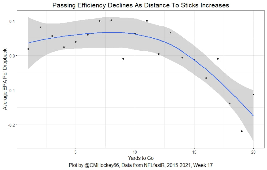
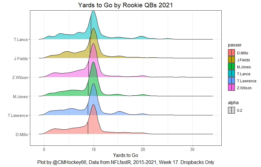
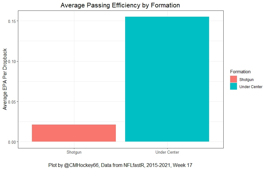
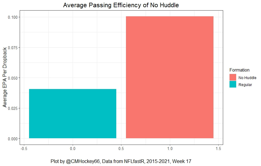
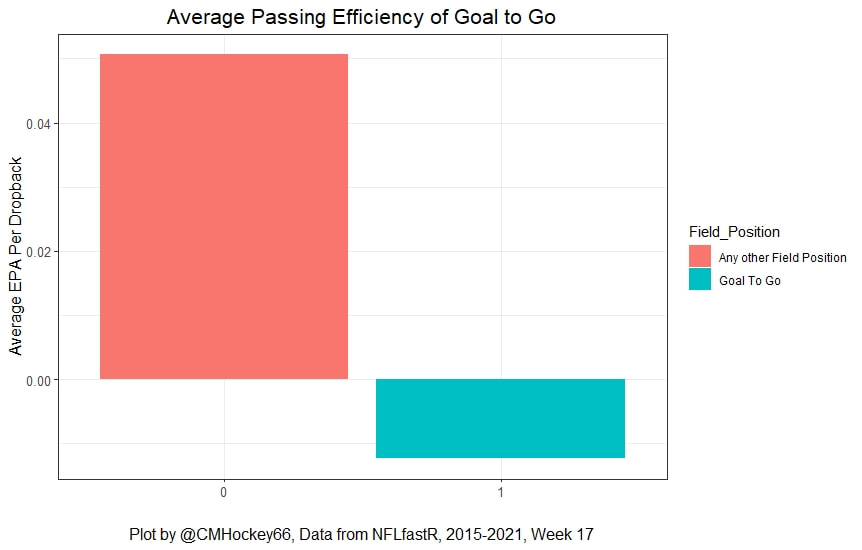
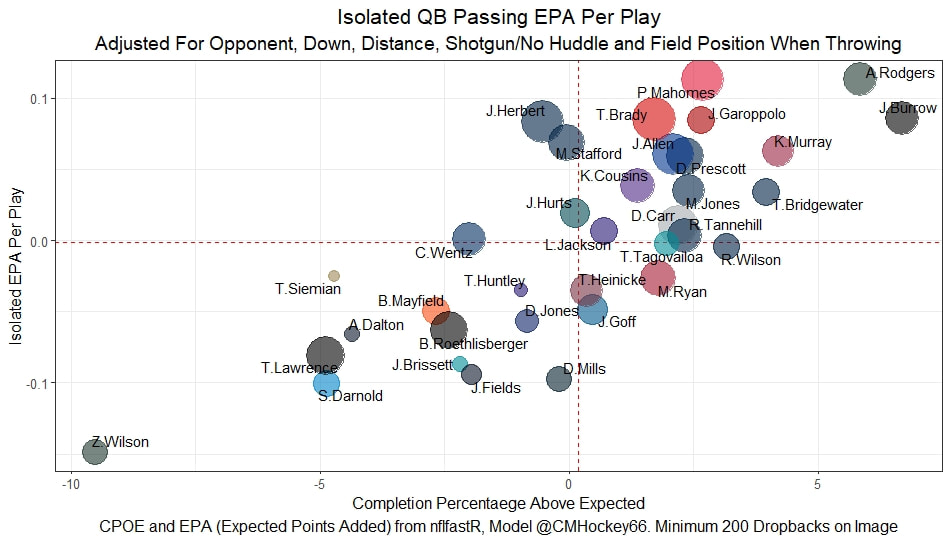
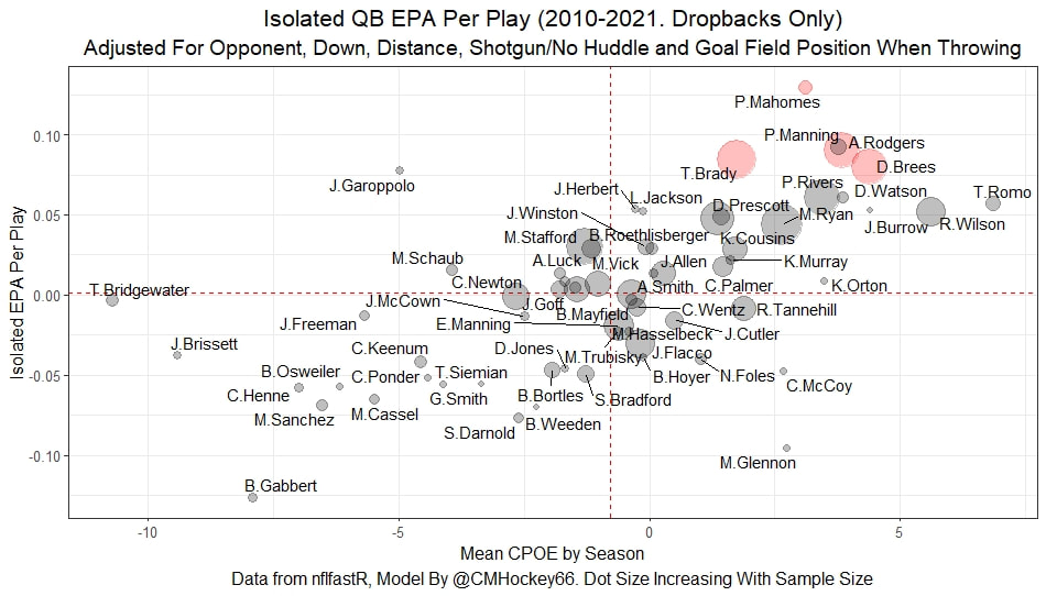
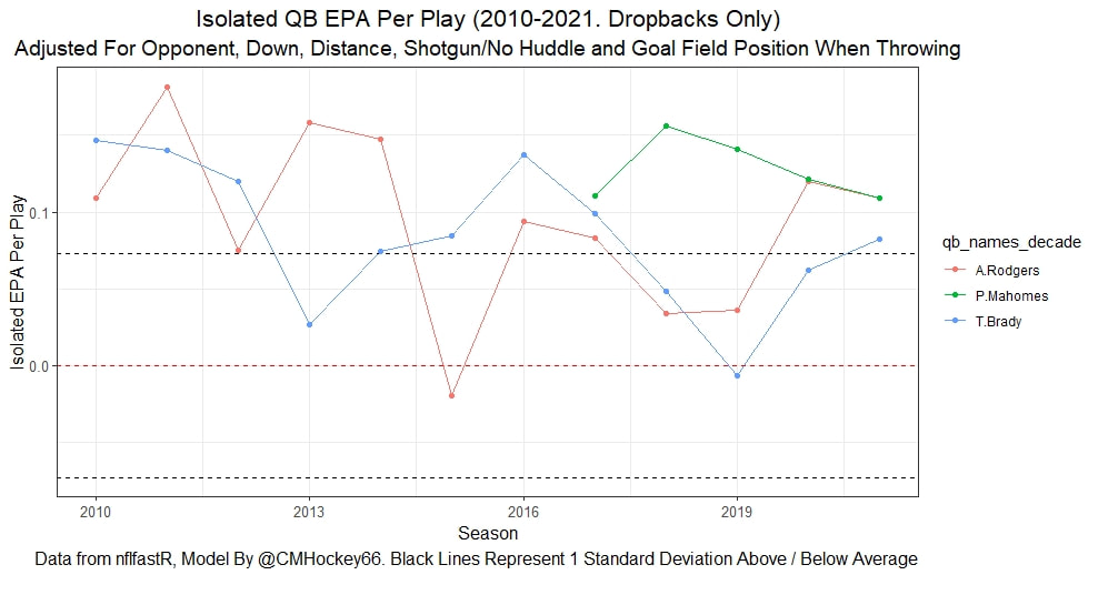

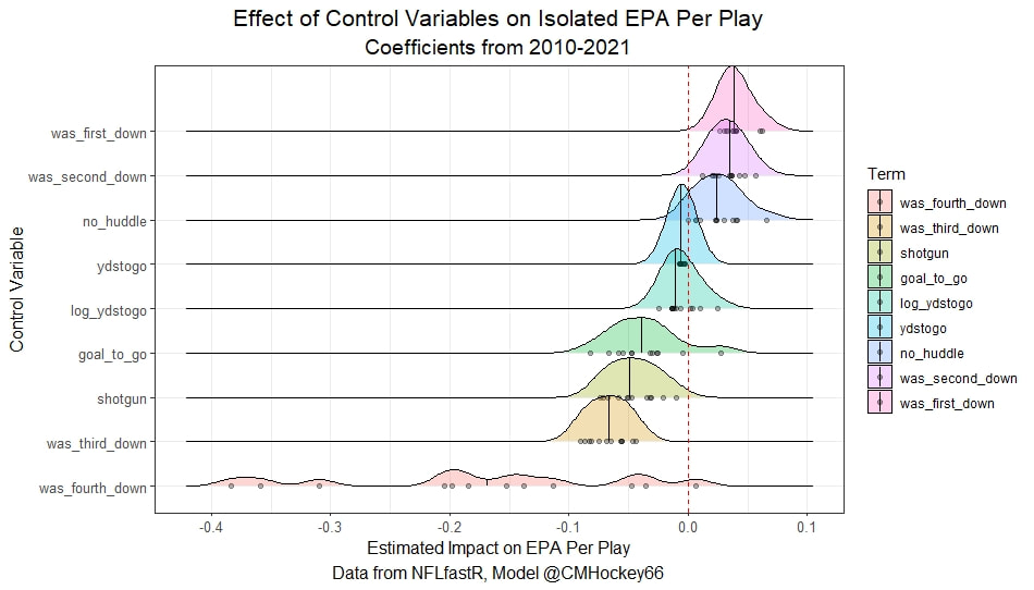
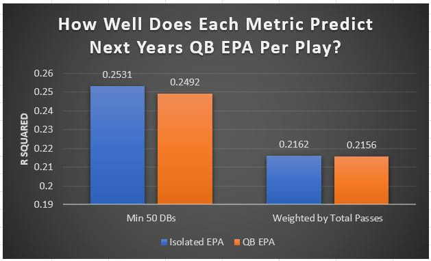
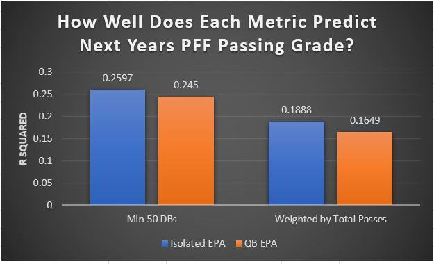
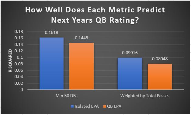
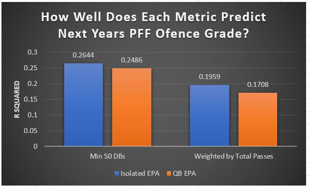
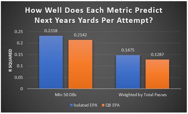
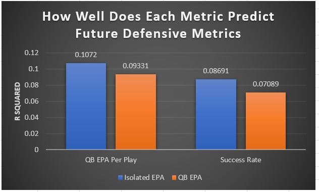
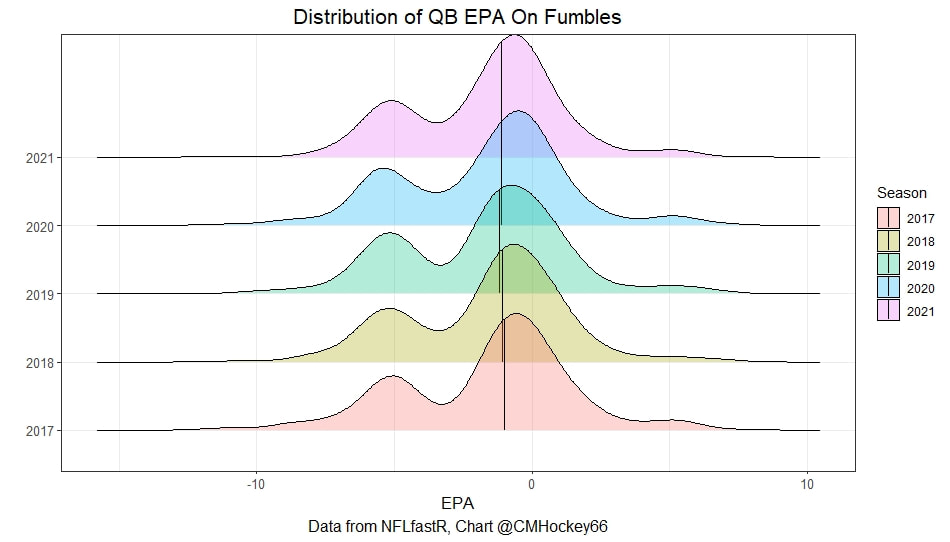
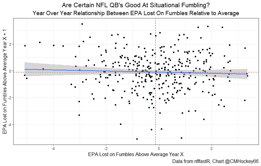
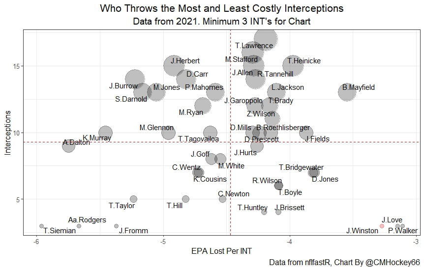
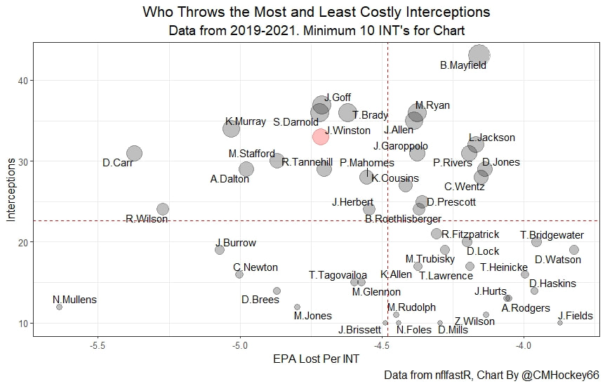
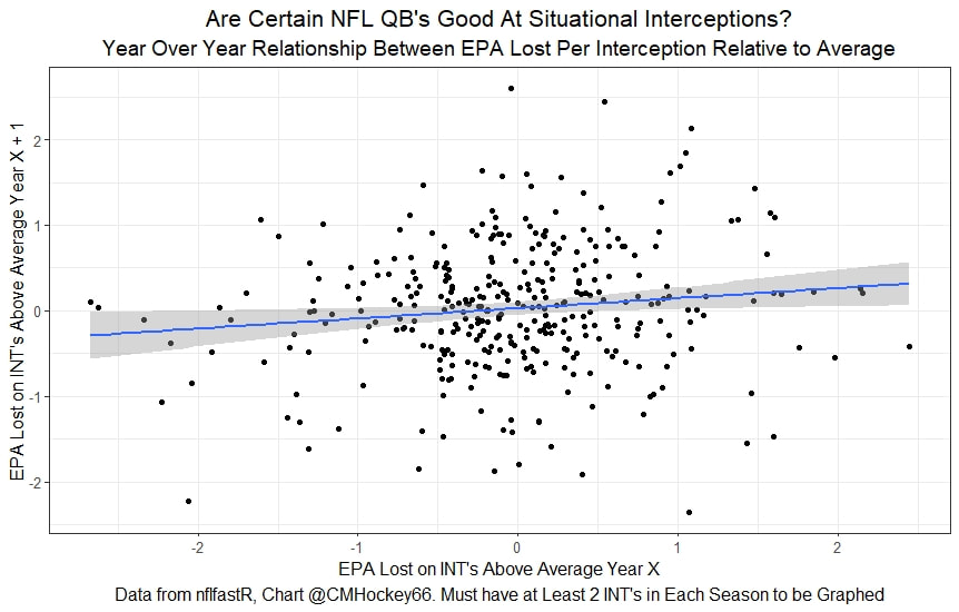
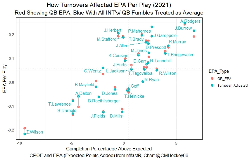
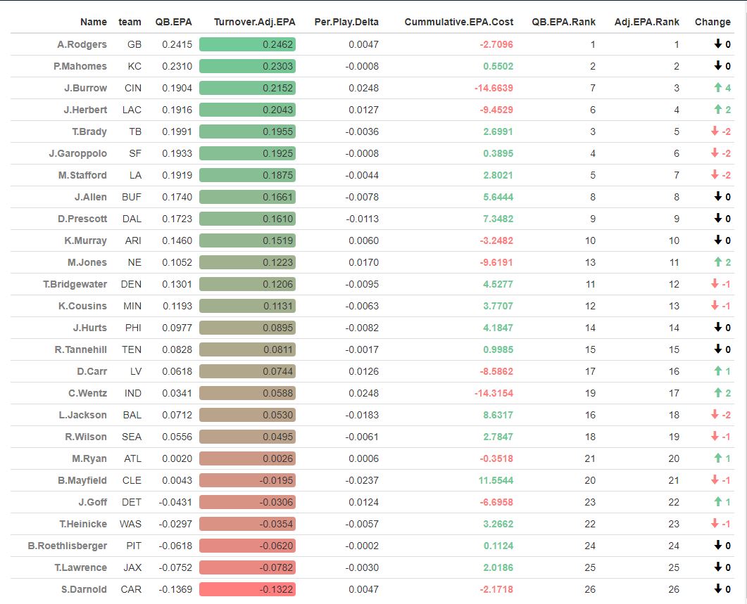
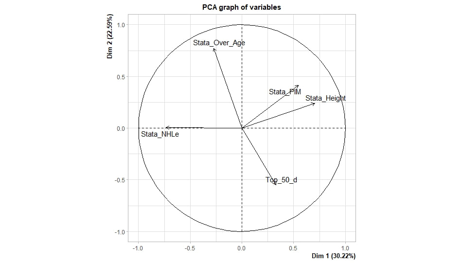
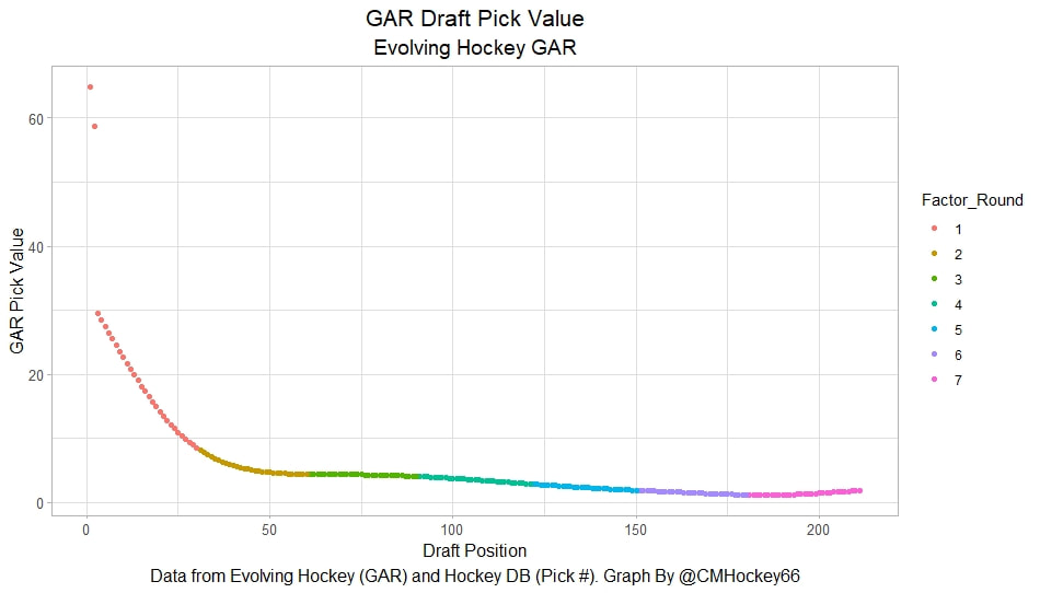
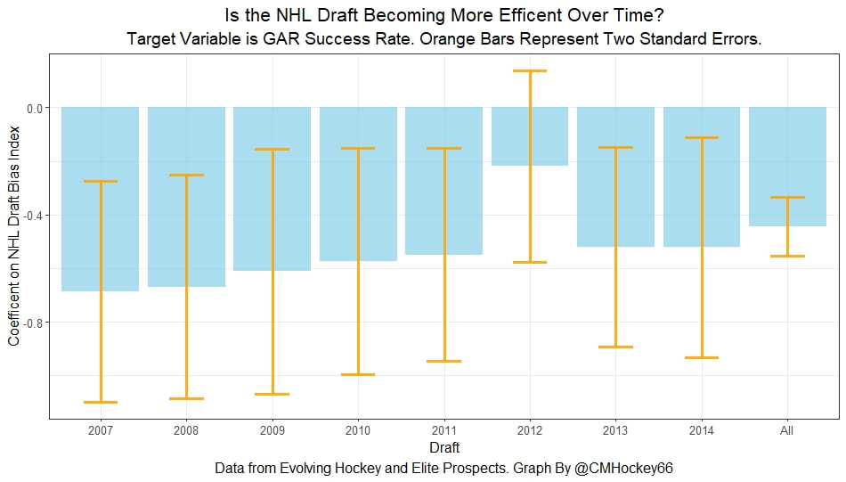
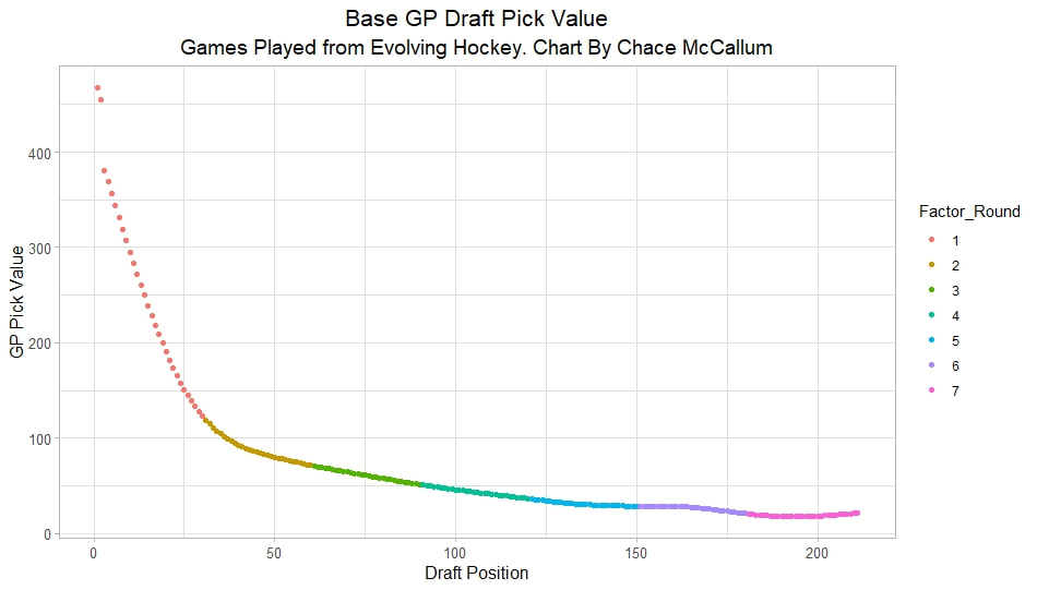
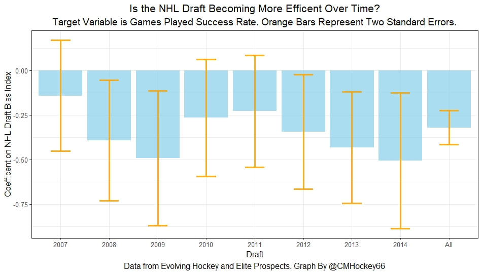
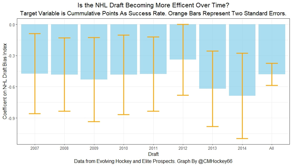
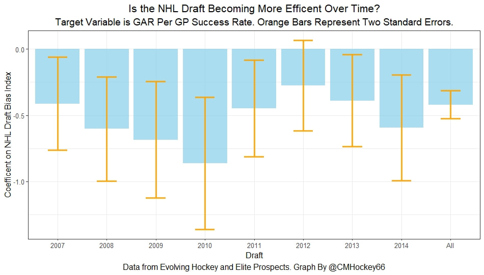
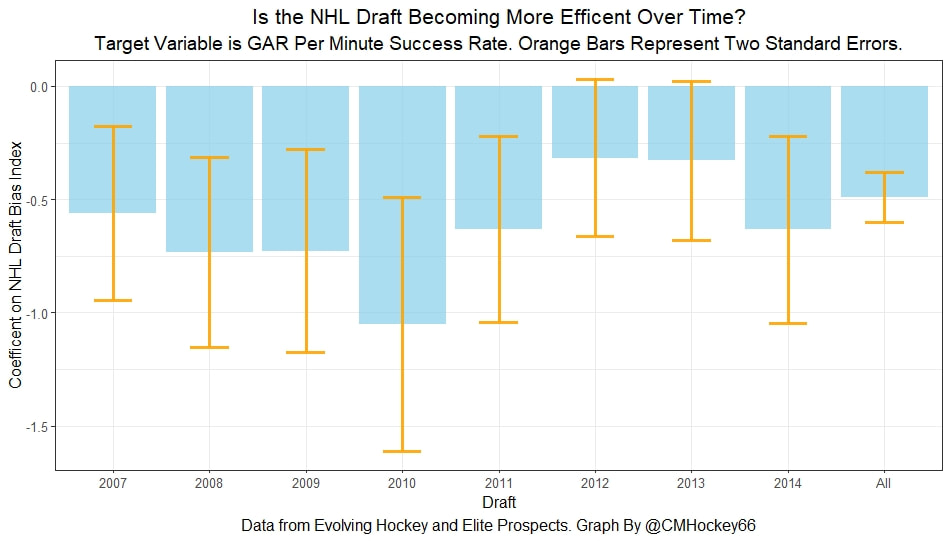
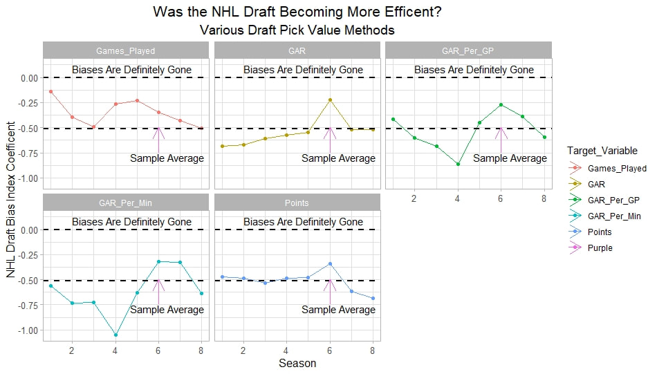
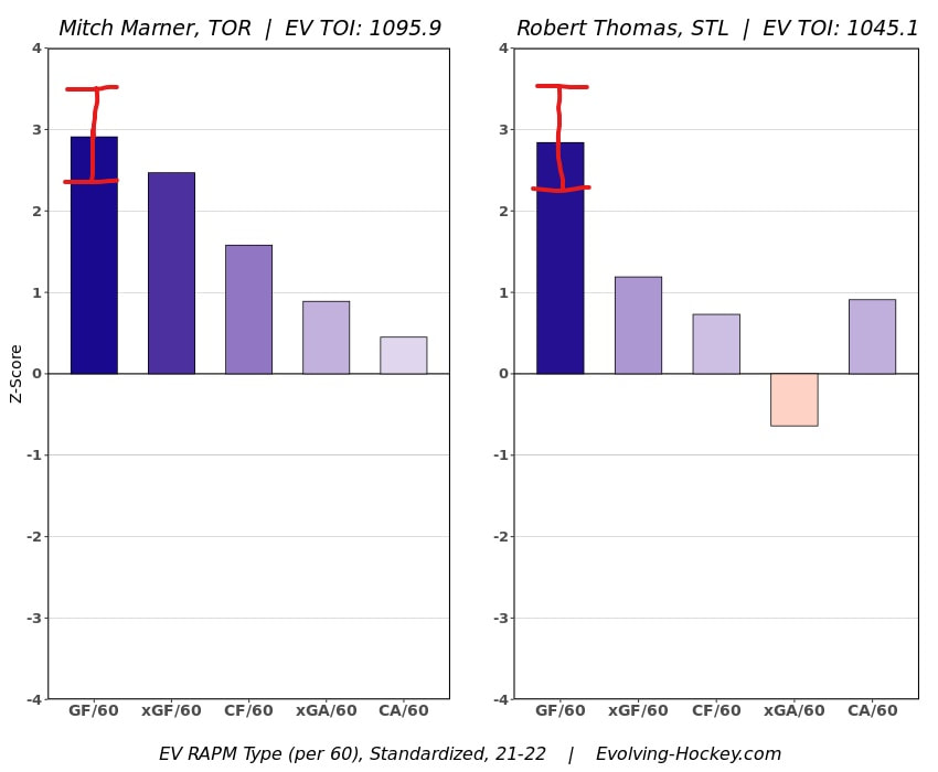

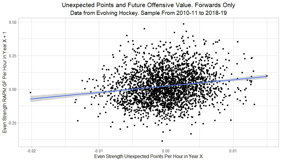
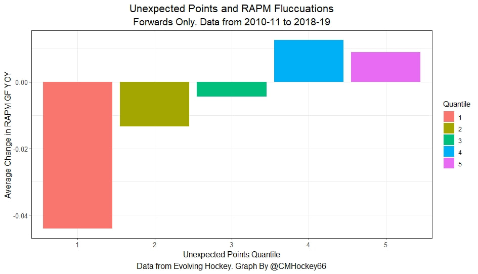
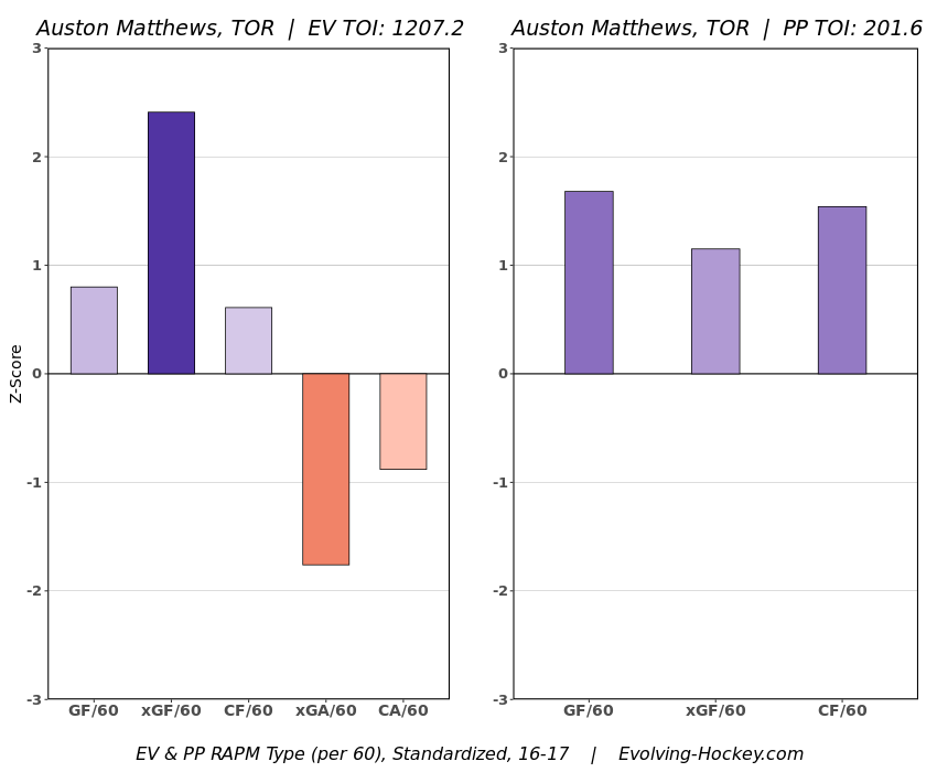
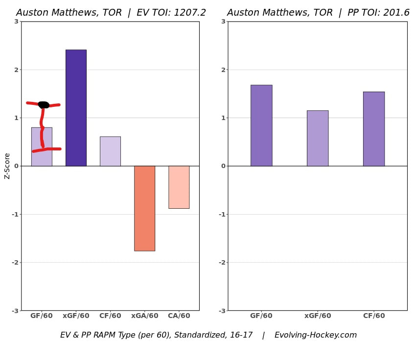
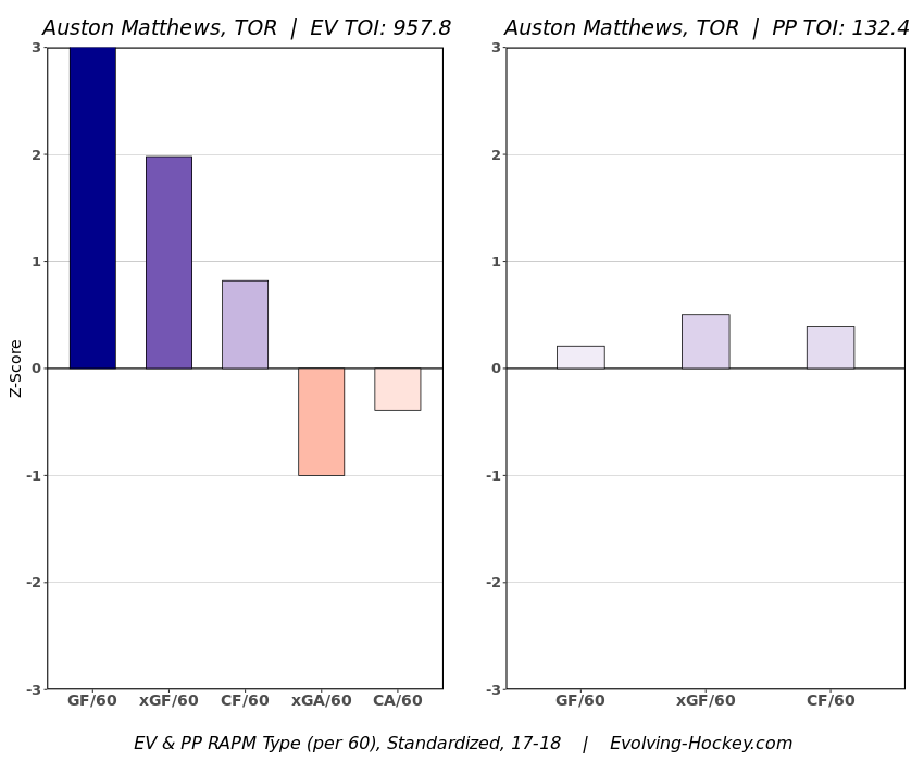
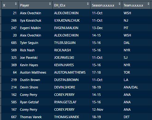
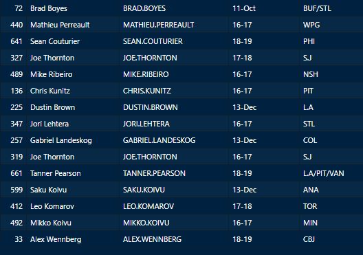
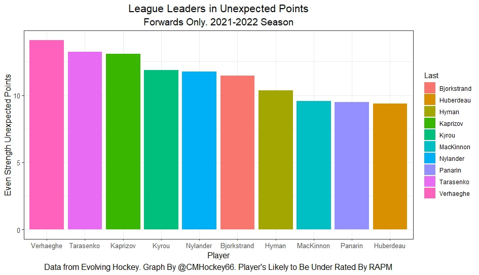
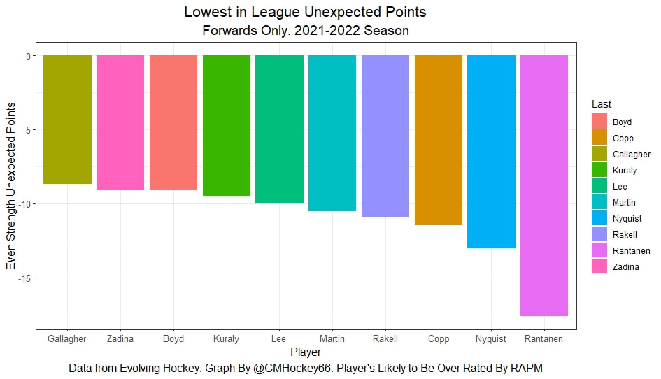
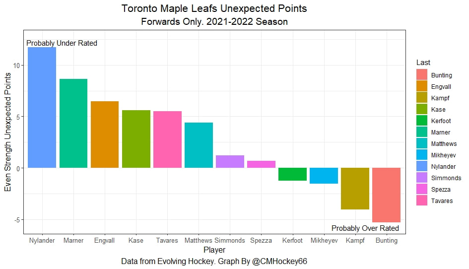
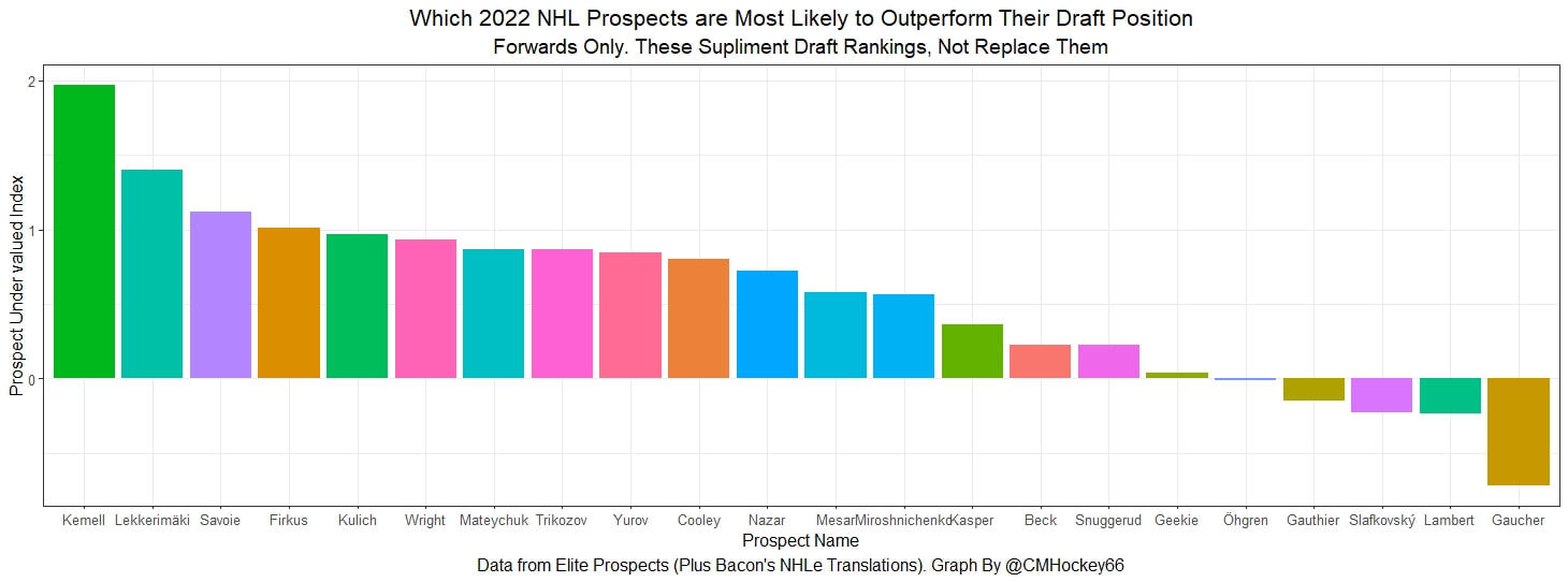
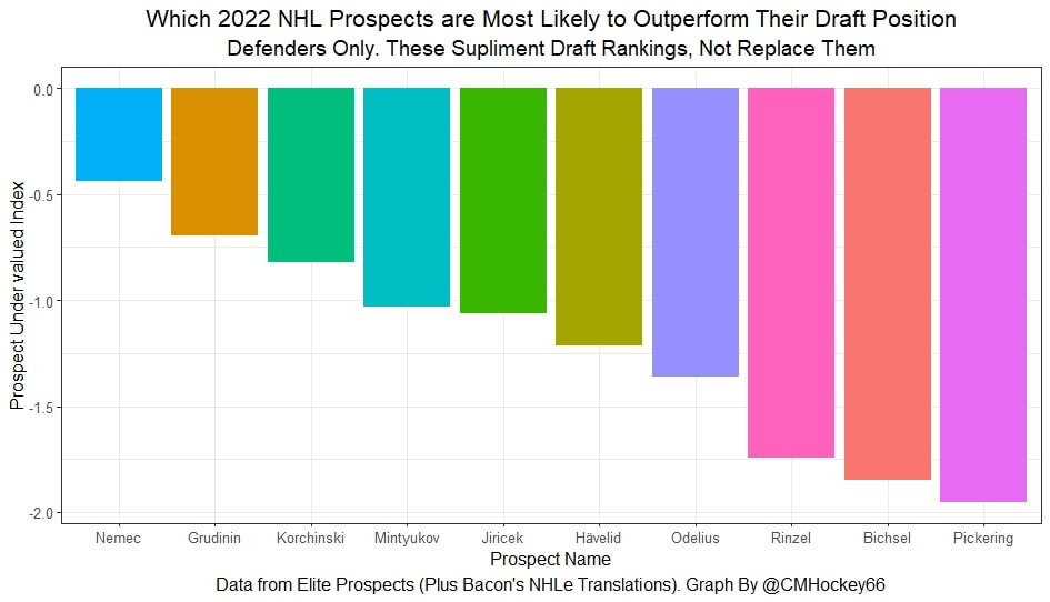
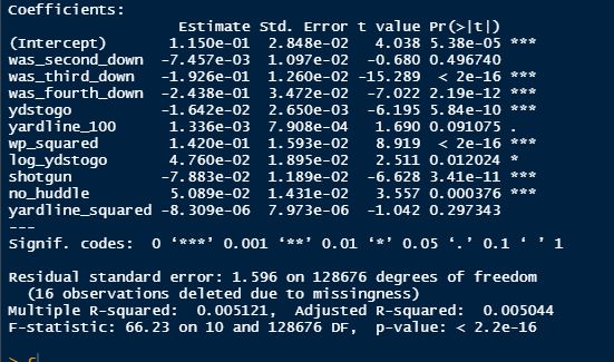
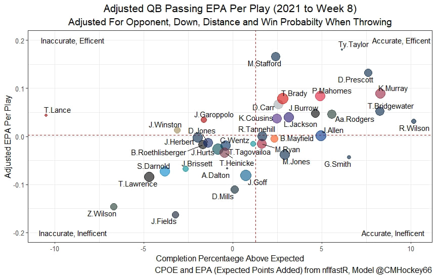
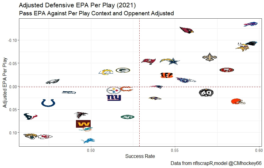
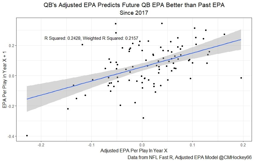
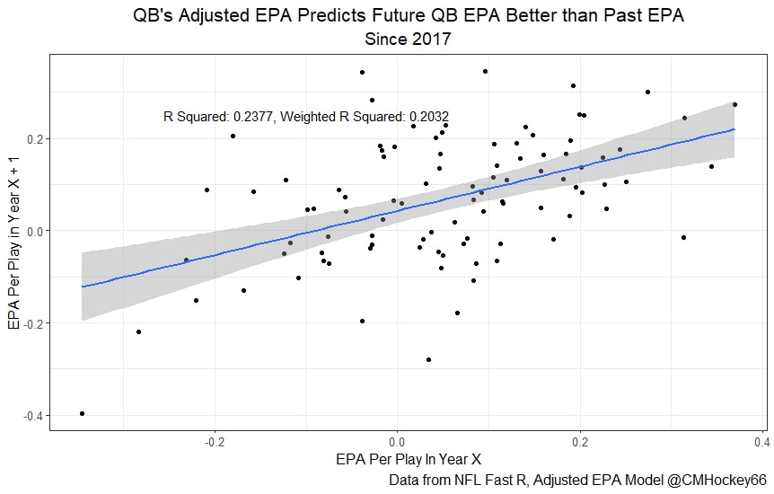
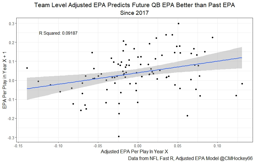
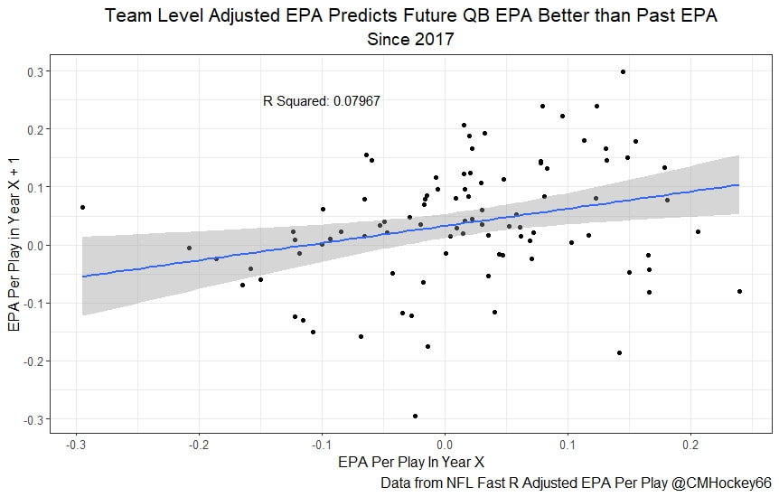
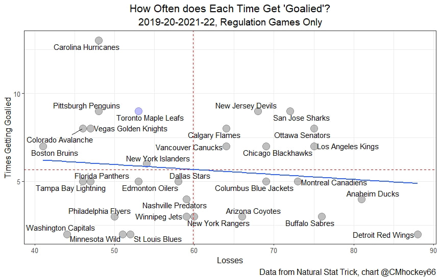
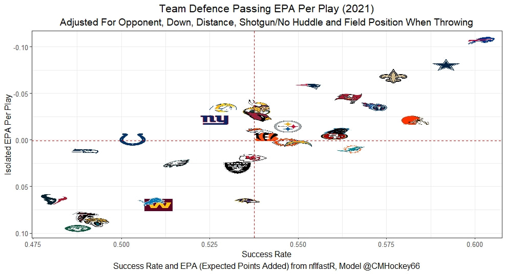
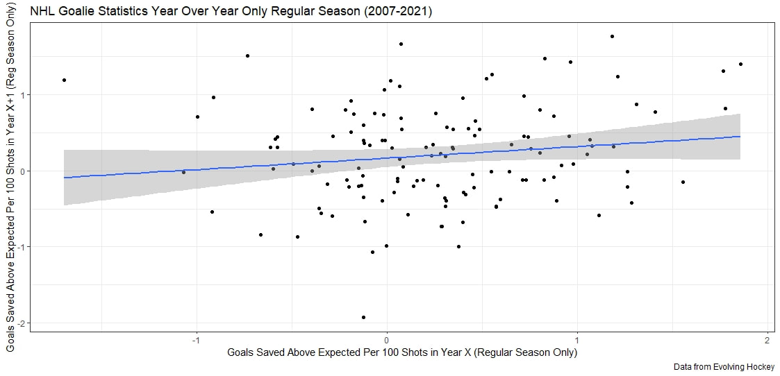
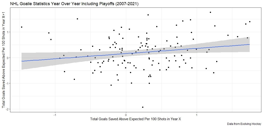
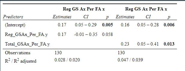
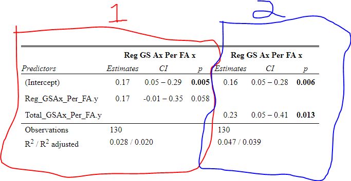
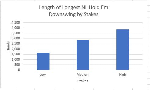
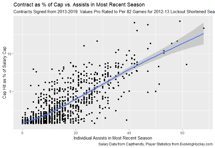
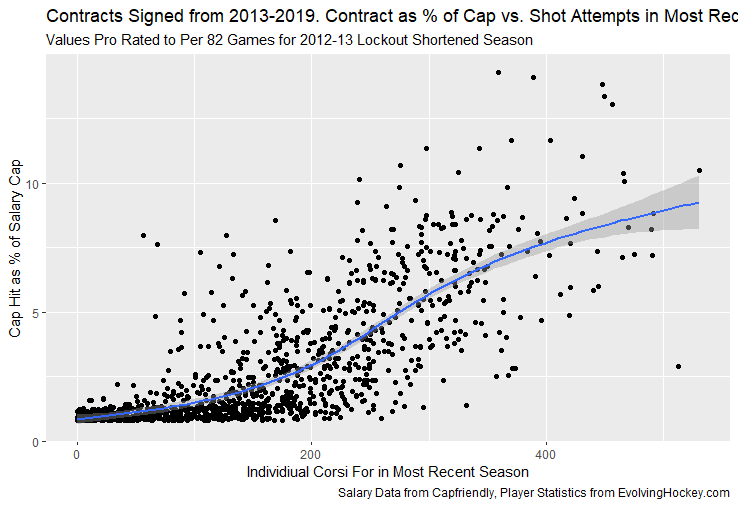
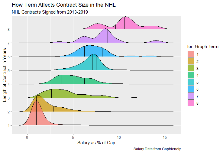
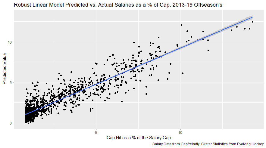
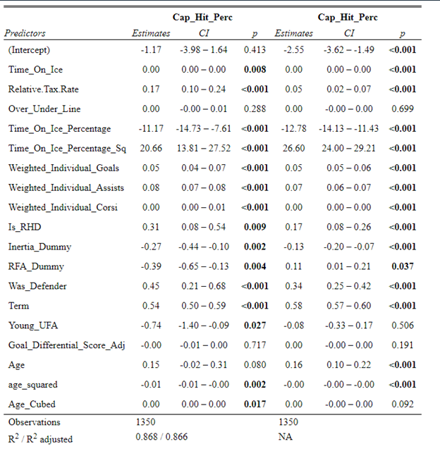
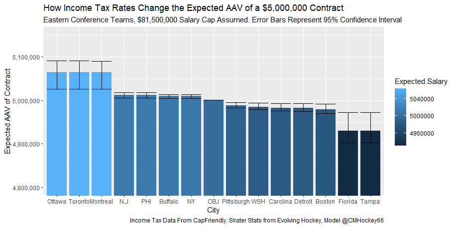
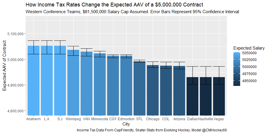
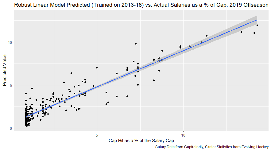
 RSS Feed
