|
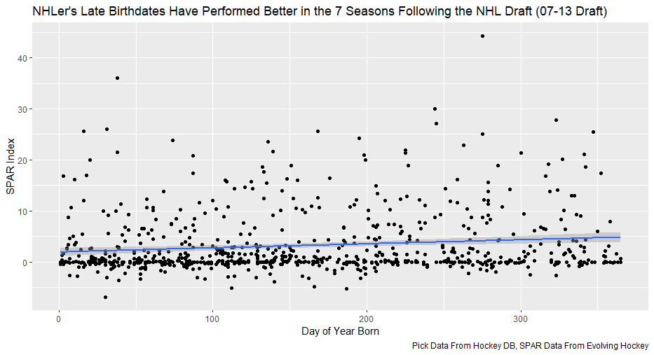
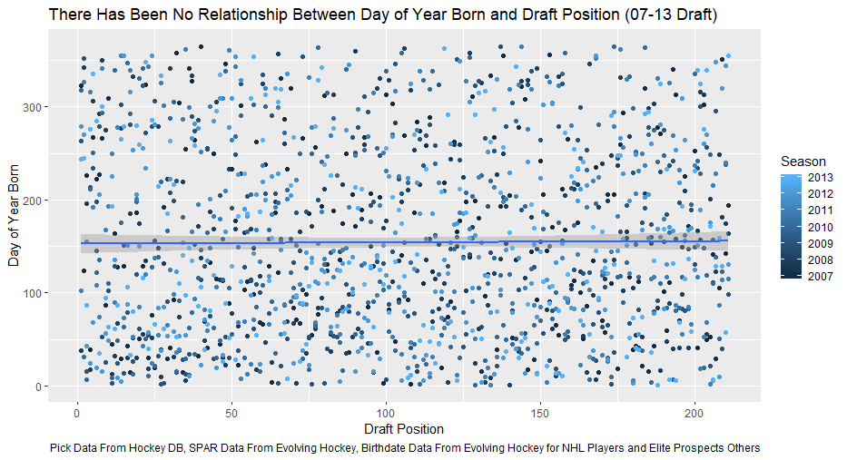
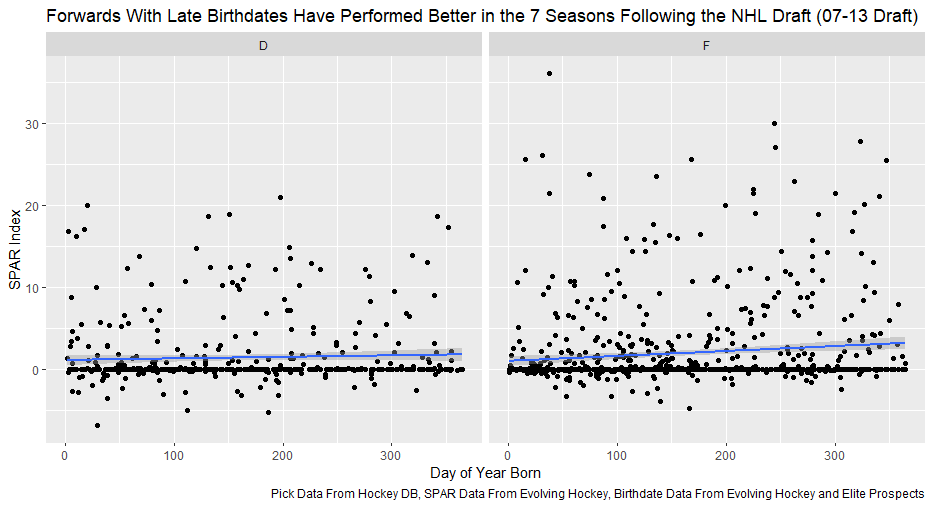
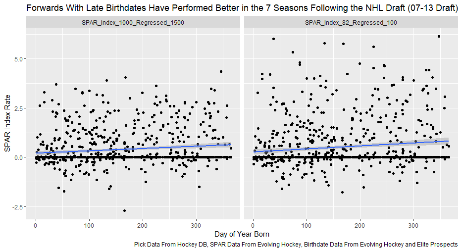
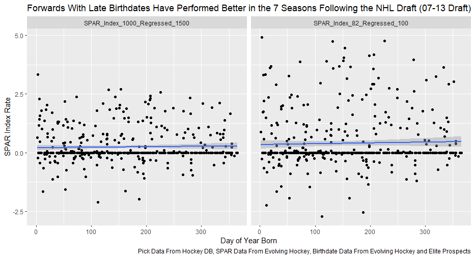
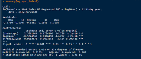
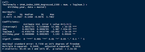
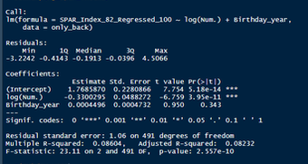
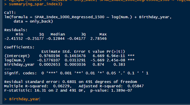
Nerds like me tend to fetishize “market inefficiencies”. That hidden pattern showing the conventional wisdom is wrong. Suggesting there is an edge to be gained with some trick. In hockey, these market inefficiencies are likely most valuable at the NHL draft because of the NHL’s entry level and RFA contract systems allowing teams to underpay top talent if they drafted it for at least 7 seasons. This post will explore a relatively old topic that has been a market inefficiency at the NHL draft in past few seasons, drafting players with later birthdays (in a given year, so December 15th as opposed to January 15). It is easy to see how players with later birthdays might become undervalued by scouts. Humans usually treat age like an integer (18, 19, 20 etc.) when in reality it is a continuous variable (you can be 17.69 years old). It is easy to see how this may lead players with later birthdays to be undervalued. Imagine two 17-year-old prospects, however one is born in mid January, while the other is born in mid December. At age 17, the January born prospect is about 5% older than the December born prospect. That is 5% more time to train with skills coaches, play, workout etc. (Obviously even more than 5% because babies are not working out). All else being equal this ~5% edge means the January born player should be better at hockey when both prospects are "17". What % of this edge is due to the older player being a better prospect, and what % is due to the advanced age of the January prospect can be difficult to discern. If scouts are not careful it can lead to the December born player being undervalued because the gap between him and his peer is a result of age, not being an inferior prospect. This potential bias likely explains (at least in part) some peculiar patterns in recent NHL draft history. Using drafts from 2007-2013, drafted players with later birthdates have outperformed picks with relatively early birthdays in the 7 seasons following the players being drafted. If you plot drafted players who have made the NHL’s output over that time against their birthdate in the year (so 1 is born on January 1st) there is an obvious upward trend in output as birthdate increases. (Note this post is using Standing Points Above Replacement (SPAR) data from Evolving Hockey to define “output”. I call the metric being used SPAR Index because it takes the average of each players Standing Points Above Replacement and Expected Standing Points Above Replacement) The upward trend shows that, among draft picks who have made the NHL, those born later in the year have outperformed prospects born earlier in the year in the 7 seasons following their NHL drafts. An NHL player who was drafted in December has on averaged, outperformed a player drafted in mid December by about 2.6 standing points above replacement index in the 7 seasons following the draft, on average. This may sound like a small margin, but it is more than one win above replacement. Given the obscene amounts of money teams pay for single wins on July 1st, it is far from insignificant. This relationship is also not likely a result of draft position and therefor perceived prospect quality either, because day of year born is not related to draft position. Age Bias By Position The relationship between birthdate and output is not equal among all positional groups either. I expected defensive prospects to be most miss valued due to the relative age effect. Defence is generally considered to be the more physical position. So, i figured having less time to develop physically would disproportionately hurt defenders. When looking at the data, the opposite is true? There is an upward trend where player output increases with birthdate among forwards, but not defencemen. (The upward trend exists for goalies too, but there is not enough data for it too be meaningful). So, it turns out only forwards with relatively late birthdays have been undervalued. The relationship only holds among the entire sample because over 55% of NHL draft picks were forwards from 2007-2013. While we have only looked at cumulative output in the 7-year period following the players NHL draft’s so far, we can see the relationship’s from above have not been a result of changing opportunity either. This is clear because when we look at per game and per hour output, we still see the same pattern. Forwards with late birthdays outperform forwards with early birthdays on a per game and per hour basis, while defenders do not. (The SPAR_Index_82_Regressed_100 variable represents SPAR_Index per 82 games played, while SPAR_Index_1000_Regressed_1500 represents SPAR Index per 1000 minutes of time on ice. To control for outliers who produce extremely well or poorly in small samples these numbers have been regressed towards replacement level. The per 82 game metrics was regressed towards replacement level up to players 100 game mark, while the per 1000-minute metric was regressed towards replacement level up to 1500 minutes. So, if a player produced 1 SPAR index in 14 games and 140 minutes, rather than a per 82 game output of 5.85, this analysis assumes the player was a replacement level producer for the remaining 86 games. This pulls their per 82 game output down from an inflated 5.85 to 0.82. The same process was done up to 1500 minutes for the per 1000 minutes data. The endpoints matter here and were selected by me, so it is worth noting everything I am about to mention applies when regressed to replacement level up to 50 games played and 750 minutes played too). The next graph shows the same metrics, but no trend for defenders. No matter what metric is used, per minute output, per game output, or cumulative output in the players 7 seasons following their draft, forwards born later in the year have been better than those born earlier in the year, and defenders have not. At least not by enough that the difference is meaningful. Even when running a regression to hold draft position constant, being born later in the year has a statistically significant increase in player output. (Using the idea from Dawson Sprigings Draft pick value article of a logarithmic trendline to account for the nonlinearity in pick value. However, the same relationship does not exist for defenders. If teams were drafting without biases over a decent sample, no meaningful correlation would exist between player output and any variable other variable when draft position is being held constant because players draft position should include all valuable information available at the time . And yet something as simple as birthate is highly correlated with output even after accounting for draft position. The effect is so dramatic that independent of draft position, a 330 day increase in birthdate within a year has corresponded to an additional 0.41 Standing Points above replacement index per 82 games, plus or minus 0.117 SPAR index. This relationship tells us teams have been systematically undervaluing the effect of forwards birthdates at the NHL draft. They have been too harsh on younger forwards and too high on older forwards.
Adjusting for relative age can be a very difficult thing to do. The most recent run of NHL drafts that have players we can analyze shows this. As a result, NHL teams may be able to draft better simply by adjusting for birthdates differently than they have in the past. By selecting players with late birthdates earlier than market has previously suggested they should, your favorite team may have an edge when the 2020 NHL draft rolls around.
0 Comments
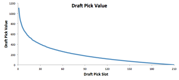
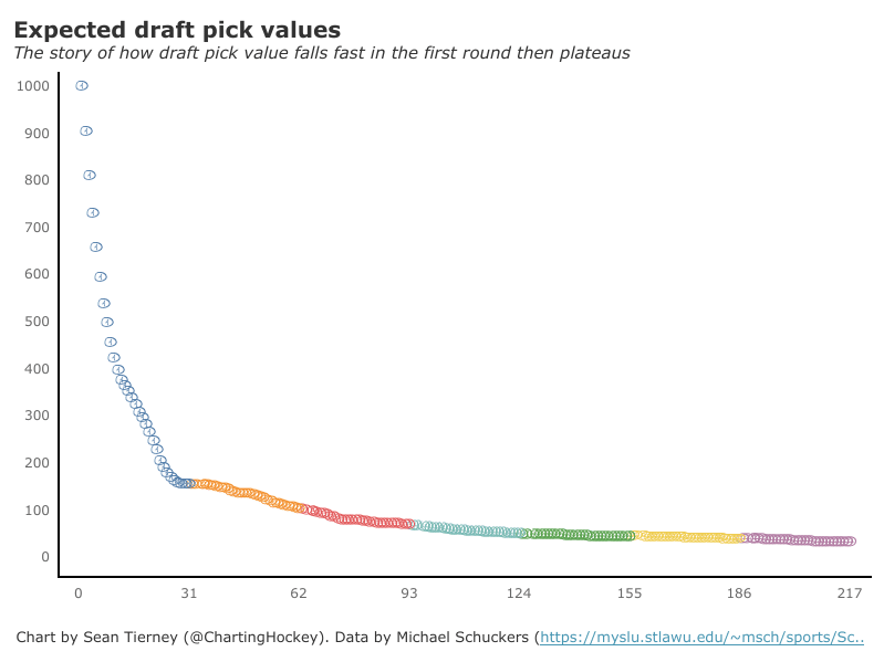
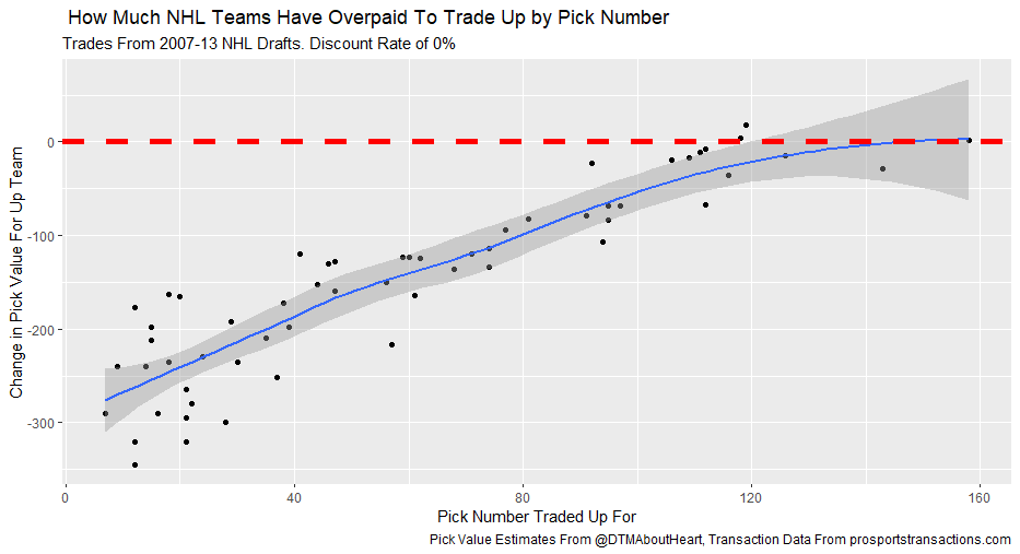
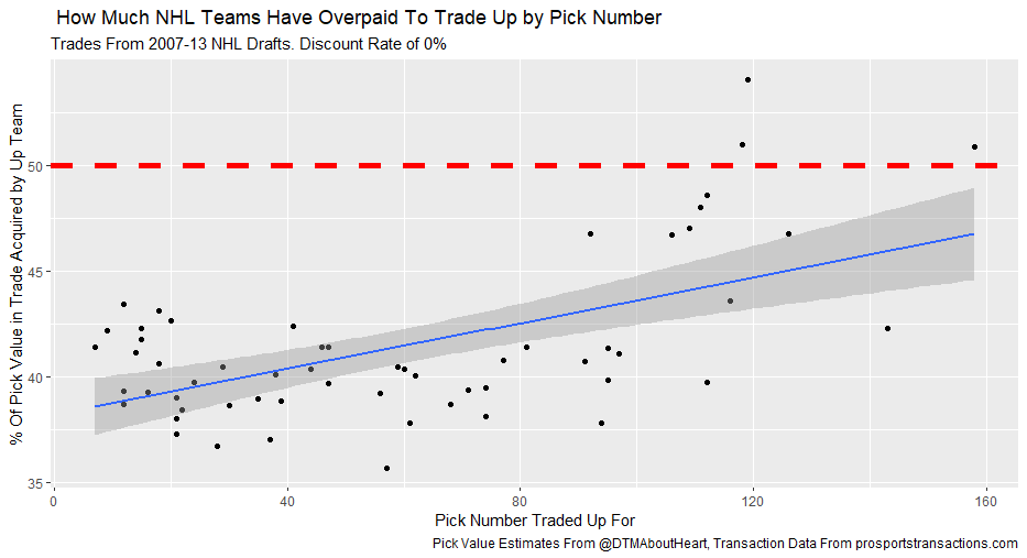
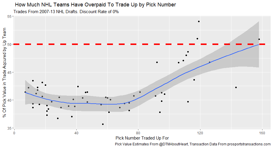
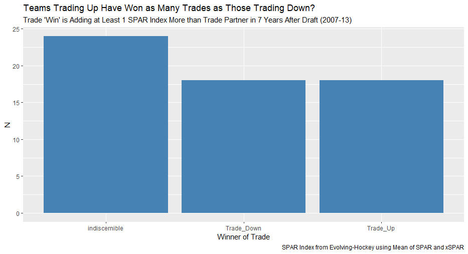
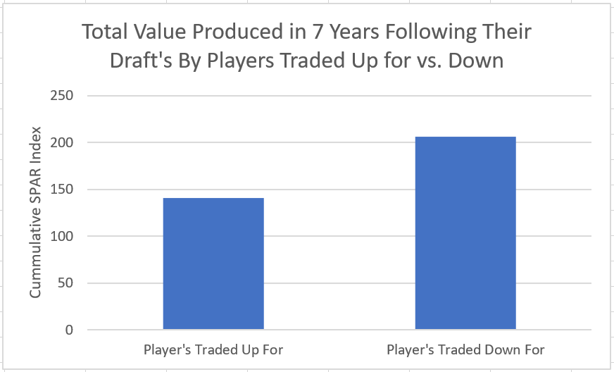
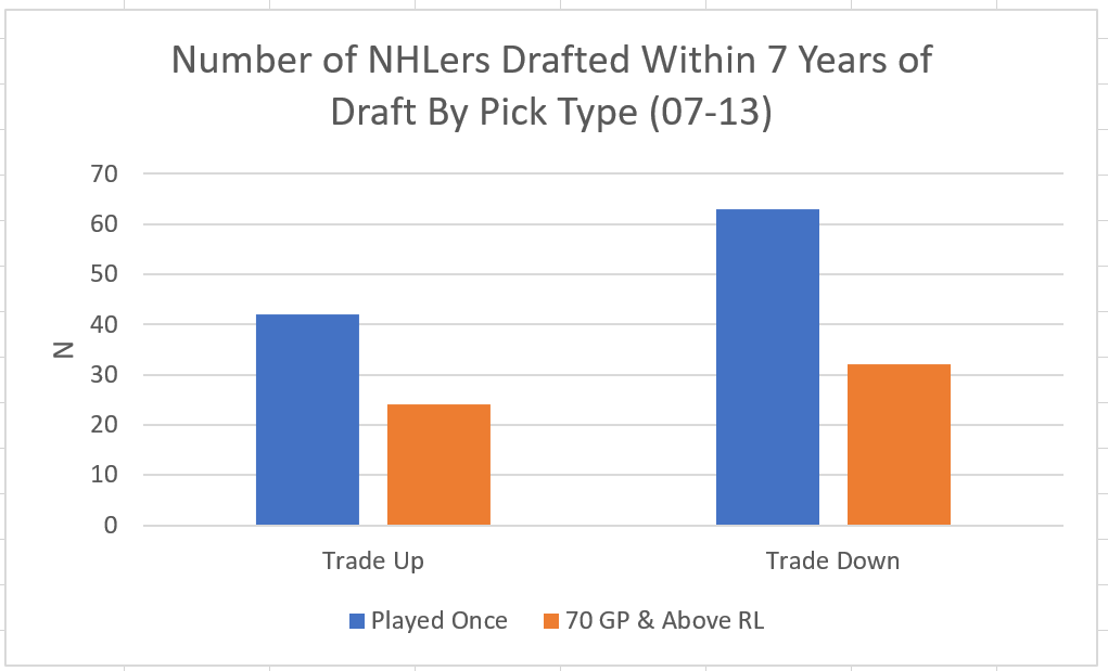
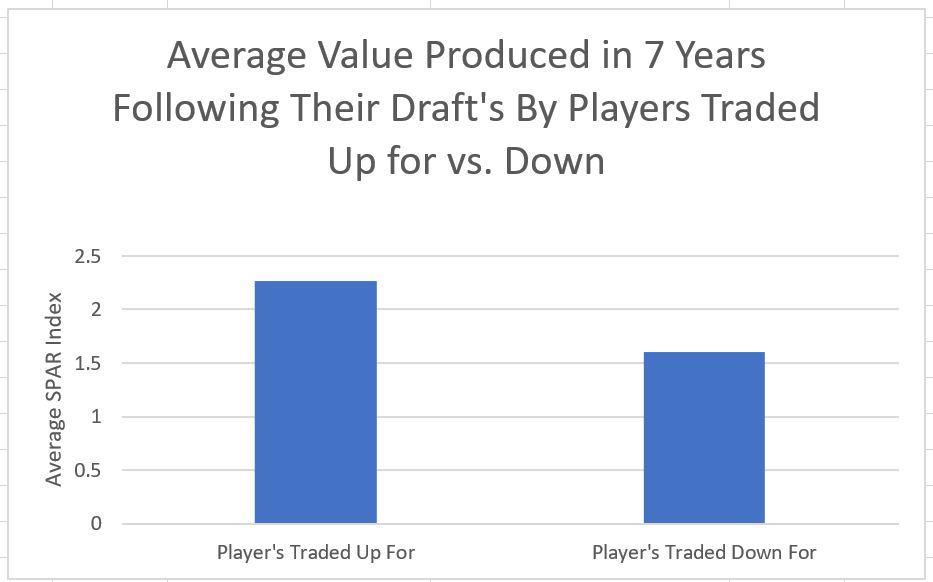
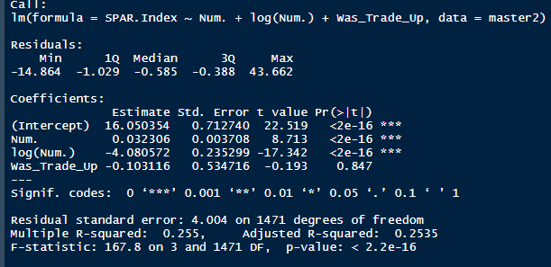
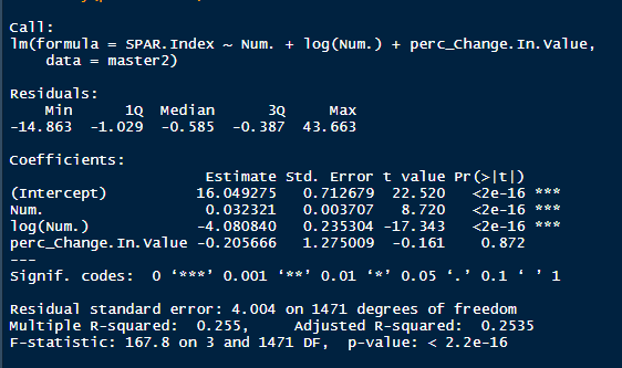
I'm not sure when the 2020 NHL draft is going to be, but as it approaches there is one thing I am sure of. Everyone on Twitter who has ever used a spreadsheet will be ready to explain the virtues of trading down. The theory usually starts with a draft pick value chart looking something like these. (DTM's is first, Shuckers is second) Based on work by smart people who have quantified the value of each NHL draft slot, the thinking goes like this. The value of a given draft pick falls off very quickly after the top few picks. After those top picks, a pick in say the fourth round is not much worse than a pick in the third round. As a result, teams are better off prioritizing quantity above quality. For example using both of the charts above, you would be better off, on average, with the picks in the middle of the third and fourth round than one pick in the middle of the second, even though the asset "second round pick" is often perceived as very valuable. Therefor the smart teams will be the one's trading down for additional picks, preying on the less enlightened teams who are fixated on an individual player. Of course the easiest rebuttal to this argument is it lacks context about the individual draft and the player's available at a given pick. After all, the Senators did trade up for Erik Karlsson's pick, how can this have been a bad decision? So while trading up may be dumb on paper, giving up value to move up can be worth it when you think there is a steal on the board. This is presumably the reason everybody knows trading down is smart in theory, and yet teams trade up all the time. I was skeptical of this augment because it involves being smarter than everyone else consistently to be a viable long run strategy, but, I honestly didn't know how successful trading up has been. So i figured why not compare the outcomes of teams who have traded up to their counterparts who moved down. To shed some light on this subject, I began by collecting data. I took every trade from the 2007- 2013 drafts involving only picks and looked at the player's outcomes in terms of Evolving Hockey's standing points above replacement over the next 7 NHL seasons to see which teams won more of the trades. Was it generally the teams moving up or down who ended up with more value? Note 7 seasons was chosen because drafting a player gets you their rights for 7 seasons. This analysis only uses the 7 seasons following the draft rather than the player's first 7 seasons to help combat the lack of data already apparent in this exercise. The number of pure pick swaps in the sample is 60. It would be higher but many pick swaps include players. Since we cannot know how much value is being placed on the player's in the deal relative to the picks, any player being involved meant the deal was not included. Also note I refer to standing points above replacement (SPAR) "index" because I simply took standings points above replacement and expected standing points above replacement, added them together and divided by 2. Trading Up Is Expected to Fail (at least the way teams have been doing it) Although to start, I should point out that teams who traded up have over-payed to do so. Using DTM's draft pick value chart we can see not only have teams almost always lost value when they traded up (only 4 of 60 trades produced positive expected value for the team trading up), but they lost the most value when trading up for higher picks. Of course the pick values are meaningless here, so here is an example. DTM estimates the 20th overall pick is worth 480 points of value. To trade up for that 20th overall pick, teams generally give up 480 points of value plus 250 points of pick value. This loss of 250 pick value points means teams have over-payed for pick 20 by an early third round pick ( #62 or 63 overall), on average. To contrast this, teams who moved up for the 80th overall pick have traded 200 points of value (covering the cost of the 80th overall pick) and then added about 100 points of expected value. Meaning teams have over-payed for pick 80 by about a mid 5th round pick (129 or 130 overall). By the 5th and 6th rounds, teams who traded up barley lost any expected value on average, but since most pick for pick trade ups were for earlier picks, the teams who moved up still usually acquired far less expected value than those moving down. I should note this does not necessarily mean NHL teams over valued those early picks most (although that probably explains a part of it) there is also the fact that it is difficult to overpay for something worth next to nothing. When we look at the % of trade value acquired by the team moving up, we see teams did tend to receive a higher percentage of the overall draft pick value changing hands when trading up for a low pick relative teams who traded up for first and second rounders, but the relationship is not as robust. Side note, the type of trend line I choose can make the argument look a lot different with the same data. With this trend line on the same graph I could easily argue teams grossly over valued early picks (roughly 1-80) relative to later picks when trading up. Maybe teams over value high picks (1-80ish) most relative to public estimates, maybe there isn't enough data on pure pick swaps in the later rounds, or some combination of the two explains the random slope change. I'll leave that up to your interpretation. Either way teams moving down have given up generally lose expected value to do so, suggesting the team trading up should generally have worse outcomes than those moving down, but has this actually been the case? Winners and Losers of Trading Up When evaluating the outcomes the original results shocked me. My first though was to examine who "won" most of the trades, those who traded up or those who traded down? I defined a trade "win" by a team adding at least 1 standing point above replacement index more than the team they traded with. Teams had to win by at least one standing point to account for the fact our estimates of player output are not perfect. If the Leafs and Habs traded, and the Leafs acquired 7.5 SPAR while the Habs acquired 7.6 SPAR, it would be unreasonable to conclude the Habs "won" the trade because there are error bars in the player evaluation metrics. As a result, deals where trading teams drafted within 1 SPAR index of one another were counted as indiscernible rather than a win for either team. I also made it so teams could not "win" a trade because the other team picked a player who was below replacement level for a long time. Say team A got 0 SPAR, while team B got -4 SPAR, using my methods neither team "won" this trade. Such a deal would go in the indiscernible category. With that defined as a trade win, the results threw me off. Turns out the most common outcome is neither team winning, but the teams who traded up have "won" just as many of the trades as those who moved down. Unfortunately this is where the good news about teams who moved up stops. All trade "wins" are not created equal. So, If we look at the cumulative value acquired by those who moved up and moved down, we begin paint a much more damning picture of trading up. Teams who have moved down have acquired far more cumulative value than those who traded up in the 7 years following the draft. It is roughly a 60/40 split in terms of total value drafted (This is assuming Viktor Arvidsson produces at his career average pace over his average number of games played next season). Note that teams who traded down also produced more NHL players, not just more quality NHL players. The reason teams who moved down drafted better was by taking advantage of the quantity > quality mindset. This becomes obvious when looking at the average value of players who were traded up for vs. down. The players teams have traded up to get actually produced more on average than those acquired by trading down, But because the teams trading down had 129 darts to throw while the teams who traded up only had 62, the teams moving down still got far more total value and NHL players. Before finishing up, I had two additional theories that may teams who moved up are smarter than we give them them credit for, so I decided to test them too. The first was that while teams who move up generally lose the deal, they are at least ahead of the pack in one area, player evaluation (evaluating the specific player they trade up for anyways). We saw that players teams trade up for produced more value on average than their counterparts. I wanted to test if this is simply because of the higher draft slots used on trade ups, or if players who are traded up for tend to outperform their draft position. If the dummy variable "was traded up" set equal to one if a team traded up for a player and 0 otherwise was a significant predictor of player quality independent of draft position, it would suggest teams who trade up were are at least generally getting players more valuable than their draft position implies. This was not the case. Independent of draft position, player's who are traded up for have actually produced slightly less value? however not by enough to suggest this is anything but noise. Finally, I wanted to test drew back on something pointed out above. Teams have tended to overpay most for early picks, specifically before pick 80. I wanted to test if there was any relationship between how much draft capital teams gave up for a player and how good the player became. My thinking was the more teams gave up to pick a player, the more confident they must be in his abilities. The more confident a team was in a players abilities, the better that player should have been. Even if teams are more confident in a player's abilities based on how much they gave up for him, it has not translated to higher output once in the NHL.
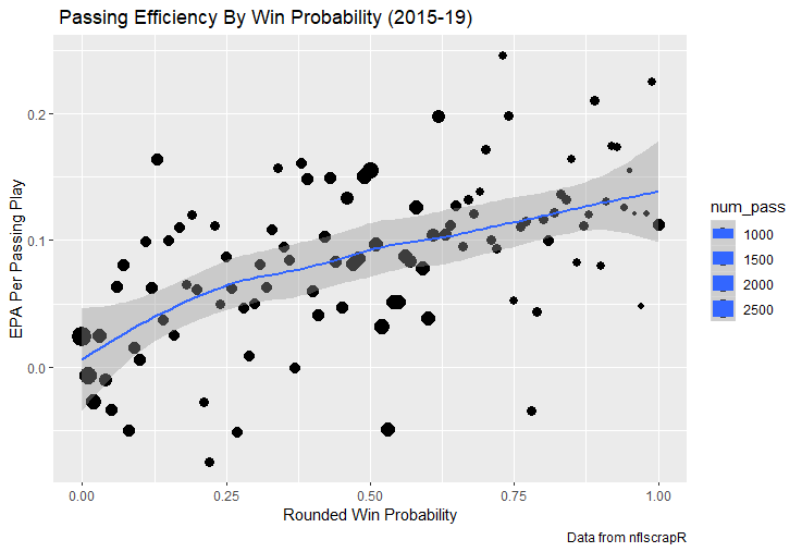
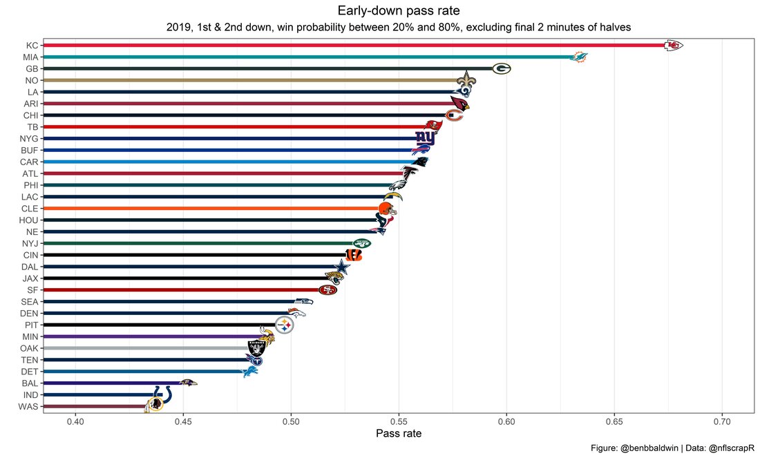
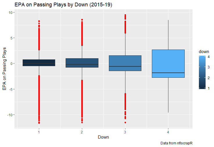
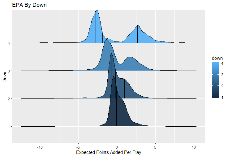
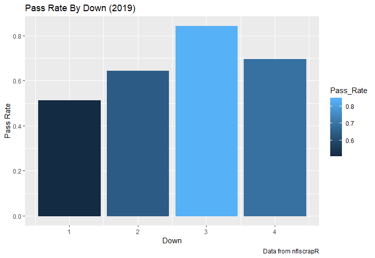
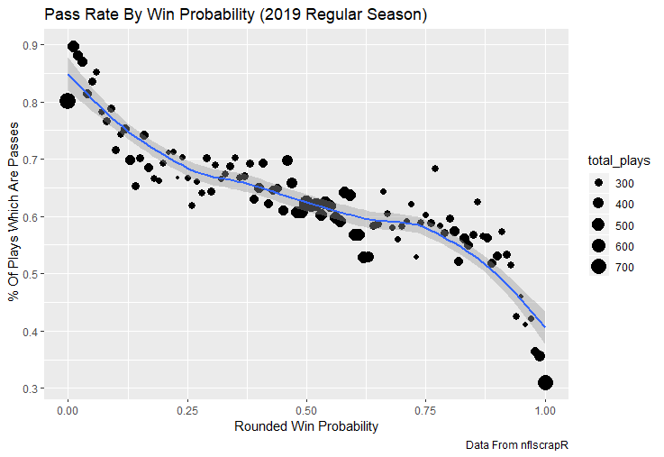
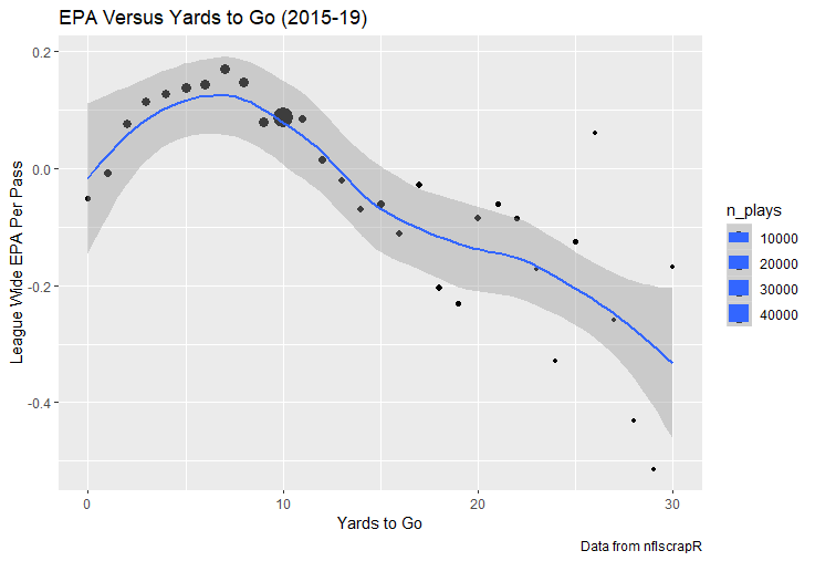
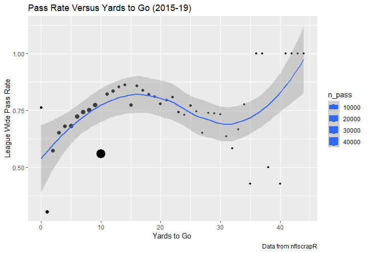
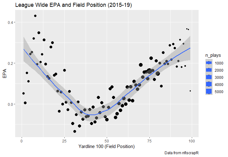
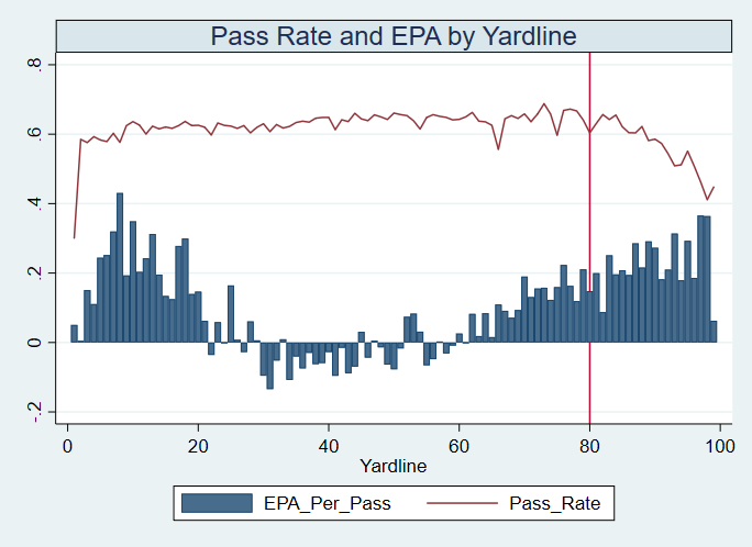
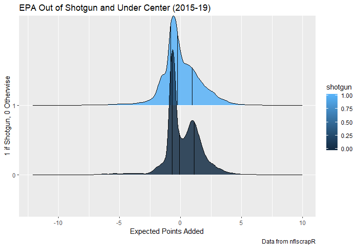
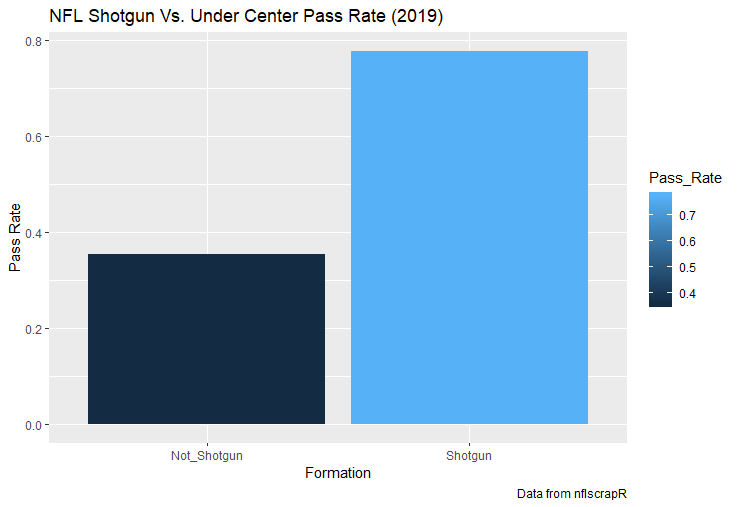
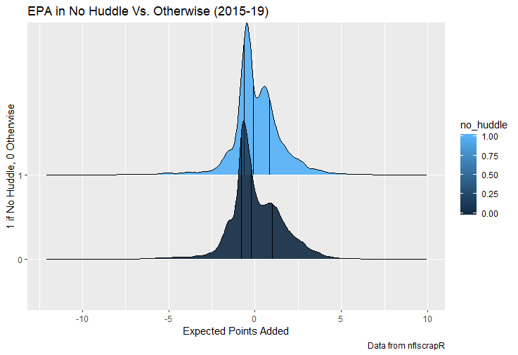
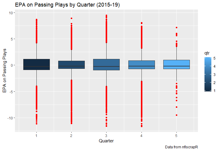
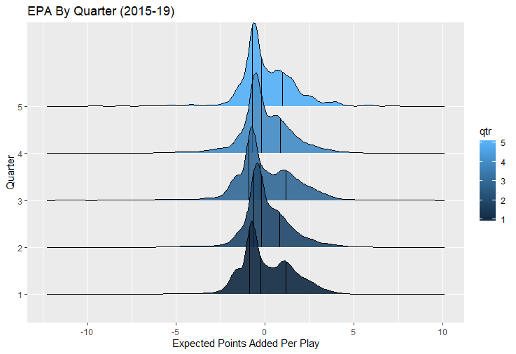
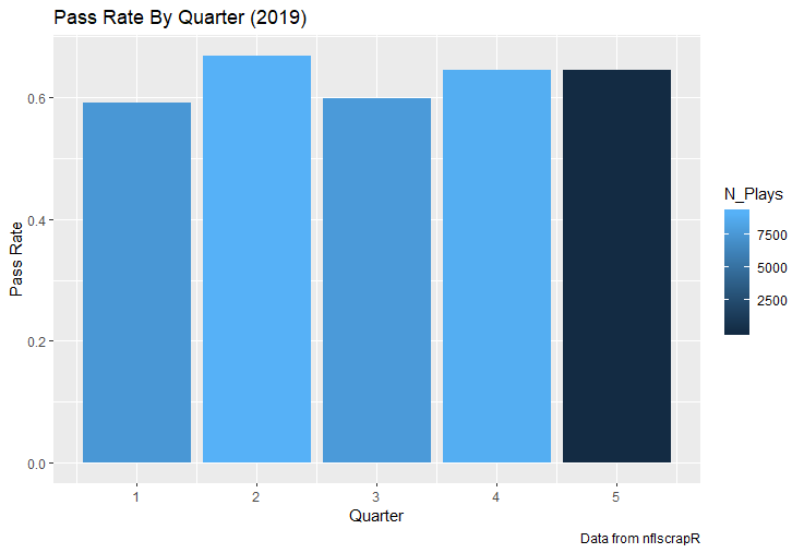
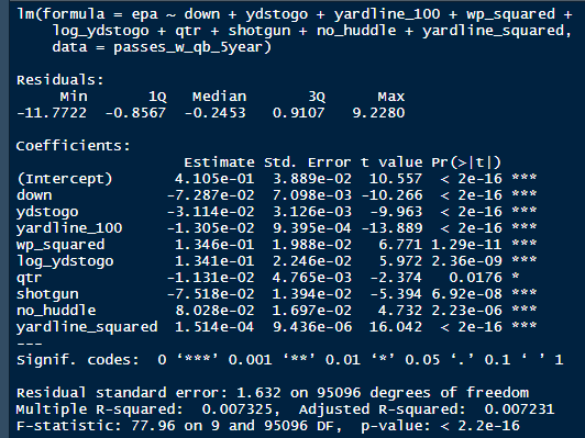
I set out to evaluate trading up based on outcomes rather than process. Not only does a "process" oriented mindset supports trading down, but the results have favored trading down too. In sum there are a few key takeaways from this post. 1) Teams have grossly over-payed to trade up, and over-payed most for high draft picks (roughly 1-80) 2) Teams who traded up tended to get a more value per player, but this is because they are drafting with higher picks, not because of awesome foresight causing teams who moved up to draft players better than their pick number implies. 3) While teams who trade down get less value on a per pick basis, they get so many more shots to find talent that they who drafted more NHL players, and more good NHL players than their counterparts. 4) The more teams have been willing to give up to trade up might signal more confidence in that player's abilities, but that confidence hasn't translated to more production either. 5) Trading Down is great in theory, and has worked well in practice. So if teams are willing to overpay to move up, don't hesitate and trade down! Thanks for reading! Also, thanks to evolving hockey for the player statistics at the NHL level, hockey db for player pick numbers, and prosportstransactions for the pick swaps data. I had an idea for a Youtube hockey statistics explainer series, feel free to check out my first video. For skill positions in the NFL like Quarterback and Running Back, production totals tend to largely be a product of opportunity. As a result, efficiency measures like yards per attempt or Expected Points Added (EPA) per drop back are much better for evaluating players. Using NFLscrapR, it is easy to obtain these player statistics, but the same data set shows various things outside of the Quarterbacks control also affect these values. For example, all else equal, passing on first down tends to be more efficient than passing on later downs. Additionally, passing into 2019's number one ranked New England Patriots defence was more difficult than passing into the number 32 ranked 2019 Arizona Cardinals defence. If the goal of statistics is to aid player evaluation, adjustments should account for factors outside of a Quarterback's control. Thankfully similar adjustments have been made for years in hockey using Ridge Regression to create Regularized Adjusted Plus-Minus (RAPM)[1]. In the RAPM model, players go into a regression model as dummy variables along with control variables to estimate an individual's impact independent of other players and some contextual variables. This post will use the same concept and apply ridge regression to the NFL play by play data courtesy of NFLscrapR to obtain estimates of NFL Quarterback's EPA Per play independent of various factors in the dataset Quarterbacks have little to no control over. [1] Macdonald, B. (2012). Adjusted Plus-Minus for NHL Players using Ridge Regression with Goals, Shots, Fenwick, and Corsi. Journal of Quantitative Analysis in Sports, 8. doi: 10.1515/1559-0410.1447 EPA and the Adjustment Idea For a long time, offensive football statistics heavily relied on yardage numbers like yards per attempt (YPA). YPA is a useful starting point; however, any football fan knows not all yards are equally valuable. For example, show any fan or coach their team throwing a two-yard check down on first and ten, then they will be disappointed. However, show them the same two-yard pass on third and one, then the pass feels like a massive success. EPA tries to take this concept and weigh each play based on the expected value in terms of points it added relative to before the play. So, imagine a team in field goal range on second and nine from the twenty. Say under these circumstances teams end with an average of 4 points. Then the Quarterback hits a perfect pass right into the end-zone. The expected value of points on the drive increases from four to seven because they have now scored a touchdown. So, this pass is worth an EPA of three (7-4=3). Over enough passes, divide EPA by passing attempts to turn it into an efficiency measure. (Note most people here are likely familiar with Expected Goals in Hockey, you can think of EPA like xG for American Football, and this Model is like the Evolving Hockey's RAPM xG). The idea for this model came from a concept found in hockey analytics called “Score Effects,” and the RAPM. Gabe Desjardins discovered score effects when he realized the score state of the game heavily influences NHL shot rates[1]. In NHL level hockey, there is a counter-intuitive trend. The winning team is likely to control a smaller percentage of the shots, chances and goals than the losing team, and the effect gets even stronger as the score differential increases. So, on average, teams up by five goals are out-chanced by a larger amount than an identical team leading by one goal. The effect is likely caused (at least in part) by loss averse players and coaches, although perfect knowledge of the cause is not necessary to spot and adjust for the trend. The thought process behind this model was, if simple adjustments based on things like the score improve hockey statistics, they would likely do the same for football. There might even be potential for more significant improvement to NFL statistics because there are far more contextual variables in the NFL play by play data than the NHL. Each NFL play has 256 rows of data attached. Many of which likely impact the EPA on that play despite being out of the Quarterbacks control, like the defence, for example. The model being presented will try to account for these contextual variables a Quarterback has little to no control over, which will yield stronger estimates of the Quarterback's marginal effect on EPA per play. [1] Desjardins, G. (2010, April 13). Corsi and Score Effects. Retrieved March 10, 2020, from https://www.arcticicehockey.com/2010/4/13/1416623/corsi-and-score-effects Picking Control Variables and Adding Teams Using raw EPA data, Ben Roethlisberger had a terrible 2019 season. His -0.157 EPA per passing play ranked in the 18th percentile of Quarterbacks with at least 50 dropbacks in the 2019 regular season. A low EPA per pass is unlike Roethlisberger, who is usually one of the more efficient passers in the NFL. Upon closer inspection, it becomes obvious why he struggled so much in his small sample. He was injured for most of the year, so he only played one full game. That game just happened to be against the New England Patriots. Using the data set, we can see Roethlisberger’s EPA against the Patriots was far from unusual. Passing against the New England Patriots was incredibly difficult in the 2019 season. The gap between the Patriots defence and the league average was about 0.3 EPA per pass. For a player who throws 600 times in one season, this translates to an expected loss of 180 points relative to an average defence. The massive gaps between teams show why no players statistics should be used against them without first accounting for their quality of competition. To account for quality of competition, team variables are the first contextual factor put in the model. This was done by adding a dummy variable equal to one if that specific defence was the defending team. So, for example, the variable was_NE_D was set equal to one when the Patriots defence was on the field and 0 in any other game. There is a bonus from team variables inside the model too. By including teams in the model, opponent and context adjusted efficiency estimates are obtained for defences too. This gives more robust estimates of team pass defence as well because the same things which affect Passers can also alter how efficient the defence appears. The same way players should not be punished for playing the 2019 Patriots; defences should not be punished for playing against 2019 Patrick Mahomes. The next variables to go into the model were more difficult. The play by play data contains hundreds of variables, but you do not want to risk overfitting by including every single one. So, to decide which variables go in the final model, Lasso Regression was used on a dataset with all passing plays from 2015 to 2019 (a similar process to ridge regression, which the final model will ultimately use). Lasso is a type of regression that penalizes the absolute value of the coefficients towards zero. Lasso is helpful when choosing from many potential variables because it can set coefficients equal to zero and, therefore, remove them from the model if they do not help estimated out of sample predictions (determined using cross-validation). Lasso is not perfect or fully "objective", but letting Lasso pick the variables improve estimated out of sample error is probably better than me picking some significance level out of thin air, then running OLS on a group of variables, and including those that pass my arbitrary significance level. Before adding the variables into a Lasso regression to pick the models additional control variables, two variables had to be created first. Much like score effects in hockey, it was hypothesized the score of the game has an influence on passing efficiency. Better than raw score totals, NFLscrapR has win probability at the time of each play on the dataset. When comparing win probability to passing efficiency, the relationship does not appear to be linear. The relationship looks like it might be quadratic, so a win probability squared was added to the data-set. The next variable created was taking the log of yards to go. This variable is used in the EPA calculation, so it made sense to try it as a control variable in this regression. Next, it was finally time to run the Lasso regression, including the teams, players and then some ideas for control variables. The optimal model picked by minimizing estimated out of sample error included 9 contextual variables. Some were more obvious than others. The regression left out many players and teams whose coefficients were almost 0, but the goal is to evaluate all players and teams. So the players and teams Lasso left out were added back into the final model. Included Controls - Down The first variable added to the model was down. Teams like the Kansas City Chiefs were praised because they passed more often than anyone else in the league on early downs last season. Nerds praised Andy Reid and company for this because passing efficiency is negatively correlated with down. So, imagine a cloned QB on otherwise identical offences, but the first team often passes on early downs like the Cheifs, and the second team generally preferred to run until third down. Then the Quarterback on the first more pass-happy team would have better statistics in the long run despite being identical to his clone, simply because of decisions his coach made. Why does this correlation exist? There is no way to be sure, but it likely, at least in part, is because the defence can be increasingly confident a pass is coming as the down increases on the first three downs. (It is also likely in part just because of how the EPA calculation works) Defensive coordinators are essentially flipping a coin between pass or run defence on first down, but by third down, they know a pass is coming almost 85% of the time. The more certain defensive play-callers can be of what’s coming, the better their players should preform all else equal. This is a possible reason why down is negatively correlated with passing efficiency and is therefore included as a control variable in this model. Win Probability Squared The next variable added to the model was the squared win probability (Lasso dropped the linear win probabitly term). As seen before, the relationship between passing efficiency and win probability is probably quadratic. Again, this is likely because of how easy it is for defensive coordinators to predict what is coming next. When teams are losing, they pass far more often than they run because passing is more likely to get them out of that deficit. On the contrary, teams generally play it safe and run when they are leading and likely to win so they can guarantee chewing some clock and do not have to risk interceptions. Defensive coordinators are therefor able to adjust and play pass first defence when the context calls for it, this is likely why passing efficiency is increasing as win probability does, because there should be a negative correlation between how likely a team is to pass and their efficiency when actually passing. It is easier to pass against defenses who do not see if coming. Yards to Go and Log Yards to Go The third and fourth variable selected were yards to go and the created log yards to go. Pass to run ration likely does not explain this one though. But, It is clear yards to go can affect passing efficiency, and the Lasso model selected both Yards to go and the Log of yards to go as a result. It makes an intuitive sense that teams far back from the chains struggle to add value. Teams can struggle enough to cover 10 yards in 3-4 downs, then once something goes wrong and they usually have 2-3 downs to make up 15+ yards they really struggle to add value in the passing game. Yard-line 100 and Yard-line 100 Squared Another field position variable was added after yards to go, called yard line 100 in the NFLscrapR data. This is where on the field the ball was spotted before the play. So, after a fair catch on kickoff, the team will be starting at their own 25-yard line, so the variable yard line 100 variable would equal to 25 for that pass. The yard line 100 variable has had a massive nonlinear effect on EPA per play since 2015. Because of the way the relationship looks, a square term was added to the yard line 100 variable. As for the why, again this likely is not explained by disguising the pass from defenses. There is a weak negative correlation between the pass rate and EPA, especially once teams enter the redzone, but overall the relationship is not particularly strong between pass rate and EPA per pass by yardline. This relationship is more likely just caused by the EPA formula. It is presumably easier to add expected points from your own goal line, since the expectations are low. Or from there redzone where you are much more likely to throw touchdowns and guarantee points on the board. I am not means a football expert, so this could be explained by something missing from my analysis too. Shotgun The final two variables were more about the offensive scheme. The first is simply called “shotgun” and it is set equal to one if the offence comes out in shotgun formation, and zero otherwise. Teams generally go to shotgun formations to pass, so it is easy to assuming that is because passing out of the shotgun is more efficient than under center, but the opposite is true. NFL teams have been less efficient when passing out of the shotgun. The relationship does not pop off the page to the eye, but it is consistently a negative coefficient. Why is passing out of the shotgun less efficient when teams generally go to the shotgun specifically to pass? Without experience playing Quarterback this can be tough to answer, but again it probably has something to do with team’s tendencies given this information. Teams pass out of the shotgun about 80% of the time but pass less than 40% of the time otherwise. Again, this should make it easier for defenses to prepare since the offence’s formation is a key tell of what might be coming. Additionally, a friend of mine who played Quarterback mentioned he preferred passing from under center because routes tended to take longer to develop out of shotgun formations. This meant defensive backs were better at jumping routes when passing from the shotgun. That is just one guys thoughts but I found them interesting. Either way passing out of the shotgun has tended to lower passing efficiency in the NFL, all else being equal. Therefor it would be unfair to punish players for their coach calling shotgun passes more often than some other teams’ coach. No-Huddle In a similar vein, there is a variable called “no_huddle”. This dummy variable is set equal to one if the offence runs a hurry up and does not huddle and is equal to zero otherwise. NFL teams have been more efficient when passing after running a no huddle. Intuitively, if defences are given less time to prepare, they should be worst at defending the pass, and that relationship holds. Score one for the air raid. It is not a major difference, but again a Quarterback can have their EPA per pass increased because their coach calls a no huddle offence more often than some other Quarterback’s coach, and this variable will account for that. Quarter The final relationship is the negative correlation between the Quarter of the game and EPA per play The reasoning is much more ambiguous here. I figure many variables have their correlations because it is a tell to the defence of what is coming, but that doesn't seem likely for Quarters. Not only is the relationship less obvious to the naked eye and hard to explain, it is least statistically significant. That being said the variable was consistently picked by the Lasso model. Maybe defense's are better at adjusting to the offence in game than the reverse? I'm not entirely sure to be honest. Altogether this leaves the model with nine control variables
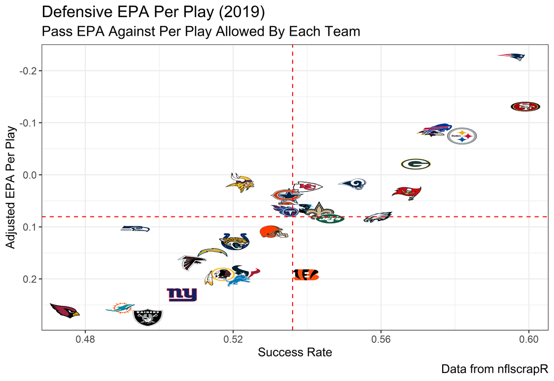
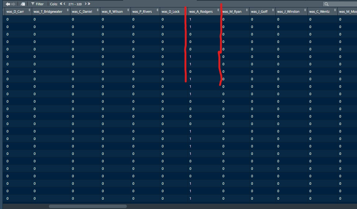
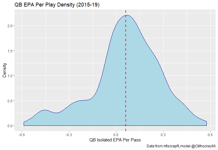
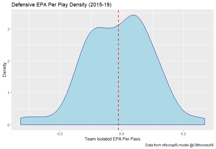
The goal of using lasso regression to pick the variables was to rely on something other than picking some significance level and looking at P values, but all these variables end up being significant at the 2% level anyways. (Data from 2015-19) Adding the Quarterbacks The final piece of the puzzle is adding in the Quarterbacks themselves. Just like adding the team variables, the Quarterbacks go into the model as dummy variables. So to obtain estimates for Tom Brady, a variable called “was_T_Brady” was created to which is set equal to one if the passers name was “T.Brady” in the play by play data. Here's a look at what this looks like in R added on to the play by play data. For those of you familiar with the Evolving Hockey RAPM write-up, this might look familiar to you. The first game in the 2019 play by play data was between the Green Bay Packers and Chicago Bears. So as you can see Aaron Rodger's passing variable is set equal to 1 for many of the first passes. Once a variable is created for each passer and the contextual variables are created the model is ready to go. An additional note is that I chose to run the model filtering out three key things. First being two point conversions. Down is a control variable, and not really available for two point conversions so it was left out by filter to down != "NA". Next was passes where the passer's name was not available. For whatever reason the name of the passer is missing from like one thousand passes each year, maybe these are double passes or something. Either way those are filtered out. Finally only Quarterbacks with at least 50 passes were included. Evaluating the Julian Edelman's of the world who throw two passes or whatever per season is not the point of this model. Its goal is to evaluate actual Quarterbacks, and filtering out those who have thrown fewer than 50 passes is a good way to eliminate gadget type players. The final reason is too help not including players who have only thrown passes against one team. There is little to no point in estimating a player who only threw against a single defence, so this was an way to avoid doing so. Now that the data is all set, it's worth looking at what kind of model we are choosing and why. Ridge Vs. OLS Obtaining player estimates while holding various contextual factors constant may sound like a job for OLS regression, but there are a few key advantages to using a ridge regression model. Ridge works similar to OLS, however the absolute values of the coefficents are penalized, just like in the Lasso model above. Difference with Ridge is the coefficients are penalized asymptotically close to zero. This means every pararmeter fed into a ridge regression model has an estimated value, none are removed. The penalization is done with a tuning parameter called lambda. The larger the lambda the larger the penalty. Like the Lasso model, the optimal Lambda was selected using cross validation in the glmnet package in R. The lambda penalization adds some bias to the model in order to reduce the variance. In theory, ridge models work best when you know all the variables are important beforehand. In reality this is usually useless theory because you cannot know what the important variables are beforehand, but sports analysis can be an exception to that rule. Sure, Tom Brady and Andy Dalton did not have a statistically significant difference in their production last season, but it is still clear to sports analysts Tom Brady is not Andy Dalton. As a result, they can both go in a model like this one as variables. Other fields probably almost never have this advantage, but sports nerds do. Additionally, penalization tends to make Ridge regression better at estimating when variables are highly correlated. So, for example Ben Rothslisberger throwing most of his passes against New England last season means the variable was_B_Rothslisberger was highly correlated with was_NE_D in the 2019 dataset. OLS tends to struggle in these situations more than ridge regression. Finally, using dummy variables for players and teams makes OLS estimates very difficult to interpret from year to year. Running a regression with dummy variables in OLS is done by leaving one of the variables out to avoid perfect collinearity. You then interpret the remaining variables as the marginal effect relative to the variable which has been left out. So say of the 32 defences, the variable for the Patriots defence was left out, then every team would be estimated as having a positive effect on EPA per play (Defences would try to be as negative as possible). Not because every defence in the NFL was bad, but because they were all worse than the Patriots. This is not the worst thing for one season but comparing the 49ers defence in 2018 to 2019 would be saying something like “Relative the Miami Dolphins defence in 2018 the 49ers defence lowered EPA per pass by 0.1, suggesting they were a good defence. Then they improved in 2019 by subtracting 0.3 off EPA per pass relative to the Dolphins”. The obvious question becomes How much does a team need to beat the Dolphins by to be good? Did the 49ers get better or did the Dolphins get worse? Some combination of both? If so, how much of the defensive improvement was the actual 49ers defence and how much was the Dolphins getting worse? These questions may be tough to answer. Worse yet, if the Dolphins happen to be the team left out, its even more difficult to interpret their marginal effect on passing efficiency. This makes interpreting an OLS with so many dummy variables difficult. On the other hand, ridge can obtain estimates for all 32 teams within the same regression. Results Now for the fun part. First we can look at the most efficient starting Quarterbacks from last season, after adjusting for our contextual factors. I've never used the slideshow feature on Weebly before, but hopefully you can click through these charts to the a viz of starting QBs efficiency for each of the past 5 seasons. (Note the 32 QB's with the most passes thrown were included so the chart is actually interpretable, if your looking for the full data-set you can get the google doc here). For those interested in the defensive side of the ball, here are are the adjusted defensive EPA per play coefficents. It is easier to see the effect the adjustments have on defence. The Patriots lapped the field in raw EPA per play against, but they also had a surprisingly soft schedule. As a result our adjustments push the Pats down to 2nd place behind the San Fransisco 49ers for hardest defence to pass against last season. Also of note the Cheifs rise from that mushy middle of the pack to the 4th spot. Here are the distributions. For QB's. And the same for defences Discussion
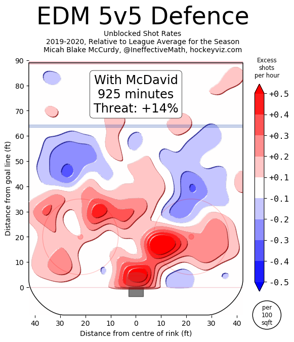
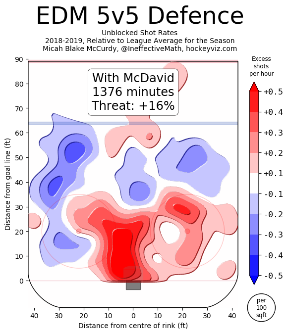
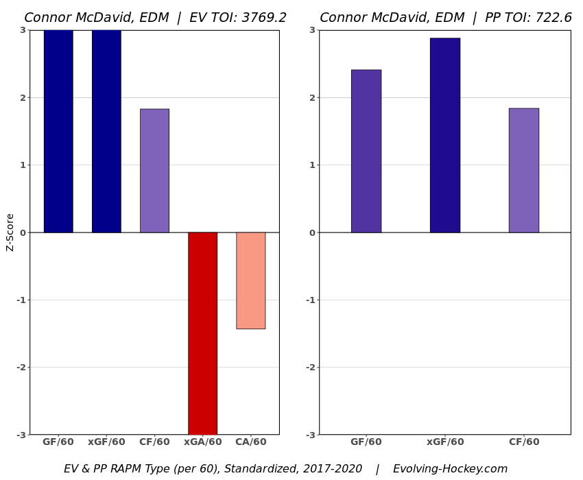
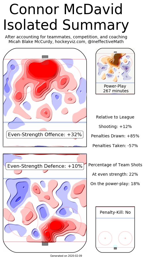
The entire point of EPA is to weigh specific contexts differently than others. This model kind of pushes EPA analysis in the opposite direction, so I suspect there may be some push-back there. Ultimately I think it depends on what you're using the statistic to evaluate. People generally use statistics to evaluate players. I mean, who doesn't love a good fight between Ben Baldwin and Packers fans about how Aaron Rodger's EPA per play in the past few seasons suggests he's overrated. Assuming this is the goal of using statistics such as EPA per play, this model should be helpful. If you want to be using statistics to evaluate player performance, a good faith attempt to estimate what portion of a player's statistics he is actually responsible for is essential. Not that this is a perfect way to isolate for context. Nor do I think this model is complete and finished. I am not perfect at working with the data we have publicly, and there is plenty more non-public data such as wide receiver quality and O-line play not being accounted for in the model. But more generally, if you are going to using EPA to suggest a Quarterback is of ______ talent, you don't want EPA to be swayed by what formations the coach is calling, and what team the QB is playing against, because they can be punished (or praised) for things outside of their control. We know various things affect QB performance, this is why people talk about stats "not including garbage time" on Twitter where they filter out blowout games (Win prob above 80% or below 20%) because statistics in these contexts are less indicative of true talent. Filtering out garbage time makes some sense. Hockey did this too at first. They started by looking at "Corsi Close" where they only evaluated teams when they were within 3 goals of the other team. After a while, it became apparent throwing away that much data is unwise. In the 2019 NFL season, 18044 of the 45546 plays in the play by play data, or just about 40% the season came in this "garbage time." And unfortunately, no amount of fancy math compensates for lack of sample size, so simply throwing away that much data is unwise. This means the natural next step is adjusting the numbers based on the context rather than throwing out some of the limited information we have. Hopefully, this model is a step in that direction for Football analysis. Next Steps There are a few next steps I have in mind. First is to apply the same thing to the run game. Passing is more important, more interesting to me, and more likely to have actual signal in the results, so I started there. That being said, there might be some value in trying the same thing for the run game, and there is only one way to find out. After that, I would like to create a model predicting the probability any given play will be a pass as a control variable. This is a more direct way of adjusting for something I suspect the model is already doing. Other than that, I'm all ears. I didn't grow up a Football fan all my life, maybe there is something more experienced fans think I'm missing or stupid for doing in this model, and if so I'm all ears @CMhockey66 and [email protected]. If you have any ideas for improvements, general questions comments or concerns I'd be happen to listen or try and help. In fact this post is essentially the rough draft for a paper due in early April, so improvements are even more welcomed. Finally shoutout to this NFLscrapR intro, plus the RAPM model on Evolving Hockey for the idea behind using players as dummy variables in a regression model. Plus the Twins at Evolving Hockey for helping me with my questions when working on this each time I asked. And if you made it this far, thanks for reading! As best I can tell, Connor McDavid sucks defensively. On the surfece, the Edmonton Oilers have been getting shelled with him on the ice for quite some time now. Then when we dig deeper and move to statistics that try and account for context, we can see our best public estimates (Shout out Hockeyviz's Isolated Threat and Evolving Hockey's RAPM) suggest Connor McDavid is at least partially responsible for the onslaught of shots, chances and goals against when he is on the ice. Now if you're trying to sound intelligent on twitter and maximize your likes to time spent ratio, you see Micah or the Twins estimates and have 3 options: 1) Dive into their methodology and figure out a flaw in the model. 2) Dig into the film and watch to see how McDavid plays in the defensive zone. 3) Tweet something like “Now I think hockey analytics have a tone of value, but this shows public models clearly have not solved quality of competition yet" Of course, everyone who has spent some time on twitter dot com knows to choose number 3. This response is sure to make you sound smart and should rake in plenty of likes and agreements, but the more I've been thinking about it, the more stupid I think this retort is (without further proof at least). To imagine why let's think about another kind of job. Instead of hockey players, let's think about CEO's of billion-dollar companies. To simplify things, we'll say these CEO's are tasked with 2 jobs: 1) Maximize profits, and 2) Maximize environmental quality Unfortunately, we know we don't have perfect data, but we can easily measure the first goal. So even though both are important, we tie CEO pay directly to maximizing profits because we can measure it easier and better. Now, this world is a messy one, so unfortunately, the CEO's will sometimes be presented with opportunities where they can increase profits at the cost of environmental quality. Would it surprise literally anyone on earth if, at least some of the CEO's in this simple world were willing to sacrifice something that is a part of their job to increase the thing that gets them paid? Of course it wouldn't! We take it as a given at least some people are more than willing to trade off the aspect of their job which does not get them paid to be better at the part of their job that does. (Taking it one step further, I hope people appreciate how nuts someone would sound in the CEO scenario if they set their sort of H0 or null hypothesis such that they simply assumed the CEO's who were strong at maximizing profits must also be good at maximizing environmental quality. Worse yet, they held this belief so strongly that when presented with solid statistical evidence showing a CEO who was great at maximizing profits actually did way more terrible things to the environment than most, they assumed it must be a problem with the statistics. You would obviously find this ridiculous) Now back to hockey. We know how much hockey players get paid is mostly driven by 2 things.
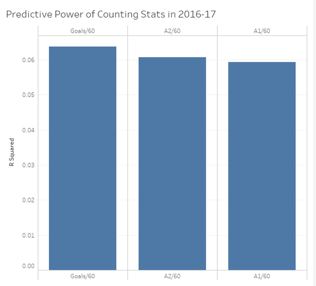
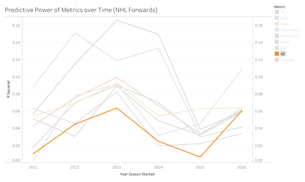
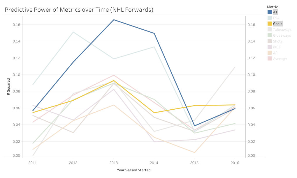
1) Their counting stats (which measure offence) and 2) Time on ice (which is much more highly correlated with our offensive statistics than our defensive ones). As for defense, it's obviously important, but as the Twins have pointed out, defensive measurements essentially have no impact on driving player compensation. Given this information, I don't know why it blows everyone's minds each time a model suggest some star player is great offensively, (the thing we tend to measure, and chose how much skaters are payed and played by) but sucks defensively, (the thing that most people don't measure, and has little to no influence over their compensation or playing time). Am I saying public models have quality of competition and other contextual factors entirely solved? No, I honestly have no idea. But what I am saying is in different contexts, not only would the offensive juggernaut/defensive liability archetype not surprise anyone, we would expect it. So I think dumping on play driving metrics because they often show superstar players are defensive liabilities, might just be a shitty argument, not some profound proof we currently don't know how to solve for quality of competition. So picture this. You're hanging out with some friends and a debate starts, "what's more important, goals or primary assists?". There are many ways to go about answering this question, but many in hockey analytics will look for how predictive each metric is, or how highly correlated each one is with future on-ice goals for. So you pull up Corsica to answer that question. First, you grab the counting stats of all the forwards who played at least 500 5v5 minutes in 2016-17, then you grab the adjusted on-ice relative to teammate goals for per hour of all the forwards who played at least 500 5v5 minutes in 2017-18. Next you delete all the players who didn't play 500 minutes in both of the seasons, now you have a decent sample of over 250 forwards, and finally you can just line the two up against each-other and easily check the correlations for how predictive each metric was and use that to argue you know what the best counting stat is. However, if you do this, the results will surprise you. If all I gave you was goals and primary assists, this could look pretty reasonable. Goals slightly outperformed primary assists in 16-17. However, the addition of secondary assists is where it gets weird. Secondary assists were actually slightly more predictive than primary assists. The more familiar you are with hockey statistics, the more surprising this probably is. Eric Tulsky showed how secondary assists aren't nearly as repeatable as primary assists back when I was in middle school, so secondary assists being inferior to primary assists hasn't been a controversial take for a while now. So what happened? Well, the obvious answer is noise. Everybody understands that hockey statistics are noisy, however, I'm not sure everyone understands just how noisy they can be. Even with a 250+ player sample, the signal is overwhelmed by the noise. This becomes obvious when you extend the sample to every back to back season since 2011. (If your unfamiliar with some of the stat's below, I talk about it in my BPM explainer). With the extended sample, the results makes a lot more sense. Primary assists are the most predictive, then goals, and finally a massive drop-off to secondary assists. So, even though you can technically use evidence to show that secondary assists are more predictive than primary assists, you would be wrong. And the problem is, this happens way more than you might think. With help from Bill Comeau there's now an interactive tableau showing how predictive each metric has been over the years so you can see for yourself how much noise there is in the predictive value of hockey statistics. It looks like a mess altogether, but if you highlight secondary assists you can see that even though they are the "worst" metric on aggregate, they have only been the worst metric 2 out of 6 times. I chose secondary assists because they are generally viewed as useless in the analytics community, but as you can see, this happens with other metrics too. Look at goals and primary assists for another example. This works well because goals have outperformed primary assists in two straight seasons with hundreds of players in the sample, at which point people will likely become very confident in the correlations. Thankfully with these counting stats we can easily cite a larger sample of data and show people why they are still probably better off weighing primary assists more heavily than goals, but unfortunately, we are not always going to have that luxury.
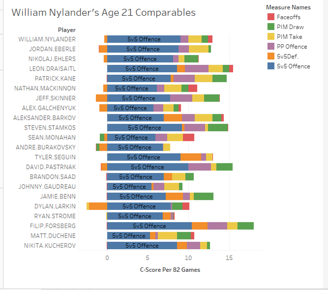
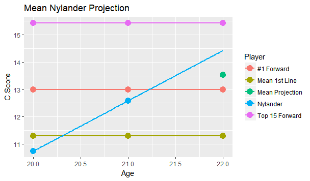
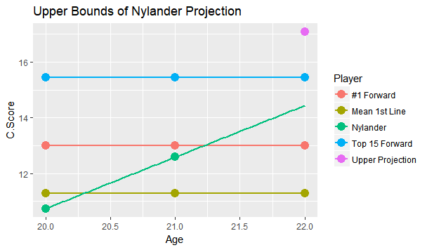
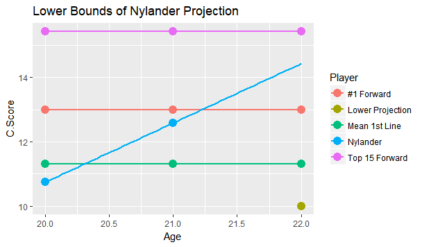
I'm referring to what feels like the new wave in hockey analytics, micro-statistics (I'm talking about hand tracked data, but the general message will apply to the first few seasons of the NHL's tracking data too). More and more often it feels like we are seeing people hand track data to learn about the game. From macro-scale projects like Corey Sznajder and companies All Three Zones Project to more Micro-scale projects like Harman Dayal tracking the Vancouver Canucks. This sort of data seems to be where the analytics community is trending. Of course, the more project's like these the better. It's awesome that we now have the ability to dig deeper into transition data to show how well Erik Karlsson exit's the zone or to quantify some players ability to apply pressure on the forecheck. This analysis might just be the future of hockey analytics, and hey, the best way to learn is to try. But as more and more of this data collected, we will inevitably zero in on how predictive each of the metrics prove to be. This has started already thanks to CJ Turtoro's RITSAC presentation where he used the all three zones project's data on the Blue Jackets, Stars and Flyers to show that the public micro stats were more predictive of future goals than traditional metrics like Corsi and xG (For defenders). It's great to see a signal like this, but it's important to urge caution even if we continue to see promising results like these in the future. Because even full seasons worth of data on the entire league can lead you astray, just like secondary assists would have in 2016-17. Sadly tracking games takes hours from extremely committed people, so we likely won't have the luxury of league-wide data sets for a while, making the already difficult task even more challenging. So yes all this new data is exciting and it's awesome that the early results at promising, but it's going to take a much longer time than most people would like before we can be confident which metrics are most predictive of future results, and until then it's good to be cautious with testing results. Today's the day the William Nylander saga finally ends. He will presumably sign somewhere, and once he does this begs the question, how good will he finally get's on the ice? Today I took an alternative approach to project William Nylander's future on ice performance. To do so I've used a catch all statistic called C-Score, which improves upon my old goals above replacement (GAR). Basically the goal of C-Score is to condense all the things a player does into a single number. From there you can judge a player based off their total output rather than just say, points. With C-Score I've developed a system to come up with historical comparables for each player. It does this by taking how similar each of their inputs are and weighing them by importance. So, for example, similar offensive style at 5v5 is more important than winning a similar percentage of your face-offs, because 5v5 offence accounts for a much larger percentage of players overall output. FInally there is an age adjustment. Rather than comparing William Nylander against everyone to play in the past decade, the projection will only compare him to fellow 21 year olds (his age last season). So who are Willy's closest comparables at the same age? Let's take a look. Note that these are ranked, so Eberle is the #1 comp, Ehlers is #2 and so on. (Also random fun fact, without the age adjustment I actually have WIlly's closest comparable as a 22 year old Phil Kessel, his first season in Toronto). William Nylander's camp has likely been citing Leon Draisaitl's contract to get more money, and the Maple Leafs are likely citing Nikolaj Ehlers's deal to keep Willy's AAV down, so it's interesting they show up as his second and third closest comparables. Hopefully this gives more credit to the idea neither side is right or wrong, it's just business. More generally, It's hard to over state how impressive William Nylander's performance up to to age 21 is. Over the past decade, his comparables include all-stars like; Patrick Kane, Nathan Mackinnon, Aleksander Barkov, Steven Stamkos Tyler Seguin, David Pasternak , Johhny Gaudreau, Jamie Benn, Filip Forsberg and Nikita Kucherov. That's 10 unquestionable superstars! And there were only 25 non-Nylander players used as comparables. Those are very, very good odds, and the number might have even been higher if we knew how Ehlers, Draisaitl and Larkin's next few seaosns will pan out. Rather than looking at a general age curve to project Nylander, I wanted to project him based off these comparables, and how they aged into their 22 year old season. The hope is that this might give Leafs Nation a better idea of what to expect from Nylander in the NHL this season. To get this idea, I created 3 projections for Nylander which should outline his expected range of outcomes. Let's start with the mean projection. The greenish dot right below the blue line shows Nylanders mean projection. This what I would consider the most realistic projection for Nylander based off his comparables, and it sits right inside the top 30 NHL forwards. That is incredibly impressive for a 22 year old forward, and would significantly boosts the Leafs expected winning percentage every night he's in the lineup. Also, it's worth noting that the 30th highest paid forward in the NHL right now is Ryan Kesler, making $6,850,000. (Thanks Cap Friendly). Thanks to inflation and the likelihood of continued growth from Nylander he will likely be worth an even higher cap hit over the long run. Of course, age curves are very noisy. Not everyone follows the average trend, so I looked at Nylander's projection if he is one standard deviation above his comp's average to get an idea of what the ceiling is for this player. The purple dot above the "Top 15 Forward Line", that's the upper bounds for Nylander. This would drive him close to a top 10 forward in the NHL. Is this terribly likely? No, in fact it may be even less likely than usual because he's sat for so long. But age curves are much nosier than we give them credit for, and this represents Nylander's ceiling. Basically the sky is the limit for a player as young and talented as he is, hopefully fans have not forgotten that. Again it's worth noting, the 15th highest paid player in the NHL today makes $8,250,000 giving any realistic extension the potential to be a massive bargain right away. Finally we have the more pessimistic projection. This is if Nylander drops by one standard deviation and represents his floor, or worst reasonable scenario. The green dot lying below the "average first liner" is the lower bounds of Nylander's projection range. Nobody likes to think that their young players will be the one's get worse, but the reality is it happens all the time. If Nylander does lose a step the Leafs should be prepared for him to fall as far as the 70th best forward in hockey. This represents some of the risks we often forget about with young players, some of them do get worse, luckily for the Nylander, the lower bounds I have projected is still a first liner, and worth about $5,750,000 today. Not bad for a floor.
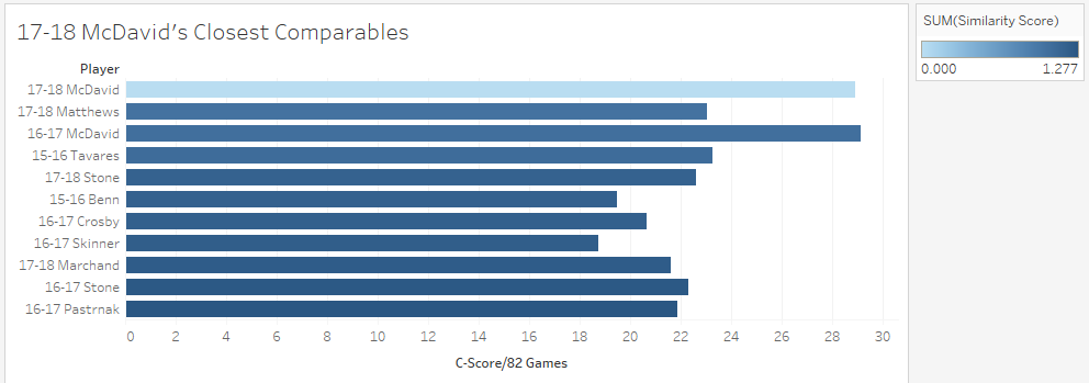
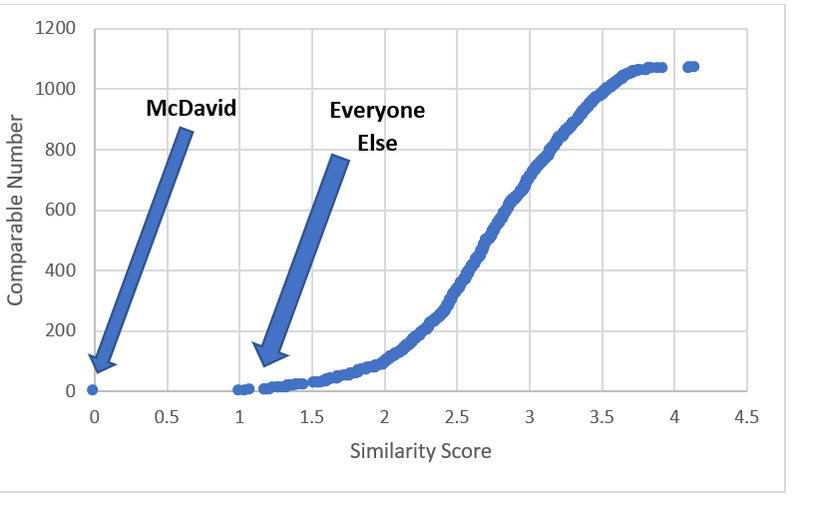
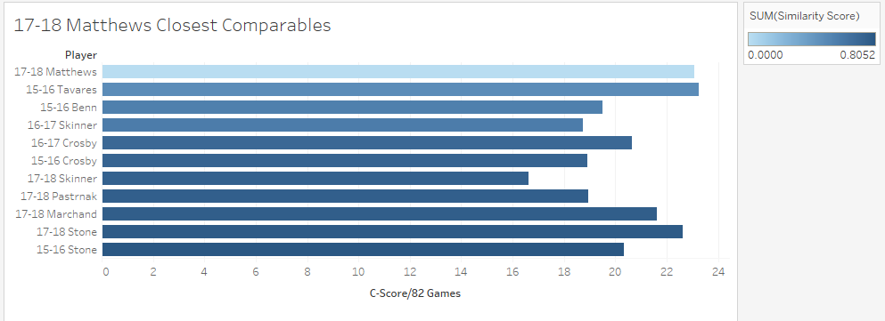
Altogether the question of "How good is William Nylander going to be?" is probably a lot more uncertain than most people think. Age curves are weird, so a single number projection probably isn't ideal. However it's reasonable to expect once Nylander gets back into the NHL, he should be around the top 30 forwards while acknowledging he could realistically climb as high as a the top 15, or fall as far as the 70th. Just like Sidney Crosby was for a long time, Connor McDavid is significantly better than anyone else in the world at hockey. This could be true for like a decade, and will probably get boring. Que talking heads on T.V, or someone looking for a hot take on twitter to say how someone is actually close to the best player on earth. It happened with Toews for Crosby, and yesterday it erupted about Matthews and McDavid. This left me wondering, who is Connor McDavid's best comparable? To answer this I used my new metric, C-Score. I don't have a write-up yet, but think of it like a greatly improved version of my old GAR (So much so everytime I say C-Score you may just want to think GAR). It tries to take all of a players important stats, and boil their output down into one number. There is a small ex-plainer on the C-Score sheet, and I can help answer questions about it on twitter or in the comments. From C-Score the goal was to find a similarity rating for each player. To do this I started with creating a Z-score for each input into overall C-Score. This measures how many standard deviations away from the mean a player is at each component of the game. This is a great way to compare skills across different years. With those Z-Scores you can easily see how close certain players are in each skill. From there I took the absolute value of the sum of the differences in Z-Scores, and weighted them by how much each metric is worth overall. So for example, BPM, which represents weighted counting stats at 5v5, is worth far more to a players C-Score than Face-offs, so, having a similar BPM rating means way more to the overall similarity score than having a similar face-off rating. With that, It's time to look at Connor McDavid's comparable seasons from the past 3 years, meaning I'm talking recent history for this post. Connor's Closest Comps So with a method to test this, i put Connor McDavid's numbers into the sheet and it spit out his closest comparables. Here are the top 10 forwards comparable to McDavid's 17-18 Season. (The smaller the "similarity score" the better.) His own season is obviously perfectly comparable with itself, but maybe people are on to something. Connor McDavid's closest comparable last year was actually Auston Matthews. The problem is that not all closest comparables are equal. Matthews and McDavid differ by a score of about 1. This likely means nothing to anyone, so I'll show you on a line graph. Matthews was technically McDavid's closest comparable, but McDavid is playing one game, and everyone else is playing another. However, if you look at Prospect Cohort analysis you will find that it is usually harder to find comparables for top tier players, and this is true to an exent. More pedestrian players do have much stronger comparables, but even other elite ones aren't nearly as far away from the pack as McDavid. To illustrate this, we'll do the same thing for Matthews, and to give him his best shot at looking one of a kind, I'll use his 17-18 season too, which was his best so far. If you look closely, you'll notice the scale here is much smaller. Matthews closest comparable is the ghost of his new teammate, John Tavares with a collection of all stars filling out the top ten, but no McDavid. Looking at it through Matthews' lens, there 33 players seasons more comparable to him than McDavid was last year. In fact Matthews was more similar to Marchessault than McDavid last year, despite the fact Matthews is technically McDavid's best comparable. For those who like the scatter plot view, here is the same thing but for Matthews, with McDavid highlighted. As you can see, relative to McDavid's plot, there are a much larger group of players, who are much more comparable to Matthews than anyone is to McDavid. So please, stop comparing players to McDavid. You doing a disservice to the player by doing so. They are probably special in their own way, but there simply aren't any players like McDavid in today's NHL, and barring some drastic change, there probably won't be for a while.
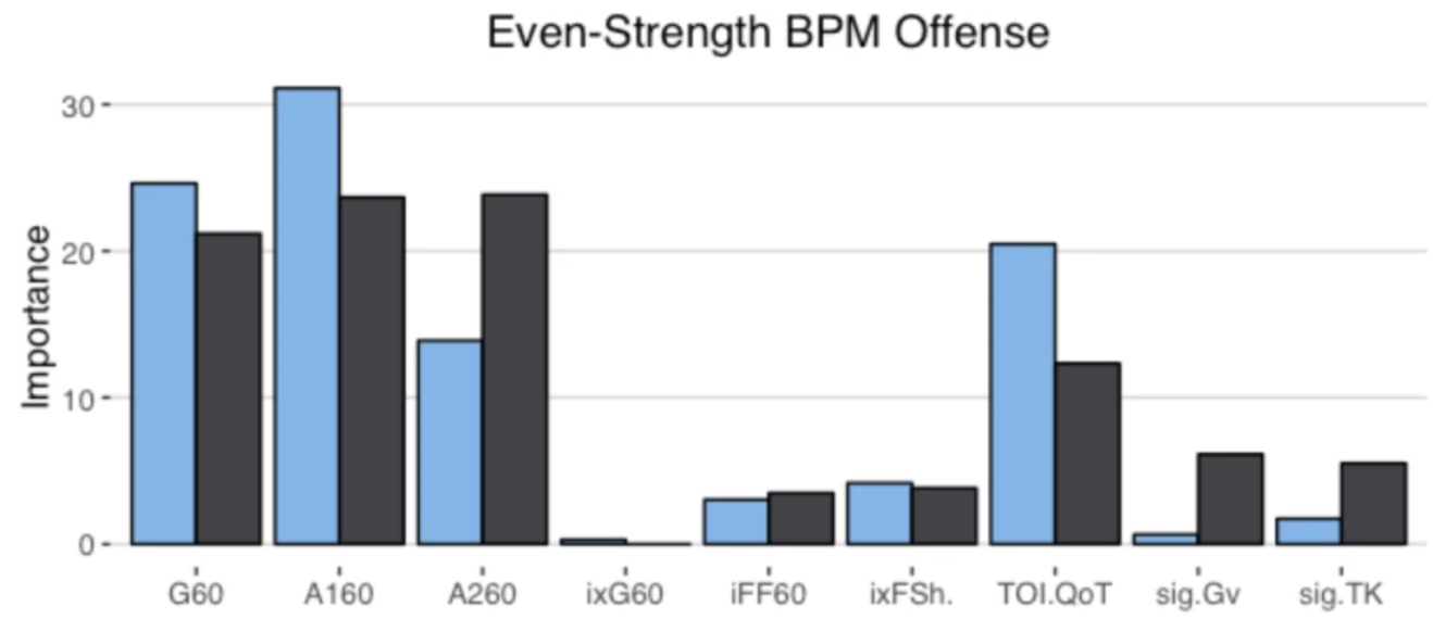
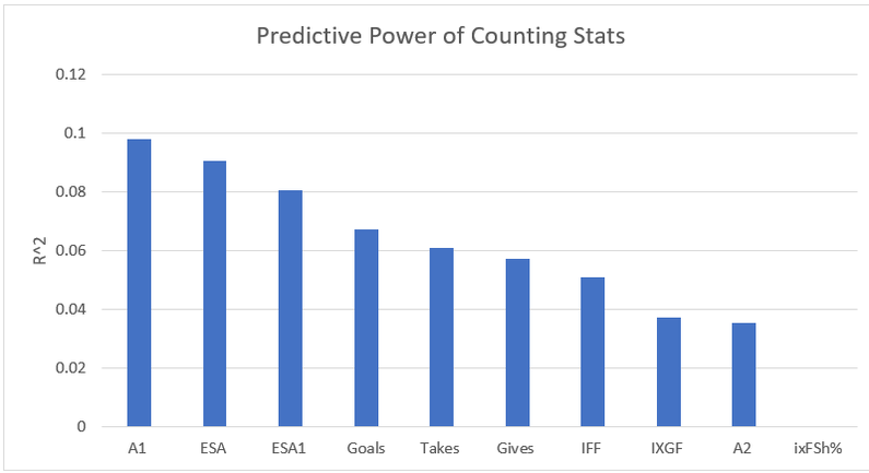
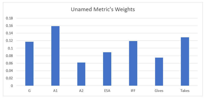
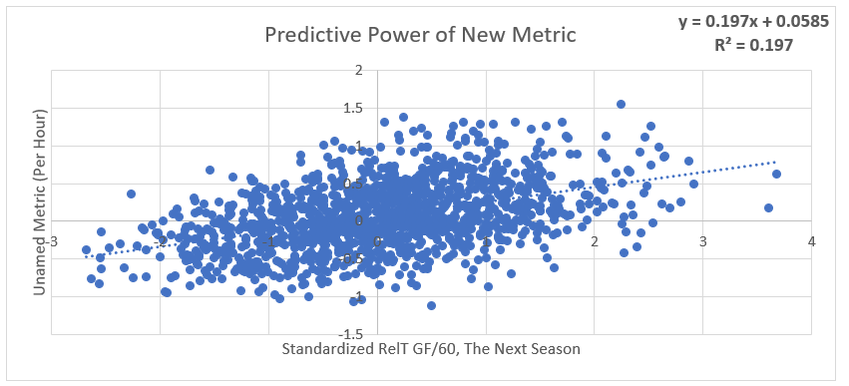
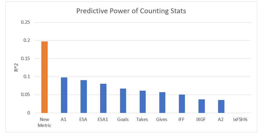
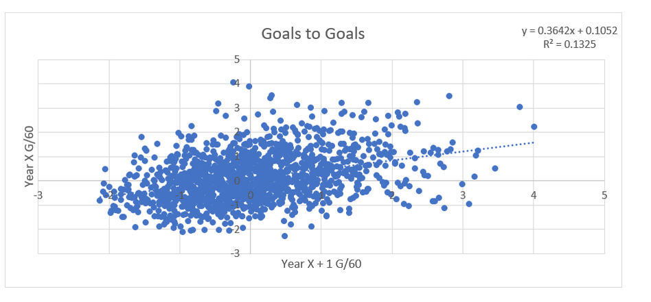
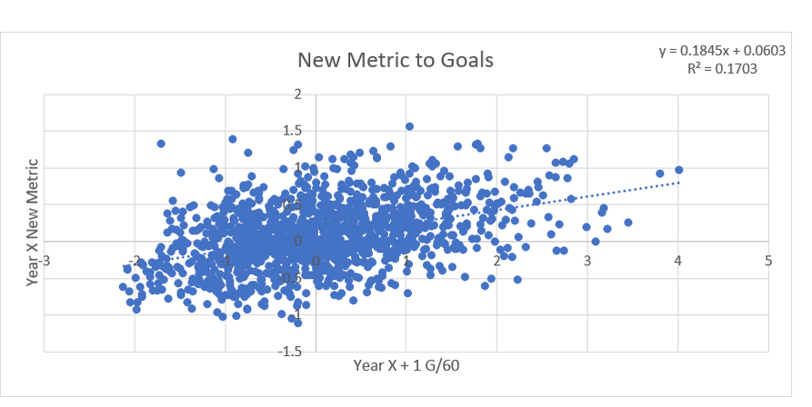
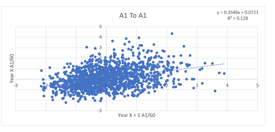
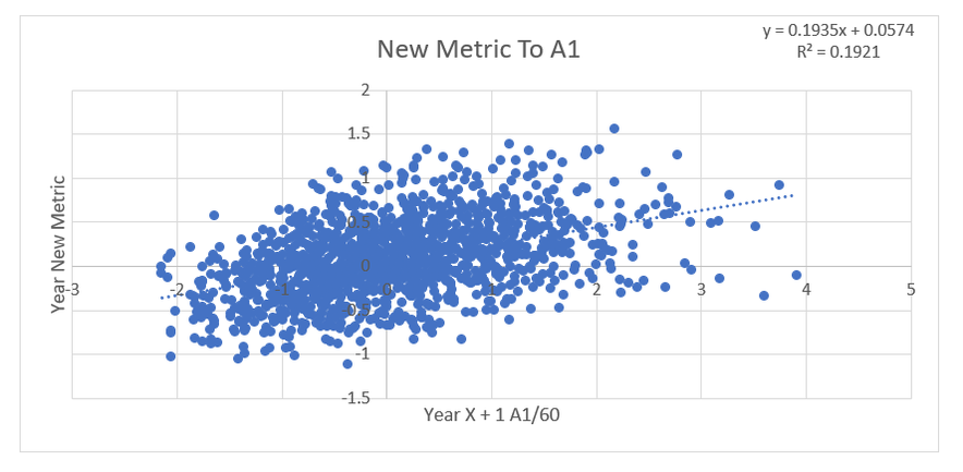
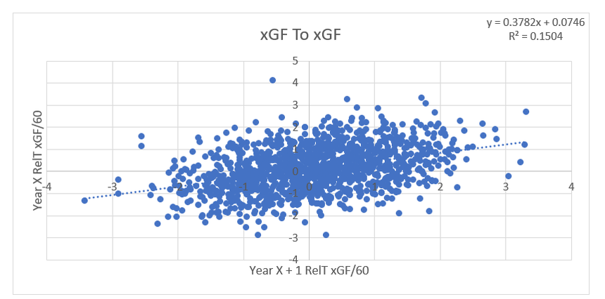
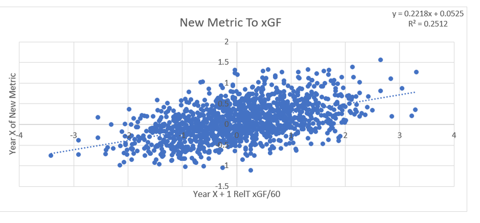
Secondary assists are significantly less repeatable than goals or primary assists. As a result, they're generally ignored inside hockey analytics circles. I understand the logic behind this, but I think there's a better way of looking at things. My philosophy here is directly inspired by Dawson Spriging's old WAR model. Rather than cutting out secondary assists altogether, he used a "BPM" or box plus minus metric. The general idea here is not to throw counting stats out, but to combine them all into one stat, assigning each one an appropriate weight. Spriging's (predictive) weights ended up looking like this (Blue is forwards, which I will be focusing on for this post.) I've always been a fan of this concept, and since Spriging's is no longer in the public sphere, I've set out to do something similar. My goal was to take public counting stats, and combine them to predict future on ice goals for as well as possible (RelT GF/60 from Corsica, where all the stats in this post will be from. Also, I will be referring to year to year correlations for the remainder of the post). The metrics I set out to use were. Goals- Individual Goals scored A1- Primary assists A2- Secondary assists ESA- Estimated shot assists, from @loserpoints IFF- Individual fenwick for (the unblocked shot's a player takes) ixFSh%- The percentage of times a league average shooter would score given that players IFF iXGF- The amount of goals a league average finisher would score given that players (unblocked) shots Gives- Number of times a player gives the puck away. Yes giveaways are going to be a good thing in this model Takes- Amount of times a player takes the puck away from the other team (All Per Hour of 5v5 Ice time) Each of these metrics predicts future goals to varying degrees. Here's each one's R squared with future on ice goals for. This shows us a few things. First, secondary assists aren't necessarily useless, they just aren't nearly as useful as other stats. Second, as Spriging's already showed, looking at primary points probably isn't optimal, because primary assists are worth more than goals. Finally, individual shot quality doesn't add much, if anything to the equation. So with the basic correlations revealed, I used a linear regression model to combine most of the stats shown above into one. (Anything including shot quality added nothing to the model and was therefor removed. As was ESA1 due to multicollinearity issues with ESA). Here are the resulting weights. Most of the weights aren't surprising. Primary assists are the most important. Then takeaways, goals, and shots are just behind. After that shot assists and giveaways provide less value, and finally secondary assists add the least. Now to test the model's actual goal, it's ability to predict future on ice goals for. An R squared of 0.197 doesn't seem like much on it's own, so let's compare it to normal counting stats. This new metric is a significant improvement over using any of the inputs on their own. Defencemen will be coming soon, but for now you can find the forwards data here. And finally if your not convinced yet, I noticed some fun quirks with the stat. The target variable was on ice, relative to teammate goals for per hour, but this new number is actually more predictive of most of the metric's we care about than they are with themselves. For example here's the auto-correlation of individual goals per hour compared to this metrics correlation with future individual goals for per hour. (All the counting stats about to be shown are standardized) Same goes for primary assists. Even something like relative to teammate expected goals for... which is weird. This new metric isn't a WAR model in itself, but I think based on the testing we can conclude it is a very useful stat. For one final thought, you may have noticed that I haven't yet referred to this stat by an actual name. That's because in hockey analytics, people often complain about nomenclature, saying that the names of some of our current stats don't help our cause. So, I'm asking you to help me come up with a name. If you can think of a more descriptive name than the "BPM" it was inspired by, then I'll gladly name the stat whatever you come up with. If you have any ideas for the name, feel free to comment, or DM me @CMhockey66 on twitter, thanks for making it this far!
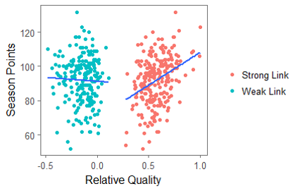
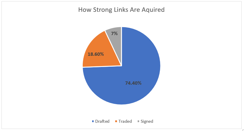
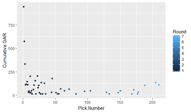
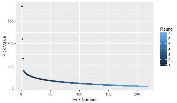
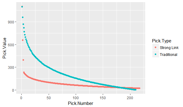
The 2018 NHL entry draft is just around the corner. As picks are traded up down and around, one of the things you're likely to see is draft pick value charts. These have been done before by many people, and the general idea is to put one number value on each draft slot. From there, it's easy to compare which picks are likely to yield more value relative to the other picks. Since this has been done before, today let's look at draft pick value charts through a different lens, creating a draft pick value chart strictly for strong links. The importance of strong linksMany people are likely unfamiliar with the term "strong link" or why they are important. Luckily Alex Novet has gone in great depth here, but I'll provide a quick synopsis of his findings. Basically, there are 2 types of sports, strong and weak link. In a strong link game, star power drives success, while in a weak link game, teams with superior depth are more likely to win. To answer the question, what kind of game is hockey? Alex used this picture. The vertical axis is the amount of points each team earned throughout the season, and on the horizontal axis is the value of the teams best and worst players (Worst in blue, best in red). The first picture shows us there is no relationship between the weak link value and a teams point totals. In a weak link game (like soccer), the stronger the weakest link, the better the team would be, but no such relationship exists in hockey. The second graph shows us there is a relationship between a teams best player and their teams point total. Generally, the stronger the teams best player the more points that team ended up with. This means even though the Vegas Golden Knights are in the Cup final and Connor McDavid's team didn't make the playoffs, hockey is a strong link game, driven by the best players. how Teams acquire strong linksSince hockey is a strong link game, every NHL front office should have one goal above all else, acquire stars. For our purposes, strong links are going to be defined as the top 30 forwards (31 this year because of the Vegas expansion) in goals above replacement each season since 2008-09 (Data Here). This is because, in a perfectly competitive market, these players would each be the strong link on their team. How have teams generally acquired their strong links? Let's break it down. There are three different ways teams have obtained their stars. First is signing them in free agency. Only seven percent of strong link seasons have been acquired this way. Players peak around age 24, meaning they almost always enter free agency past their prime. As a result, teams generally don't get elite talent on the open market. The next way teams have added superstars to their roster is in trades. About 19% of strong link seasons have been obtained in a trade. This means it's possible, but not all that likely for a team to get their best players in a trade. Finally, we have the draft, where an overwhelming majority of stars are acquired. Sure every armchair GM loves to mock trade the next Hall for Larsson, or dream that the unsigned free agent their team signed might become the next Artemi Panarin, but the reality is that NHL teams should plan to acquire their strong links through the draft. It's where about 75% of them come from. Re-Thinking Draft Pick Value ChartsSo thanks to Alex Novet's work and my findings we know two things. First, good NHL teams are driven by strong links. Second, most teams will need to acquire these players through the draft. This gives us an alternative way of viewing an old concept, draft pick value charts. Traditionally these charts aim to value each pick by their ability to produce NHL players, but instead, let's look at each pick based solely off it's ability to produce strong links. Using the parameters set above, here's a look at the cumulative strong link goals above replacement (GAR) by each draft position since 2008-09 This is a rough look at what's to come. Obviously the 45th pick isn't better than the 44th just because Patrice Bergeron was drafted there, so here is the same thing smoothed, which will represent our strong link draft pick value chart. This is the approximate value of each draft pick if your only goal is to draft stars. As mentioned above, I'm not the first person to create a value chart. Traditionally, these value charts look at how each pick yields any type of NHL player, not just strong links. So what's important about my findings is the difference between the value chart above and a more traditional one. To see the differences, here's my strong link value chart plotted against Dawson Sprigings (DTM) draft pick value chart. When plotted against a more traditional value chart, it's easy to see the dramatic differences in relative pick value. DTM's chart see's a 12% drop after the first pick, then each drop get's smaller and smaller from there, and relative value level's off after the first round or so. In contrast, the strong link chart holds the top three picks to a much higher standard. Each lottery pick provides significantly more value than the next, and from pick four on wards every pick is easily replaceable. aPPLICATIONS OF THE STRONG LINK PICK VALUE chartAdmittedly, when I first had this idea I wasn't sure how many practical applications there would be, but there is one very important takeaway from this, albeit in a small niche. The 4th overall pick has very little value relative to the lottery picks, and is very similar to the picks below it. This has one major application because of the NHL draft lottery. Specifically referring to teams that are; A) Bad enough to be in the lottery to begin with, and B) Unlucky enough to lose the lottery and fall out of the top 3 These teams are likely going to be desperate to acquire star talent, and they're probably planning to acquire that talent through the draft. The problem is, bottom feeding teams that are knocked out of the top 3 are left with a pick which isn't significantly better at producing the superstars than the picks after them. This brings us the biggest lesson to be learned from this exercise, don't be afraid to get creative with your first round pick, even if it's a really high one. The plethora of picks a team would receive in exchange for say the 4th overall pick gives them a much better chance at drafting a strong link than that singular pick. After the top three, look to trade down, prioritizing quantity over quality. An alternative way to get creative with top non lottery picks can be emulating Arizona last draft. Arizona, a rebuilding team traded their 7th overall pick in exchange for Derick Stepan and Antii Raanta. It's generally frowned upon for a team in the Coyotes position to trade their first round pick, however using the strong link value chart this looks like a fantastic trade. They still need star talent, but at pick 7 they probably weren't getting it anyways, so they flipped the pick for a first line center and a budding star in goal. These two assets are probably going to provide more value than a lottery ticket at 7. It takes a lot of guts to trade a pick that high, but teams shouldn't be nearly as skeptical of doing it as they currently are, non lottery picks probably aren't as valuable as people think. The draft position data used in this post is thanks to Rob Vollman's super spreadsheet, and for the years which he does not have draft position the rest came from Hockey Reference. For those interested, here's a link to the actual individual strong link pick values. Of course, remember that these values are the approximate relative value of each pick, not a rule-book written in stone to follow at all times. If there's any questions comments and concerns about this based feel free to comment or reach out to me on twitter @CMhockey66!
|
AuthorChace- Shooters Shoot Archives
November 2021
Categories |


 RSS Feed
