|
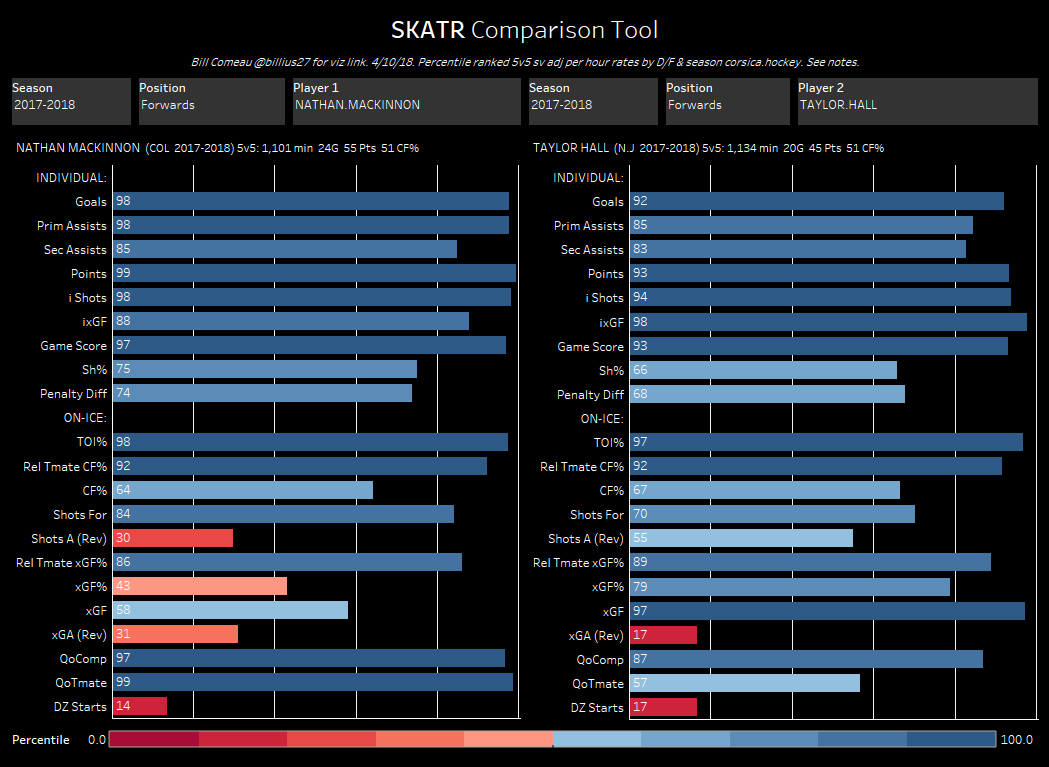
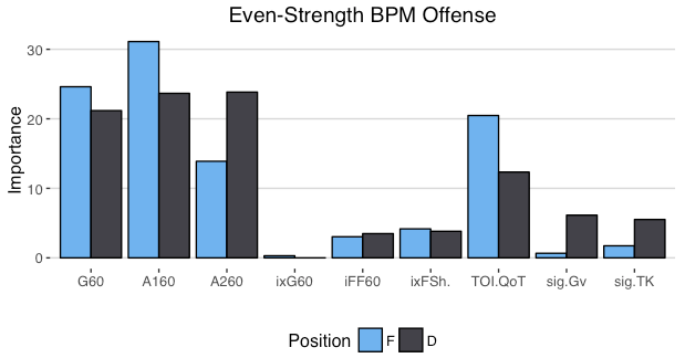
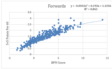
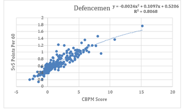
For our purposes, GAR is an Acronym which stands for Goals Above Replacement. It measures the total amount of goals a player adds to his team relative to a replacement level player, and tries to do so by taking everything a player does into account. Then getting it down into one number. So theoretically, if a break-even goal differential team gained a +20 GAR player, their goal differential would increase to +20. Edit: I'm in the process of greatly improving upon this idea. Check out the first step towards my new and improved GAR here. If you're only looking for a specific section of the stat, here's a quick table of contents, if not, let's dive in. 1) The Value of GAR 2) Replacement Level 3) Even Strength Offence 3A) C-BPM 3B) C-XPM 4) Even Strength Defense 5) Power-play Offence 6) Penalty Differential 7) Extras 8) Weaknesses 9) Testing and Results 1) The Value of GAR Before diving into how it's calculated, first let's address the question, why is this important/necessary? Well, you may have scene great resources around twitter that look something like this. (Data Viz From Bill Comeau). These charts are a great way to consume tones of information in a small amount of time. You can see tones of statistics in one glance, from their point production to their ability to drive play, and even their context, it's all there. The problem is when you have to choose between two players with similar production, like Hall and Mackinnon for example. Above you can see Mackinnon had more points, but Hall had better shot and expected goal metrics. Mackinnon played tougher competition, but with much better teammates. What about the fact Mackinnon had a better penalty differential? Or the additional face-off and power-play data that isn't even included here. With all of that, who was better overall? You can try to weigh everything in your head, but the odds of you being able to come to consistent conclusions without being bogged down by the same personal affinities and biases that we turn to numbers to get away from in the first place are very low. This is why we can turn to GAR, as a framework for how to weight things. Also, just as a general tool, having player output in one number can be incredibly useful. It's not going to be perfect, but it's a great starting point for player talent. 2) Replacement Level The next question around GAR model's is why are they "above replacement level"? For a simple explanation, let's assume individual goals are all a player brings to the table. Then imagine a theoretical hockey team called the Computer Boys. And during the 2017 off-season the Computer Boys lose Eric, their top line left winger to free agency. Over a full season, Eric always scores 22 goals. With Eric gone most people think that the Computer Boys have lost 22 goals from their lineup, however that's not the case. If the team was to just leave a void on first line left wing, then i guess they would lose 22 goals. But of course, they wont do that. The second line left wing will step into Eric's minutes, the third will take the second and so on. This shifting of the line-up will replace some, but not all of Eric's 22 goals. This why it's worth comparing player contributions to replacement level rather than zero. So what is replacement level? That's a question which I don't have a perfect answer to. However for the purpose of this model it has to be something. From Rob Vollman's book, Stat Shot he cites the 75th percentile as replacement level. He also notes that will drop after an expansion draft. Since the Vegas Golden Knights made the NHL about 3% bigger, I'm using the 78th percentile as replacement level. This means you have to be better than 22% of the league at a given skill to provide above replacement level value at said skill. With replacement level defined, let's dive into the inputs that give us goals. 3) Even Strength Offence The next part of GAR (Goals) is to try and encapsulate everything a hockey player does to help his team win games. To cover this, my WAR has 5 main inputs. Since about 70% of NHL goals are scored at even strength, most of the goals come from even strength play. Let's start with offence. 3A) C-BPM Ask the average hockey fan what players do to contribute offensively, and they will immediately cite points, which leads into the first half of the offensive equation. To account for players point production there's C-BPM. Which is built around Dawson Sprigining's BPM. Here's his inputs, weighted based on their ability to predict future goals. This basically represents the weights for C-BPM. The longer bars show the more important inputs for each position. Some things of note here. For forwards, primary points are king. For defencemen all points are relatively equal, with slightly more focus on assists. And for either position, shot quality (ixFSh%) is slightly more important than shot quantity (iFF/60). I did make some small modifications (C-BPM likes goals slightly more relative to primary assists than BPM), but this is a good breakdown of the weights. Since the goal here is to encompass point production, I compared CBPM to points per hour. There are a few outliers, which are mainly guys with high shooting percentages or low TOI. Other than that, CBPM lines up closely with point production and does a good job encompassing players score-sheet stats. For a quick look at who excels in this metric, here's the best C-BPM players from the 2017-18 season (Minimum 1000 minutes played).
3B) C-XPM I mentioned above that point production (CBPM) is only half of the equation. That's because there's another key input to players offensive output, their ability to drive play. Some players (especially defencemen) can be elite offensive players without massive point totals. They achieve this by driving shots and scoring chances towards the other teams net. Making sure their team generates goals even though they may not be directly picking up points. To account for players ability to drive play offensively I use C-XPM (again based on Dawson Sprigings WAR, and his XPM metric). This uses 2 key metrics, Relative to teammate Corsi for, and relative to teammate expected goals for. If you're already familiar with those metrics, the next 2 paragraphs aren't for you. If your not, here's a quick synopsis. First is relative to teammate corsi for (RelT CF). This starts with the basic idea of corsi, which is a fancy way of saying a shot. Each shot attempt a player is on the ice for counts as a corsi for. Once we have a players Corsi for, we can adjust for players quality of teammates. For an example, let's bring back Eric. Imagine Eric generates 65 shots per hour of ice time, while his line-mates generate an average of 60 shots per hour. In this scenario, take Eric's 65 shots, minus his line-mates average of 60 shots (65-60) and Eric would have a +5 relative to teammate corsi for per hour. (The equation is more complex than this, and if your interested you can read more in depth here, but that's the general idea). After reading about corsi everyone thinks the same thing, "but not all shots are created equal". Of course a shot from the blue-line is far less valuable than one from the slot, which is where Corsica's expected goals comes into play. Expected goals adjusts each shot for quality by taking into account the shot's type, angle and distance. This way if two players generate the same number of shots, the one who generates higher quality will be recognized as the superior play driver (the same relative to teammate formula is applied here too). With the 2 main metrics defined, C-XPM is simple. Since it's a combination of the two metrics above, the first step is to get them on the same scale. To get corsi on the same scale as (expected) goals, think about goals as a function of shots. Every shot attempt over the past three years has had a 4.08% chance of going in, so just multiply the corsi events by 0.0408055, and suddenly it's on the same scale as expected goals. (This number will change every year, but you get the idea). Once they are on the same scale, this quick equation combines them together. (((RelT CF/Min - RL CF/Min)*TOI) + ((RelT xGF/Min - RL xGF/Min)*TOI)) This gives is the framework for CXPM. Originally I had corsi and expected goals weighted equally, however with some testing I found XG to be way more volatile (especially for defense-men). As a result, the ratings are skewed to include both but favor corsi. The next addition to C-XPM is a quality of competition adjustment. There are 2 different ways to look at quality of competition. First is by looking at the time on ice percentage of the competition, and the second is by their shot and expected goal metrics. Since corsi and XG can be split into offensive and defensive sides, I went with those for the adjustments here. The idea here is that the better a players opponents are at suppressing shots and expected goals, the more value is in that players shot and chance generation. Here's the formula i used to adjust. (((QoC CA/Min - Average CA/Min)*TOI) + (((QoC XGA/Min - Average XGA/Min)*TOI) Again this is the framework, with the weights skewed slightly to favor corsi. This adjustment is nothing major. In extreme cases it swings players results by about 1.5 goals or so. This is probably the most controversial debate in hockey analytics today, so I'm especially open to feedback on improving this part of the model, but in the meantime, the context adjustments did make the total more repeatable, which is a good sign. Again, to get an idea of who excels in this metric, here are the top 5 forwards and defencemen at C-XPM from the 2017-18 season.
4) Even Strength Defense Even Strength defense uses 2 of the metrics mentioned above, corsi and expected goals. This time it's relative to teammate corsi (RelTCA) and expected goals against (RelTxGA). It's the same thing, just the ability to suppress shots and chances relative to your teammates rather than generate them. So the basic equation is the just the inverse everything mentioned above (((RelT CA/Min - RL CA/Min)*-TOI) + ((RelT xGA/Min - RL xGA/Min)*-TOI)) Again i found Corsi to be more consistent than expected goals. Furthermore players don't have an the ability to influence their goalies save percentage, so preventing quantity against (Corsi) is more important than players ability to suppress quality (XG). For the context adjustment, it's more of the same. (((QoC CF/Min - Average CF/Min)*-TOI) + (((QoC XGF/Min - Average XGF/Min)*-TOI) This adjustment is applied the exact same way as the offensive context adjustment. Once again, here are the leaders in this metric from the 2017-18 season.
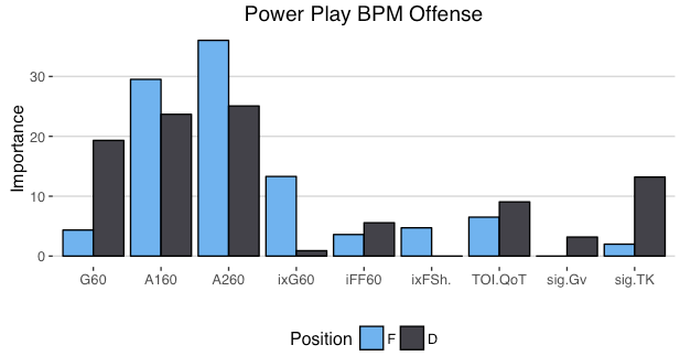
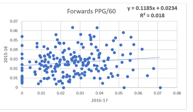
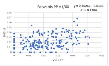
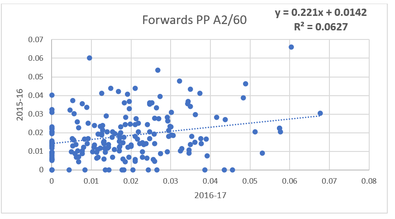
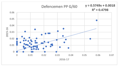
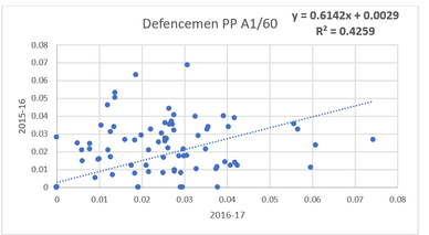
5) Power Play Offence The next components of the model are to deal with special teams. About 30% of goals in the NHL are scored on special teams, so roughly 30% of the value in this model is distributed between these upcoming sections. First up on special teams is power-play offence. Just like C-BPM, power play value comes from point production. And to weight all of the stats, again I turned to Dawson Sprigings BPM. Power play production has some weirder results. People generally put a premium on primary points, however based off the BPM weights being used, either type of assist provides significantly more value than a goal. This sounds counter intuitive. And while Dawson used machine learning techniques beyond my pay-grade to find these weights, I decided to look at the repeatablility of goals, primary and secondary assists per hour on the power-play and it started to make more sense. (players with minimum 50 minutes played on the power-play in each season) So that's a lot of information, but there is one big takeaway. Many are likely puzzled with why goals for forwards have so little value, and while I can't tell you how Dawson got the weights, it's worth noting that goals per hour among forwards in recent history has been incredibly noisy. More noisy than any of the other point based metric. Furthermore, Ryan Stimpson's work illustrates that passing data is more predictive of future goals than shot data at even strength, and since power-play offence is especially reliant on passing to open up the opposing penalty kill, the gap might be even larger on the power-play. These two things help explain why assists are king on the power-play, not primary points. And once again for fun, here are the top power-play performers on from the 2017-18 season.
6) Penalty Differential If an individual players rating looks out of whack to you, this section is likely the reason why. We love to rave about a great power-play or complain about a teams terrible penalty kill, however there is more to special teams than that. A significant part of special teams is deciding how much time is spent playing each one. For example, the 2017-18 Maple Leafs have an amazing power-play, generating the second most goals per hour in the NHL. Sadly they don't get the full benefit from that power-play because the team struggles to draw penalties, as a result, the leagues second most efficient power-play only scored the 9th most goals last season. Of course the flip side is on the penalty kill. Take the Carolina Hurricanes, they gave up the 4th most goals per hour on the P.K. an absoutley terrible result. But in spite of their bad penalty kill, they tied for 9th least goals surrendered while short handed, how? They masked their P.K woes by being the least penalized team in the NHL. On top of it's importance at a team level, penalty differential has proven to be repeatable at the player level, so it's an important input into the goals above replacement formula. For the model, it's split into two separate categories. First is players to draw penalties, and second is players ability to stay out of the box. To calculate the value of each, the formula's are similar ((RL PIM Taken/Minute*TOI) - PIM Taken) *0.1207 (PIM Drawn - (RL PIM Drawn/Minute*TOI)) *0.06885 Conventional wisdom from @EvolvingWild states that a penalty is worth 0.17 goals, however my weights are different. The first reason for that is using 0.17 goals results in an sub-optimal distribution of goals. Using 0.17 it resulted in greater than 40% of the goals being attributed to special teams, which is far to high, so the numbers were scaled down. It's important to note here that the raw values don't matter much, the values matter relative to each-other. I could have easily used 0.17 goals, there would just be more goals to go around in the other categories too. The second reason they are different relative to each-other is to make up for a shortcoming of the model. I have no way of accounting for penalty kill prowess, so instead I shifted more credit to players ability to stay out of the box. It's not perfect and I'm always open to suggestions (especially about P.K. data), but since I was unable to quantify penalty killing at the skater level, staying out of the box is the best proxy to helping your team short-handed. With the equation defined here's last seasons leaders in the NHL's most under rated skill.
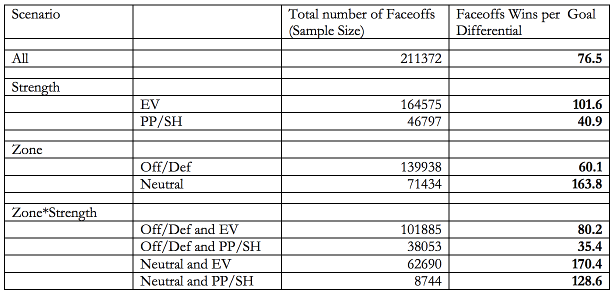
7) Extras For the finishing touches of the model, we have face-offs. The mainstream media tends to treat face-offs as some sort of defensive WAR, and push back from people generally revolves around "face-offs don't matter" neither of which are true. Face-offs are a valuable input into a center-mans output. Micheal Shuckers did a study and found these to be value for each type of faceoff. In a perfect world each Face-off would be weighted based off all the information listed above, however for simplicity sake focus on the top number. Altogether, it takes 76.5 Face-off wins to be worth one goal. Take 100 divided by that 76.5, and you get 1.3071895425 . From there, it's really easy to derive the formula for Face-off value. (F = Face-offs) (F Wins - (F Taken*0.45))*0.013071895425 This way, 45% in the circle is replacement level. And the amount of value that comes from Face-offs is likely more than people expect. Since there are no defencemen here, let's look at the top 5 and bottom 5 face-off value players from the 2017-18 instead.
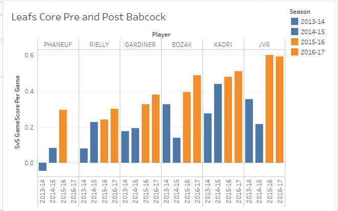
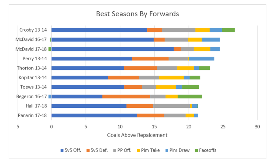
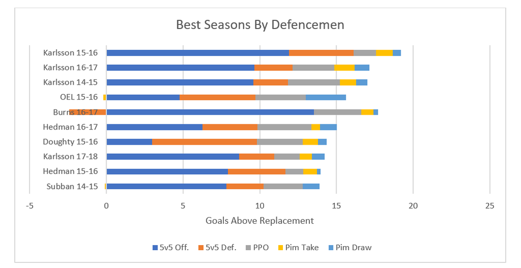
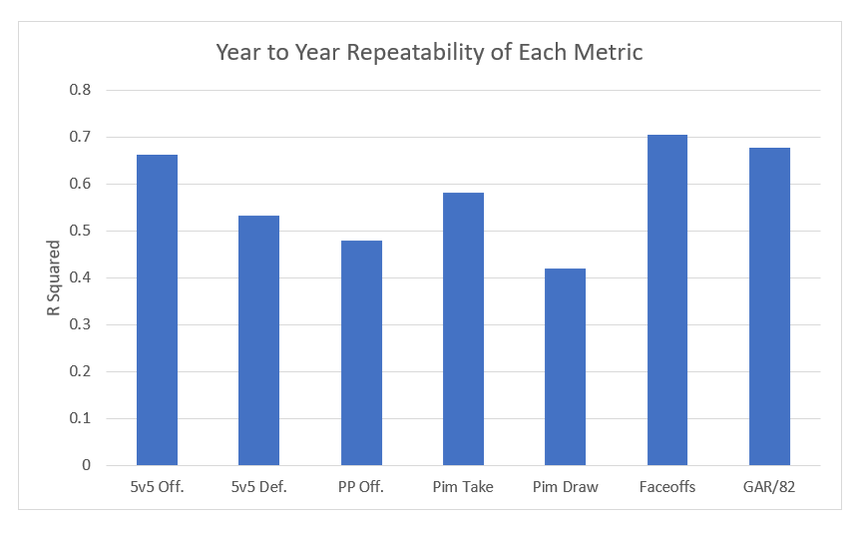
Turns out there is actually something Connor McDavid isn't good at. The final extra to the model is the addition of a prior to both even strength offence and defense. Meaning any single season value uses some of the previous seasons data too. This makes the model slightly worse for talking about say awards voting, but gives a better idea of players true talent. Altogether, the inputs I've described are added together to make GAR! 8) Weaknesses As I've mentioned before, any GAR model, including mine, are going to have weaknesses. And it's important to understand those weaknesses when working with the data. First is the inability to quantify short handed impact. Ian Tulloch's zone start adjustment is a step in the right direction, but I was still unable to come up with a penalty kill metric that adds anything but noise. So for this model, the best penalty killers just stay out the box. The second one is about the prior. When a player has no prior history (rookies) their history is considered to be average. This by definition means that the value of a rookies season will be under rated if he's above average, and over rated if he's below average. Also with the prior, if a player dramatically outperforms their past performance, they will be scaled back towards their career norm. This helps find "true talent" because generally, the more extreme a players results, the more likely luck played a significant role. On top of those, there are a few other major weaknesses of all models, which have been explained well already by others. The first is the Sedin problem. This issue arises when two players play almost entirely together, models struggle to distribute credit between the 2, you can read Matt Cane's thread about it here. Then there is the problem where elite players can do weird things to their teammates result, explained by Ian Tulloch here. And finally there is one weakness in many public models which has yet to be addressed. 8A) The more important QoC One of the biggest puzzles in hockey analytics today is adjusting for context, and specifically QoC, which generally refers to quality of competition. I have a small adjustment for that in the model, however I don't adjust for the more important QoC, quality of coach. This is something Dawson Sprigings noted back when he was in the public sphere on the hockey graphs podcast. He spoke about how in his WAR model, he found adjusting for quality of coach to be more important than quality of teammate. Many people (including myself at first) are likely highly skeptical of this, however let me present a case study. When working with the first model I made (very similar to Gamescore) I noticed something really weird when creating the age curve. From the 2014-15 onto the 2015-16 season, a cluster of players all saw improvements in their results, and it caught my eye. All of these players had one thing in common, they all played for the Toronto Maple Leafs. Using Dom's Gamescore from Corsica, you can see the results for yourself. Gamescore is a primarily an offensive metric, and the Leafs shooting percentage dropped from 7.51% to 6.31%, their goals for cratered, and yet every single core piece of the team saw their results improve. So what changed? They transitioned from some of the worst coaching in the NHL to among the best, and benefited from the Babcock effect. And to show this wasn't just a weird year, I included the two years before Babcock in blue, and his first two seasons behind the bench in orange. Over the 4 year sample, every single player had their best two seasons under Babcock, and their worst two before he took over. This is probably one of the most extreme example's I could cite (Bruce Boudreau and Mike Sullivan appeared to have massive effects too), however it shows the huge effect a quality of coach can have. That being said, I don't have a method to account for this, and this is a topic not often discussed in the public sphere, so it will likely be a while before adjustments in this field are made again. So for now, in ability to adjust for QoC will remain a weakness. 9) Testing and Results With the calculations out of the way, we can finally get to the fun stuff, the results! Throughout the summer I plan to be adding to the data set as far back as I can go, but for now we have the past 5 years of data for forwards, and 4 for defencemen. Let's start by looking at the best GAR seasons at each position in recent history. In the end the sniff test is meaningless, but it is nice to see the model recognizing the best seasons to be from superstars. Peak Crosby is the king, and McDavid is going to truly be something special. For defencemen, Karlsson has lead the way in literally every season I have data for (and has somehow only won the Norris once in that time). Then Hedman Doughty, OEL, Burns and Subban also make appearances in the top 10. The full list of results are available on this google doc. It's only the past 2 seasons for now, but in the upcoming week or so I'll be adding more seasons, and different filters like age, draft position, salary and anything I find interesting for people to play around with too (Thanks to Rob Vollman's Data). And just to show that all of the metrics I've presented you with aren't just noise, here is a chart showing the year to year repeatabiltity of each metric. If you've made it this far, thanks for reading! That makes goals above replacement, a quick snapshot of player talent boiled down into one number. It's not as complex as some others, but it does combine all of the numbers people are most likely to cite anyways when discussing why player X is better than player Y. If you have any questions comments or concerns your welcome to comment or reach-out to me on twitter @CMhockey66. I'm always open to discuss why numbers are the way they are, improvements going forward, or anything really. And finally, thanks to Manny and his website Corsica, which is where all of the data in this post came from!
8 Comments
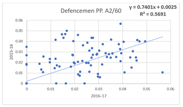
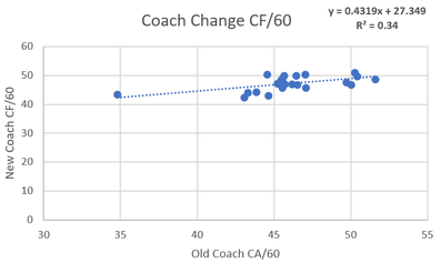
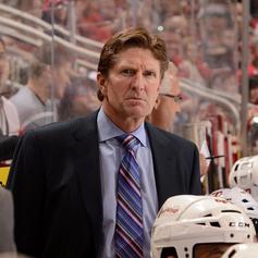 A question I have always had is what impact coaches actually have on NHL teams. Usually, their impact is simply mentioned anecdotally with nothing actually backing anything up other than winning records. I used to never think coaching impact would be high, but the 2015-16 season made me rethink this theory. In this season these two teams were possibly the most extreme case studies of the impact a coach can have. First, there was Babcock and the Leafs. In 2014-15 season Toronto a 46.32% Corsi under coaches Randy Carlyle and Peter Horachek, good enough for fourth last in the league. But then that summer they landed the biggest coaching fish Mike Babcock and skyrocketed up to a 50.59% Corsi, good enough league average (despite bleeding talent that summer and throughout the season). Early in that same season, the Penguins were in a tailspin like the lite version of the 2014-15 Leafs. Crosby wasn't scoring, and the team was a disappointing fifth in the metropolitan division. This was not simply luck as the star-powered team only had a 48.34% Corsi. But then it all changed when they Fired Mike Johnston in favor of their AHL coach Mike Sullivan. Under Sullivan, they lit the league on fire running the table with a 55% Corsi en route to their first of back to back Stanley Cups. Ever since watching both these dramatic swings it seemed to me like the coach could be even more valuable than the players on these teams. So these coach MVP's left me asking one question, how much impacts do coaches really have on shot rates? Method The method I used was fairly simple. First off teams were all put into two sides with year X on the first side and Year X+1 right beside it. For example, the 2012-13 Penguins went on the left side and they would be compared to the 2013-14 Penguins on the right. This way we could look at how teams shot rates changed from season to season. The next step was to attempt to isolate the variable that was coaches. This was done by taking all these teams and binning them into 3 categories. The first category was teams that made midseason coaching changes, these teams were removed from the data. For example, because the 2014-15 Leafs fired Carlyle for Horacheck, the 14-15 vs. 15-16 data for Toronto was not included. There are already a lot of moving parts when using this method to compare Babcock to his predecessors so including data with a third coach seemed to be unnecessarily adding another extraneous variable. Next there are the two bins actually used, first was the same coach category. This was teams having the same coach for the year of X, plus the year after that. For example, the 15-16/16-17 Hurricanes used Bill Peters for the entirety of two seasons and therefore were in this bin. The second bin represented the "Coach Change" bin, and it was a team which used two different coaches for the entirety of two different seasons. For example, in the summer of 2016 the Anaheim Ducks fired Bruce Boudreau and hired Randy Carlyle, so the Ducks 2015-16 data was compared against the 2016-17 data in this bin which examined the effects of a coaching change. From there we can examine how shot rates change from year to year for both same coach teams and coaching change teams, and infer that the difference is probably largely related to coaching. This results in the binds being 99 same coach teams since 2011-12 and 22 summer coach change teams to work with. Now that there is a method, let's see how they differed. (Data from Corsica.Hockey) 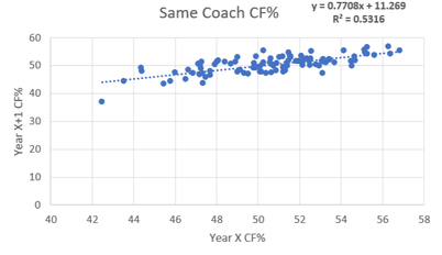 Repeat-ability of CF% With Same Coach First off let's see the teams who remained the same and how their shot rates compared year to year. To see what the relationship is simply creating a scatter plot of the data and see what the correlation was. To the left is the results of that process. A glance at the R^2 shows us a correlation of 0.53. What this means is there is a moderately high relationship between an NHL teams who have the same coach in back to back years CF%. This seems logical. While they're always moving parts but teams generally don't change enough on a year to year basis to make a huge swing in CF%. Using the equation of the line of best fit there is also another interesting thing I found. If you sub 50 in for X in the equation y=0.7708x+11.269 you get a value of 49.809. What this means is that teams who stick with their coach actually get tend to get worse the next year. This is probably just regression to the mean however maybe the whole "Coaches voices go stale voice narrative" may actually have a little bit of truth to it. So now that we know how teams who keep their coaches results fluctuate let's compare them to teams who change their coach fair and compare. 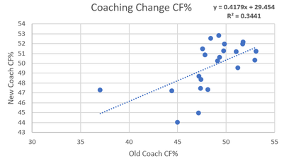 Repeat-ability of CF% with Different Coaches Before we begin it should be noted that the coach change bin is much smaller, with only 22 teams so that could increase noise. With that in mind it's time to examine the new coach bin. The difference is substantial compared to the same coach graph and you can see it at first glance. The R^2 shows us a correlation of 0.34. This means there is almost no relationship between year to year CF% a mung teams that changed coaches between said seasons. From here we can take the difference between the two (0.53-0.34) which gives us 0.19. This means that teams who change coaches in the off season's CF% are 19% more variance than those who keep the same coach for two years. From here I make the cautious conclusion that coaching can be responsible for up to 19% of the variance in a teams CF%. Also from this line of best fit there is another interesting observation. When you sub 50 in for X in the equation of y=0.4179+29.454 you get a y of 50.349. This means that teams that fired their coaches actually saw their shot rates improve next year. Again this is probably just regression to the mean but i thought it was interesting. So now that we can estimate the fact that coaches are responsible for nearly a fifth of a teams shot rates, lets look at what specifically changes. 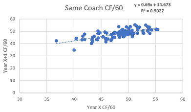 Coaching Impact on Shot Generation Now that we can see the impact coaches have on Corsi For Percentage, now we can look more specifically at what side of the puck coaches seem to influence more. This can be done using the same simple method of above but just splitting into two bins, Corsi For Per 60 minutes and Corsi against per 60 minutes. First, lets look at shot generation with the control group (same coach) to the left. The repeatably gives us an R^2 of 0.5027, slightly less repeatable than overall CF%. Now that we know how repeatable offense is a mung same coach teams, let's see how they stack up relative to coaching changes and estimate their impact from there.
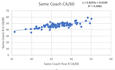 Coaching Impact on Shot Suppression Hockey coaches are infamous for putting way too much emphasis on the defensive side of the puck. Seemingly every team has a horror story of the coach not playing a gifted offensive player enough because of perceived defensive weakness. We are about to see that there is a reason for this. To the left, we can see the repeatability of shot suppression a mung same coach teams. The R^2 is 0.5881 which is the strongest relationship yet. The R^2 is 0.08 larger in this sample than the shot generation sample. 8% Less noise in the shot suppression sample is a strong clue that coaches may have a larger impact on defense than offense, but to be sure we can use the same test as used above. 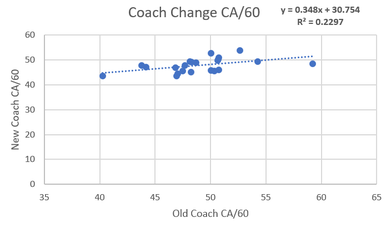 To the left is the sample where teams had a coaching change and the R^2 comes out as 0.2297. This means that there really isn't a relationship in the year to year shot suppression from teams that changed coaches. One last time we can take the same coach R^2 minus the coach change R^2 (0.5881-0.2297) and we get a value of 0.3584. This would appear to mean that coaches can be responsible for up to 35% of shot suppression. The fact that up to a third of a teams defense (when it's defined as shot suppression) are simply the results of the teams' coach is an impressively high number. I would wager that very few, if any single players have such a massive sway on teams shot rates. So bringing this back to a point made above this could illustrate why coaches seem to love defense so much. It appears they have twice the impact on what happens without the puck rather than with it. Knowing this it makes intuitive sense that they focus on defense so much as it could be a result of either focusing on what you control or a choice support bias. Trying to figure out which one leads to a sort of chicken vs. the egg kind of debate. This depending on whether you think coaches focus on defense because they can control it or control defense because they chose to focus on it, but the point remains that coaches can drive as much as 16% of shot generation, and 35% of shot suppression. So since such a large portion of shot rates are can be driven by coaches me think that coaches are maybe the most underrated part of hockey teams on-ice results. |
AuthorChace- Shooters Shoot Archives
November 2021
Categories |
 RSS Feed
